Amelia’s Magazine | Meet Lorna Scobie: Featured Artist from That Which We Do Not Understand

Amelias_Magazine_TWWDNU_Lorna_Scobie_black_catsAmelias_Magazine_TWWDNU_Lorna_Scobie_black_cats
Lorna Scobie has contributed to Amelia’s Magazine for many years. She was one of my top picks at her graduate show in 2012, and since then she has designed for multiple clients, illustrated children’s books and won many awards for her wonderful animal illustrations. Black Cats was inspired by the superstitions associated with these creatures. ‘Whether they are the bearers of good or bad luck, black cats are subject to our superstitions from England to Japan. Here I have confronted this prejudice, and filled the viewers vision with silent black felines. Are they evil omens, or are they just like any other cat?

Cat_2_Lorna_Scobie
What inspired the personalities of your black cats?
Cats have great personalites – they are all so individual. I love the confused face you see on kittens so much, and I think most of these black cats have that face! I hope I’ve managed to portray that black cats aren’t just black cats, and that each one is as funny, quirky and silly as other cats. It’s funny to think that some people see black cats as devilish!

Cat_1_Lorna_Scobie
Apparently you don’t actually like cats yourself, so what drew you to these little furry beasties?
Although I don’t like the sneakiness of cats, I love drawing them. Cats have such great characters, they make it so obvious when they are miffed! I like the way they can contort their bodies when they lick themselves and it’s really fun to draw all their limbs. There’s just something about cats!

Tiger_Lorna_Scobie
What are your favourite animals, in real life, and why?
I love tigers – which is ironic as they are just big cats! The orange and black is so striking.

Dogs_Lorna_ScobieDogs_Lorna_Scobie
You’ve contributed to Amelia’s Magazine for years, what keeps you coming back?
I love the variety of content in Amelia’s Magazine. Sometimes I find myself drawing the same sort of things everyday and so it’s really refreshing to take part in one of Amelia’s live briefs and try something new. I also have SO much respect for Amelia. When I was in my second year of university Amelia was kind enough to give us a talk about her career and since then I’ve been a huge fan of everything she has done. Hearing Amelia speak inspired me start my own blog and social media pages.

Reindeer_Lorna_Scobie
What has been you favourite commercial client since you left university, and why?
I will always have a lot of love for Stella McCartney Kids as they were one of my first commercial clients, and it meant a lot to me that they trusted me despite it being fresh out of Uni. I really enjoyed the project – creating animal masks – as it was unusual and I was allowed a lot of creative freedom. I’m yet to have a bad experience with a client, perhaps I’m really lucky, but I think it’s because the majority of people out there are really lovely!

Jungle_Lorna_Scobie
What one top tip would you share with a new illustrator?
The best tip I’ve ever been given is that there is no rush! There’s so much pressure on new graduates to be instantly successful and it’s not fair to put that on yourself as it rarely happens. I firmly believe that if you are creating illustration that you like and if you work hard, you will get to where you want to be. It’s unlikely this will happen over night, so relax, don’t rush, it’s not a race!

Dalmatians_Lorna_Scobie
Have you got any exciting projects in the pipeline, and if so can you share a few details with us?
I feel like I’m constantly working on developing some picture books so hopefully some of these projects will come into fruition! I’ve also been working a lot with a big Paris fashion house recently, and lots of that illustration will be out in December.

Birds_of_paradise_Lorna_Scobie
Find out more about Lorna Scobie‘s working process here and buy her lovely Black Cats print – complete with super shiny gold leaf on the cats’ eyes – on my Kickstarter campaign page here.

Categories ,#TWWDNU, ,animals, ,Black Cats, ,cats, ,Gold Leaf, ,illustration, ,illustrator, ,Kickstarter, ,Lorna Scobie, ,Stella McCartney Kids, ,That Which We Do Not Understand

Similar Posts:


Amelia’s Magazine | Meet Mateusz Napieralski: Featured Artist from That Which We Do Not Understand

Amelias_magazine_TWWDNU_mateusz_napieralski_tribal_cumulusAmelias_magazine_TWWDNU_mateusz_napieralski_tribal_cumulus
Mateusz Napieralski (also known as Gust of Wind) works from a studio in London, where he explores the relationship between the handmade and the digital. Tribal Cumulus explores the unknown powers of mystic rituals, where humans and nature merge during ceremonial, hypnotic trances. His bold colours and textures show the powerful energy that is generated but can’t be seen by the human eye. Real gold leaf is used as highlights throughout the illustration.

Mateusz Napieralski
How did you put your illustration together?
I wanted to create an abstract composition capturing the invisible energies created during mystical rituals and dances. I started with sketches of forms, textures and abstract shapes, which I then collage together. I then scanned in my original sketch and carried on with the composition in Illustrator. I like how much freedom digitalizing my sketches gives me. I love playing with scale, movement and placement of all the shapes. Once I was happy with the layout I started applying colour; experimenting with colour palettes is a very enjoyable part of the process for me. Although it’s also quite dangerous, because I end up with many different options and can’t decide which one I like the most!

Mateusz Napieralski 4
What attracted you to the open brief?
I’ve been a big fan of Amelia’s Magazine for good few years and contributed some editorial work in the past. I think the open briefs are such great opportunities for young designers and illustrators to test and develop their skills. This particular brief was very special, because it is such a broad, open topic, which could be interpreted in so many ways, especially when you think of all the different artists involved and their approaches. I also loved the idea of seeing my work printed in gold, because I have never had a chance to experiment with gold leaf printing techniques.

Mateusz Napieralski 6
Your day job involves motion design, how does this feed into your graphic design and illustration work?
I always enjoyed working across different disciplines and mediums, and motion graphics and animation have been present in my work for the past 4 years or so. I think it also gives me that edge to think about my illustration work in different ways and think how the characters and forms I create could work in terms of movement. I think there is also this flowy, smooth feel to my character design and composition, which I guess also comes from the moving image side of things. I guess being able to animate also makes my work a little bit more relevant, as clients are now moving faster into moving image based mediums, and it’s definitely an exciting time for illustrators – everyone loves seeing their work come to life through animation!

Mateusz-Napieralski-what_happens_at_night
You are a member of Just Us Collective – who is in your collective and what have you been up together?
Just Us Collective was established quite a few years ago to promote up and coming talent of designers/illustrators and makers that are in full time education (usually in their final year of studies). I became a member during my final year of studies with about 30 others from around the country, working across various disciplines. Since joining Just Us I took part in a group show which was held at Beach London, and I also pitched some illustrations for an online stationary shop.

Mateusz Napieralski 3
How much has your Polish background influenced the way that you create? and in what way?
I can certainly say that my style and thinking about illustration has been influenced by being exposed as a kid to some beautiful Polish illustrations and Polish poster design. I am in love with the bold graphic shapes of Polish folk art and I guess this comes across in my work as well since the shapes and forms I work with are usually quite bold and have that cut-out feel which is quite Polish.

Mateusz Napieralski 5
What other projects have you worked on lately? Can you share some favourites?
I’m currently working on an illustrated fairytale about a Polish Mermaid, which is quite exciting as this is a purely illustration based project, which I haven’t done in a while. The final outcome will be a little illustrated fairytale zine. I’ve also been busy with making some santa-lovers to start feeling a little bit more Christmasy. I’m also working on a little branding project, but it’s still early stages, so stay tuned for more on that.

Showreel from Mateusz Napieralski on Vimeo.

Please share with us any plans you have for Gust of Wind in the coming year…
I’m currently trying to develop my style and apply it to even more mediums, for instance I would like to look at product design and see how my work could translate in that area. I want to carry on working for various clients and see where Gust of Wind takes me. I’d like to experiment more with moving image, I think it would be great to have some bigger projects to work on. I love identity and branding, I think I would like to find an opportunity to create some playful, bold illustration led identity project. That would be a dream!

Read what Mateusz has to say about his artwork here and pledge for your limited edition gold leafed print on my Kickstarter campaign here.

Categories ,Beach London, ,Gust of Wind, ,illustration, ,illustrator, ,interview, ,Jan Witwicki, ,Just Us Collective, ,Mateusz Napieralski, ,Mermaid, ,Polish, ,Tribal Cumulus

Similar Posts:


Amelia’s Magazine | Meet Niall Grant: Featured Artist from That Which We Do Not Understand

Amelias_magazine_TWWDNU_Niall_Grant_Mater_GaiaAmelias_magazine_TWWDNU_Niall_Grant_Mater_Gaia
Niall Grant works between studios in Norwich and London, creating fine prints that are inspired by traditional European illustration. He has worked for a diverse range of clients and showed work in numerous exhibitions. Above you can view Mater Gaia, his contribution to my 10th anniversary artists’ book, and also available exclusively on my Kickstarter campaign as a very limited edition fine art print with real gold leaf. The image is inspired by his interest in life, death and the dreaming in between. The artwork features the celestial skies and elements of 16th century alchemic illustration above a forest clearing where beautiful crystals burst from the soil. His work provides a ‘visual medicine’ for the viewer.

Niall Grant Neverland
Neverland.

How did you create Mater Gaia?
I created this piece firstly with pencil sketches, and built on those with ink brushes and fineliners. This piece in particular was composed by using different drawings I made whilst researching the project. The colour was added from paper and watercolour swatches I’ve been using for years. This process feels very natural to me, and is quite a traditional approach to image-making.

Niall Grant Sleeping Fox
Sleeping Fox.

What does she mean to you?
Latin for ‘Mother Earth‘, this work depicts Gaia, who some believed to be Goddess of the Earth. It comments on how acts of nature are still attributed to unseen forces in some lands.

Niall Grant Hart Of Ten
Hart Of Ten.

Why did you decide to enter the open brief, were there any things that really appealed and if so what?
My eyes lit up when I first saw the brief. I thought the subject matter was perfect for what I was working on at the time. I myself am a spiritually strong person and I feel that’s important. There’s an Indian proverb that says “Everyone is a house with four rooms, a physical, a mental, an emotional and a spiritual. Most of us tend to live in one room most of the time but, unless we go into every room every day, even if only to keep it aired, we are not a complete person.” A lot of people neglect that spiritual room until the day they die, just going the way of the world. They don’t even think to look into it because it seems too dark, but if you keep asking questions they will be answered.

Niall Grant Strange Creatures
Strange Creatures.

Were there any big influences on your style of illustration from an early age?
I really admired the artwork of Yoshitaka Amano growing up. Gustave Dore, Norman Lindsey and Vania Zouravliov are all identifiable influences in my work. I have thousands of pages of artists work from all different eras. I love making Art and I love looking at it.

Niall Grant King Of The Monsters
King Of The Monsters.

You have worked for many amazing brands and companies, what have been highlights of your career so far?
I really enjoyed working with Lettucewear last year. It was more of an Artworking job and not my usual style, but they treated me very well throughout the three month project and we were always on the same page. It just ran like clockwork really. I think having good communication with who you are working with makes the project much more pleasurable.

Niall Grant The Abacus
The Abacus.

What is your favourite type of job to work on and why?
I love doing album art. I think it’s so special when art forms come together to complement each-other. I love the initial process of connecting with the music and interpreting it visually in your mind’s eye. I really enjoyed working with Secret 7” on the Jake Bugg vinyl cover.

NeverlandStudy_Niall Grant
Neverland Study.

You work between Norwich and London – why the two places and how does this work in practice? 
I grew up in Norwich and have roots there. Housing is literally half the price as London, which releases pressure. I have a nearby screen printing studio too, so I can get prints done whenever I want. London is two hours away, so I can work at a studio there for afew days and meet clients etc. It’s handy at the moment but I can see myself committing to one in the future.

Shells Music Niall Grant
Shells Music.

What are you most looking forward to working on in the future?
I have lots of personal projects that I need to finish up at the moment. I try to always be doing one, but they often overlap. I have a few secret projects underway with some exciting clients at the moment. Expect album covers, murals and editorials.

Read more about Niall’s piece for That Which We Do Not Understand here and grab your exclusive Mater Gaia fine art print on my Kickstarter campaign page here. 50% of the profits from the sale of this beautiful artwork will go to Niall Grant.

Categories ,Fine art print, ,gaia, ,Goddess of the Earth, ,Gold Leaf, ,Gustave Dore, ,illustration, ,illustrator, ,interview, ,Jake Bugg, ,Kickstarter, ,Lettucewear, ,Mater Gaia, ,Mother Earth, ,Niall Grant, ,Norman Lindsey, ,Norwich, ,Secret 7”, ,That Which We Do Not Understand, ,Vania Zouravliov, ,Yoshitaka Amano

Similar Posts:


Amelia’s Magazine | Meet Yoko Furusho: Featured Artist from That Which We Do Not Understand

Yoko Furusho_TWWDNU
Yoko Furusho is a Japanese illustrator based in New York, and was featured in my first book, Amelia’s Anthology of Illustration. Since then she has worked with a long list of commercial clients, and featured in many exhibitions and books. She loves to draw details, textures and patterns with ink and acrylics. The Scenery of the Other Side was inspired by Japanese ideas of the afterlife, following the recent loss of her grandfather. ‘Souls must cross a huge river, and are first judged by the King of Hell. Cows and horses carry the good souls to heaven and my illustration shows what I think this might look like.’

Yoko_Furusho_flyer
Your artwork is titled Scenery of the Other Side – what elements does of this world did you decide to feature and why?
I wanted to focus on the after life world which we don’t understand. Since I lost my grandfather last year, I started to think about where we go after our life. I guess I was very lucky that until last year nobody around me has died, so I was very shocked to realize what happens at the funeral ceremony and when the souls go away.

Yoko_Furusho_scales
How did you create the artwork and what inspired the colour palette?
I always like using colours but I chose really happy colours to create the after life world, because I want the old souls (including my grandfather) to be happy.

Yoko_Furusho_landscape
It was inspired by the death of your grandfather, what did you learn about how death is dealt with in Japan, and what most surprised you?
In Japan, funeral ceremonies are very solemn. The funeral is usually on the day after the wake, and the procedure is similar to the wake, where incense is offered while a priest chants a sutra. At the end of the funeral ceremony, the guests and family may place flowers in the casket around the deceased’s head and shoulders before the casket is sealed and carried to the elaborately decorated hearse and transported to the crematorium. Actually I was very surprised about the funeral alter. The ceremonial alter is covered in flowers so that it looks like a palace in a flower field. Then I realized that is where my grandfather would go and live after he died. So I felt very weird. I was so sad that I lost my grandfather, but I thought that if he was going to live in such a place in the after life, then actually that wouldn’t be too bad.

Yoko_Furusho_lady
You contributed to my first illustration book several years ago, what has happened in your career since then?
Yes, Amelia’s Magazine was one of my first clients. I remember that I was so excited when I first saw the magazine on the news stand in New York. And I was even more excited when I realized that the magazine is based on open-briefs. In that point in my career it was a great opportunity to show my work to people who are excited about the sort of cute and colourful illustrations that I make. So I really appreciate the chance I was given by the magazine and I wanted to celebrate your 10th birthday with my art.

Yoko_Furusho_lady head
What has been you favourite commercial brief and why?
So far, I have worked on four childrens’ books in Europe and in Japan. Through working on these books, I have come to realize how much I like books. When I see children happily reading my books this is such a precious moment for me. Now that I am so passionate about books, my long-term goal is to have an exhibition featuring all of the books that I have published.

Yoko_Furusho_japanese lady
What else are you working on at present?
Currently, I’m working on my next children’s book, which is going to be published as my second original. At the same time, I liked the theme that I worked on for That Which We Do Not Understand so much that I have started to create a new series called The Scenery of the Other Side, which features the fantasy world of Japanese afterlife. You can see some of the images I have made so far in this blog post: I am going to include the hell side of the after life world as well!

Yoko_Furusho_dino
Lastly, was this work in any way cathartic to create? And if so what was the most cathartic part of the creation?
The concept came up easily because I have been interested in the theme since last year. So this imaginary afterlife world was just opened in my mind. I looked for Japanese rituals after the life and drew them straight to the end. I think it has been a good time for me to create my own series and I’m happy that I could end up with this image. Thank you!

Yoko describes her illustration in more detail here. You can pledge for her marvellous artwork, featuring gorgeous gold leaf highlights all over, on my Kickstarter campaign here. Just 5 days left to go to make your pledge!

Categories ,#TWWDNU, ,After life, ,Amelia’s Anthology of Illustration, ,Funeral, ,illustration, ,illustrator, ,interview, ,japanese, ,That Which We Do Not Understand, ,The Scenery of the Other Side, ,Yoko Furusho

Similar Posts:


Amelia’s Magazine | Meet Essi Kimpimäki: Featured Artist from That Which We Do Not Understand

Amelias_magazine_TWWDNU_Essi_Kimpimäki_shamaness

Essi Kimpimäki is a Finish illustrator who will be featured in my upcoming 10th anniversary limited edition artists’ book, That Which We Do Not Understand. You can also buy her wonderful work as a limited edition print featuring real gold leaf: visit my Kickstarter campaign here to find out more. Essi relocated to Scotland to study at the Glasgow School of Art. She creates textures through the use of ink, rollers, watercolour, paint, sponge and pencils, before scanning her work into Photoshop where she plays around with the colours and arrangements. Shamaness (above) is her contribution to my book and is inspired by ancient Mesoamerican civilisations who believed there was a strong connection between the spirit and visible world. The jaguar was a protective spirit companion for shamans as they moved between the realms and the bird is emblematic of the ecstatic trance state.

strawberry by essi kimpimaki
How did you research the themes for Shamaness, and what was it in particular that appealed to you about the ideas you chose to illustrate?
I have always been really interested in different cultures, of both past and present, all around the world – the further away the better! I find it fascinating how differently people perceive the world we all live in, and especially the more abstract ideas in life, the things we do not fully understand. In my opinion, the old civilizations usually had the most interesting ways of seeing things, which is why I looked at the ancient Mesoamerican cultures for this project, and the way they saw and experienced the connection between the spirit and visible world.

morocco by essi kimpimaki
Morocco.

The colour palette is amazing, where did you find inspiration for such a bold scheme?
Thank you! I work pretty intuitively when it comes to colours; I like using bold colours in my work in general, and I suppose with this one the bright colour palette came naturally with the exotic location deep in the jungle. I also wanted to create a stark contrast between the shamaness and the dark background of the night-time jungle.

How did you find out about the open brief and why did you decide to submit?
I think I first saw it on my Twitter feed. I have admired Amelia’s Magazine for a long time but never had the chance to even try to contribute to it, as it wasn’t in print anymore at the time I discovered it. So when I saw this opportunity, combined with the inspiring theme, I obviously had to give it a go!

deer by essi kimpimaki
What are your favourite subjects to draw and why?
I’d say my favourite subject to draw is definitely faraway places. There are so many places in the world that I’d like to see (but I’m pretty sure I’ll never see them all unless I win the lottery..), so I guess researching and drawing these places is kind of like alternative travelling to me. I don’t overly enjoy replicating an existing place right down to the comma, but I rather try to create an image that will hopefully convey the atmosphere of the location to the viewer.

sketches-for-childrens-book-essi-kimpimaki
Sketches for children’s book.

You also make your own screen prints, what do you love most about the process of creating art this way?
I currently work mostly digitally, but definitely want to get back to screen printing soon! Working digitally is faster and more cost efficient, but it’s just a completely different experience. When screen printing, you get so much more involved in the process, you are actually creating something tactile with your hands. I also find that screen printing can be pretty stressful at times; when things start going wrong, they really do go wrong, and you can’t fix it as easily as you can with Photoshop. But I guess this also adds to its charm! You can also end up with happy accidents that actually make the work better and more interesting. And seeing and feeling the lovely texture of the finished print definitely makes it all worth it.

new-prints-essi-kimpimaki
You are originally from Finland but now reside in Glasgow… why did you decide to study in Scotland and what has kept you there?
At least at the time there weren’t really any illustration only degrees available in Finland, you had to study graphic design as well, which I wasn’t interested in. I also just wanted to live abroad again (I had previously lived and worked in England for a few short periods), so returning to the UK was an easy and natural choice for me. Because of the high tuition fees in England, I ended up looking at art schools in Scotland, decided that Glasgow seemed like a nice city, and that’s pretty much how I ended up here. My intention was never to stay here after graduation, but I guess things rarely go as you plan! I have my friends and boyfriend here now and I also find Glasgow an inspiring, exciting and friendly city to live in. If only it was located somewhere sunnier, though…

How much of an inspiration does your homeland remain, and how do you think your Finnish roots affect your approach to work?
I honestly don’t know; I’m not aware of actively being inspired by my homeland, but then again, I guess these things often happen subconsciously. Unfortunately I can’t remember where I read this from, but someone wrote that due to our location, Finnish culture is a mixture of West and East; more ornamental and romantic aesthetics from the East, and minimalistic and graphical approach from the West and Scandinavia. I think this is something I can relate to regarding my own work, so maybe that is where my roots show.

christmas-cards-essi-kimpimaki
What are you working on at the moment.. can you give us any sneak peaks?
I’m actually preparing for the Christmas period at the moment; folding cards, cutting cardboard, packing prints, sending out orders. I have just received my Christmas cards and a few other new prints from the printers, ready for the Christmas market I’m attending next month. In addition to this, I’ve been doing some very early sketches of the main character cat for a children’s book that me and my friend are working on!

Don’t forget to visit my Kickstarter campaign if you like Essi’s work. Her print is for sale right here. Read about the creation of the print on her blog here. 50% of profits (after print, packaging and shipment costs are met) go to the artist, so if you like what you see, go support her!

Categories ,Essi Kimpimaki, ,finland, ,FInnish, ,glasgow, ,Glasgow School of Art, ,illustration, ,illustrator, ,interview, ,Kickstarter, ,Mesoamerican, ,scotland, ,Shamaness, ,Spirit, ,That Which We Do Not Understand

Similar Posts:


Amelia’s Magazine | Meet Karin Soderquist: Featured Artist from That Which We Do Not Understand

K Soderquist - The Magicians Assistant
Karin Soderquist studied at Camberwell College of Art and first captured my attention at her 2011 graduate show. She is currently based in Stockholm, Sweden, has contributed to numerous exhibitions and publications, and is a member of Bat Country Collective with Emma Farrarons. The Magician’s Assistant was guided by a subconscious instinct to make an image with a little bit of magic. ‘As I started working on the image the woman turned into a cyclops. I added more details such as the pigeon, the gloves and the apple, but the final question remains: who’s the magician and who’s the assistant?

K Soderquist - Mermaid
Your artwork is the result of a conversation with your subconscious… is this a common way for you to work and if not why were you inspired to work in this way?
When working on illustration commissions there are usually a lot of planning before sitting down and actually making the illustration. You have to send sketches and roughs to the client to show them your idea so that they can say if they like it or not. Therefore, when working on personal projects, I sometimes like to take a different approach where I don’t plan ahead as much. I usually start out with just a rough idea of what I want to do and start drawing. I find it a very relaxing way of working. That’s how I created my submission for That Which We Do Not Understand. And I felt like letting my subconscious guide me was very much in keeping with the theme of the brief.

K Soderquist - Dancing Cats
How do you put your illustrations together?
Over the past couple of years I’ve developed a way of working that I really enjoy. I start off by drawing the image out in pencil. Then I cut out all the pieces of the image in coloured paper, scan them and reassemble them in Photoshop where I add the colours. I like the hand made feel that working with paper and scissors gives the illustrations and finishing the work digitally gives me a lot of freedom to play around with colours and composition.

K Soderquist - Akademikern
You have done a lot of work for Akademikern, what kind of magazine is this?
It’s a magazine for the members of the union SSR. It’s for people who’s studied HR, economics and behavioral sciences etc. It’s always a lot fun getting commissioned by them, the art director and the editor are great to work with and the articles are always interesting to read. I love the challenges that doing editorial illustration can bring!

K Soderquist - sexy pastries
I adore your Lets Fika pastry images… can you tell us more about the deserts featured? what is your favourite?
They’re all traditional Swedish pastries, I did them for an exhibition at the swedish cafe Fika on Brick Lane about two years ago. It’s a chocolate ball, a princess cake, a semla and a cinnamon bun. I made them into pin-ups to add a bit of swedish sin. My favourite Swedish pastry is actually not included. It’s called a Dammsugare (which means vacuum cleaner) or Punchrulle. It’s flavoured with arrack and covered in bright green marzipan, yummy!

K Soderquist -Atomic Love
Why did you decide to study in the UK?
I wanted an adventure and I’d been daydreaming of living in a big city for a while, so studying was a good excuse to move there! It’s probably one of the best decisions I’ve made. After about four years I got home sick and moved back to Sweden but now I feel home sick for London!

K Soderquist - Marie
I first came across your work at your graduate show, what is the most important thing you have learnt about working in illustration since leaving uni?
Everything, haha! In hindsight I think there are a lot of really important things you don’t learn at art school (at least not on the course I did). I’m still figuring a lot of stuff out. But I think the most important thing I’ve learnt is how to work quickly and how to make an illustration I’m happy with in a couple of days or sometimes a couple of hours!

K Soderquist - Freak Fruits
You can read more about Karin’s work here and buy her fabulous gold leaf art print on my Kickstarter campaign page here.

Categories ,#TWWDNU, ,Akademikern, ,Bat Country Collective, ,Camberwell College of Art, ,Dammsugare, ,Emma Farrarons, ,Fika, ,illustration, ,illustrator, ,interview, ,Karin Söderquist, ,Kickstarter, ,Punchrulle, ,stockholm, ,Swedish, ,That Which We Do Not Understand

Similar Posts:


Amelia’s Magazine | Meet Katie Ponder: Featured Artist from That Which We Do Not Understand

Amelias_Magazine_TWWDNU_Katie_Ponder_Weather_Witches
Katie Ponder graduated from Falmouth University and was one of my favourite new illustrators discovered at New Designers this year. She was the winner of the 2014 AOI book category award and took part in the recent exhibition at Somerset House. The Weather Witches was inspired by the change of seasons, and the design of tarot cards. In this image the tempestarii (who control the weather) exchange summer for winter, as the leaves fall and the starry nights draw in.

Katie_Ponder-Rite-of-Spring---growth
Rite of Spring, Growth.

Your illustration was inspired by ideas you first discovered in childhood… can you remember how you came across them and what effect they had on you then?
Whilst considering the theme of That Which We Do Not Understand, the seasons changed from summer to a very sudden winter. Dramatic changes in the weather always bring to mind a song I learnt at primary school about a weather witch, when she was happy she would make the sun shine, but when she was angry there would be thunder and lightening. There is a lot of folklore about witches some times referred to as tempestarii, who control the weather. Inspired by this, I imagined the seasons personified by two witches, who are sisters. The changing of the seasons happens when one sister passes her reign onto the other sister, so that she may rule for her share of time. My image is about autumn, when the sisters exchange places and the weather changes from summer to winter, the leaves fall off the trees and dark starry nights draw in. I am interested in how changes in seasons and the lunar cycle impact the world and also our physical and mental wellbeing.

Katie_Ponder-Titantia-and-Bottom
Titania & Bottom

What in particular appeals to you about Tarot?
I read my own tarot cards on a regular basis, and collect different packs. I find it intriguing me how a picture can reflect some kind of personal truth, and can inspire different ways of thinking about a situation. I also love the symbolism within tarot cards; in particular I love the Rider Waite deck, which has very bold graphic colors, and mysterious symbolic landscapes and scenarios.

Katie_Ponder-Reflection
Reflection.

How did you put together The Weather Witches?
To create my image The Weather Witches, I started of collaging using old papers, self made textures and found images. I then scanned the collage into Photoshop and played around with the composition until I felt there was an aesthetic balance. I added new textures and tweaked the colors and contrasts to create the final image.

Katie_Ponder-Rite-of-Spring---Arrival
Rite of Spring, Arrival.

What was the most challenging part of the process and what was the most satisfying?
I found it a very enjoyable project to work in response to ‘that which we do not understand’ as mysticism and the occult fascinate me and have inspired a lot of my work. Composition is really important to me, and I really like an image to feel balanced. The idea of portraying two sister witches allowed for me to make a fairly symmetrical image, which I find very satisfying to work with.

Katie_Ponder-Pisces
Pisces.

Falmouth University consistently turns out top illustrators, why do you think that is?
The illustration course at Falmouth is well known, the tutors are available to talk to all the time and they are absolutely amazing, and very inspiring, I miss them so much! All the people I studied alongside were very ambitious and had lots of drive, which created a very motivating atmosphere in the studio. I also think what makes Falmouth a really good course is how they prepare you for industry. As part of the course we had to arrange meetings with leading professionals in the industry to have our portfolios reviewed. Knowing that the best art directors and agencies are going to look through your portfolio pushes you to work at the highest standard you can. Also attending these meetings teaches you how to handle and be confident in intimidating professional scenarios.

Katie_Ponder-Words-have-wings
Words have wings.

You only recently graduated this summer, what has happened since then?
I was very lucky to be awarded the new talent award for books by the Association of Illustrators as I finished university. Over October my work was exhibited at Somerset House in London, which was a wonderful experience, and now my work is on a touring exhibition at different venues around the UK. Since graduating, I have moved back to central London where I am originally from and I have been really enjoying being back in the city, seeing lots of art and ballet. I have set up a small studio to work from, and I have been working on commissions as well as meeting people to talk about projects to work on in the future.

Katie Ponder Women Who Run With The Wolves
Women Who Run With The Wolves.

What are you currently working on?
I am working on a couple of ideas in between commissions. The project closest to my heart is some work that has been inspired by ballet and classical music, and is the catalyst behind a book I am developing at the moment.

Kaite_Ponder_Heart of Darkness by Joseph Conrad
Heart of Darkness by Joseph Conrad.

What are you most looking forward to in the coming year?
In December I am taking part in a stop motion animation course, which I am very excited about. I did a project in 3D whilst I was at university and I am eager to see how that might translate into stop motion animation. I am also pursuing my other long-standing passion next year and training to be a yoga teacher, which I plan to have as a companion job alongside being an illustrator. There is also some travelling I really want to do that I am currently working towards and dreaming about.

Visit Katie Ponder‘s website here and pledge for a limited edition gold leaf fine art print of the The Weather Witches on my Kickstarter campaign page here.

Categories ,#TWWDNU, ,Association of Illustrators, ,Falmouth College of Art, ,Falmouth University, ,illustration, ,illustrator, ,interview, ,Katie Ponder, ,New Designers, ,Rider Waite, ,Somerset House, ,Tarot, ,tempestarii, ,That Which We Do Not Understand, ,The Weather Witches, ,Weather Witch

Similar Posts:


Amelia’s Magazine | Meet Laura Wilson: Featured Artist from That Which We Do Not Understand

Amelias_Magazine_TWWDU_Laura_Wilson_FORTUNAAmelias_Magazine_TWWDU_Laura_Wilson_FORTUNA
Laura Wilson is a recent graduate who runs a collaborative creative blog and illustrates for online feminist magazine Bitchtopia. She has a deep interest in neo-Paganism and ancient symbols of the divine feminine. Fortuna was inspired by the use of tarot cards for divination, and the Pagan triple Goddess of the Moon. ‘I wanted to depict the ways in which opening our minds to mystery can enhance our souls and enable us to embrace a fuller spiritual life. As a feminist, womanhood and matriarchal ideas have a big influence on my life and my art.

Laura Wilson-Do No Harm
Where did you source the imagery used in Fortuna, and what inspired your choice of what to include?
I was inspired by divination, particularly tarot cards, and had a look through my own deck for some ideas. The artwork on tarot cards is always so beautiful, even if you don’t believe they hold any kind of power, they’re still a gorgeous collector’s item. I wanted to illustrate the idea of divination opening a person’s ‘third eye’ to the possibility of magic, and allowing them to access their spiritual intuition. I was also inspired by images of Hindu deities such as Vishnu and Kali, which prompted the many-armed character.

Laura Wilson-Pastel I
How do you create your illustrations? What processes do you use?
I like to use both traditional and digital methods in my work – for Fortuna, I started with an ink and watercolour painting, which I then added more colour to digitally. I tend to use a lot of pencil, inks and watercolours in most of my illustrations, but recently have been pushing myself to create more work just digitally, as it can be a lost less time consuming! I think I’m still in a phase of experimentation with my art; I haven’t found the process that works best for me yet, so I’m still trying out new things and finding my feet.

Laura Wilson-Pastel II
You describe yourself as a Neo-Pagan, how would you define this?
I’m not sure if I would really call myself a Neo-Pagan, but I am definitely very interested in and inspired by the culture of Paganism. It was something that I was very involved in for a while, but over time I’ve moved away from believing in one thing and I’m now in a state of just being very open to the possibilities of spirituality while at the same time being aware that we can’t really be sure of much in this world. That’s one of the things I admire most about Paganism; it acknowledges the mystery and mysticism of the universe and never tries to claim that it has the one right way of thinking; Paganism accepts all beliefs and understands that there’s no single right path through life. Generally speaking, it just believes in the importance of Nature and our ties to the earth, and that everything in the universe is connected.

Laura Wilson-GEEKED cover
What do you most like to illustrate and why?
One thing that shows up a lot in my work is mermaids; I think of them as sort of my creative muse. I’ve always loved the idea of these beautiful, terrifying creatures, who can be so alluring but use their appeal to cause shipwrecks and drown sailors. The femme fatale is a very interesting concept to me. I also tend to work with fashion illustration; but in a way that is body positive and inclusive. I think that fashion has got stuck in this rut of only representing this tiny demographic of skinny white people, when that doesn’t accurately represent society at all. I want to push for more diversity in fashion illustration, and depict more variety in body shapes and sizes, skin colours, disabilities and people outside of the gender binary.

Laura Wilson-2cute 2care
As a recent graduate of illustration what is the biggest thing you have learnt since leaving university?
That you have to keep pushing yourself to create new work and keep looking for opportunities. And that you have to force yourself to make time for art! It’s been a bit of a shock suddenly being away from art school and not having the support of my tutors and classmates anymore, and having to fit creating work around a job. But I’m very lucky to live with two of my ex classmates, and share a studio together, which helps keep me motivated. The three of us also run a blog together, theonethreethree.com, to keep us creating new work every week.

Laura Wilson-Whispers
What kind of work do you contribute to Bitchtopia?
Bitchtopia is an awesome feminist culture magazine which covers current events, art, music, fashion… and loads more. It’s written by an amazing community of women from around the globe, and I’m really honoured to be a part of it. I create feminist artwork for them to post, as well as illustrations to go alongside their articles, and have recently designed some prints for them which will be going up for sale in their store.

Laura Wilson-The Deep
What are your hopes for the future?
I’m looking forward to hopefully more collaboration with Bitchtopia and other feminist collectives, as well as working on some personal projects. I’ve also been meaning to create a zine for a while, so will hopefully get that moving forward soon – it will be a visual mash-up of feminist fashion illustration, alternative culture and Neo-Paganism.

Read more about Laura’s work here and buy her stunning limited edition Fortuna print here. It would be so inspiring to have you on your wall!

Categories ,#TWWDNU, ,Bitchtopia, ,Feminist, ,Fortuna, ,Goddess of the Moon, ,illustration, ,illustrator, ,interview, ,Laura Wilson, ,neo-Paganism, ,Pagan, ,That Which We Do Not Understand

Similar Posts:


Amelia’s Magazine | Meet Lindsay Lombard: Featured Artist from That Which We Do Not Understand

Amelias_Magazine_TWWDNU_Lindsay_Lombard_crystalsAmelias_Magazine_TWWDNU_Lindsay_Lombard_crystals
Lindsay Lombard uses graphite pencils to create delicate illustrations; she then scans her drawings and applies coloured digital elements. Crystals was inspired by the power of crystals. ‘I wanted to develop a structure within the piece, to channel the idea of an energy grid which is a technique used to create a healing energy with the stones. And in the same way that different areas of the body would have a crystal placed upon it, I wanted the colour in the piece to be quite spaced and represent these different areas.’

Thus-Owls-by-Lindsay-Lombard
You chose crystals as your theme, what is your relationship to using crystals in healing?
Crystals have always fascinated me in their structure, they’re such a natural and raw beauty. I like the idea of creating a positive energy around yourself, people will always face hard times in their life and everyone needs to find the best way of finding their way through them.

Lindsay Lombard_crystal
What kind of crystals did you use as the basis for your drawings, and where did you source them from?
I went to the Natural History Museum and did some sketches noting how the light was balanced over the surfaces and the different textures. I mainly looked at the quartz as I like the impurities in the stone, and the varying colours and shades that they form in. I then recreated these in more detail at home.

Lindsay Lombard_Fall
I love the way you build up your images, what is it that keeps you coming back to simple pencil drawings?
Light and shadows have been a big focus in my recent work, and I find pencil is such a natural way to portray this. It’s not the permanence of pen or paint that I dislike, as I rarely use an eraser, but more the restriction I come against when I use it, I find pencil such a changeable material and I love the detail it allows me to implement in my work.

Lindsay Lombard_Backpack
Who have been your recent clients and how did you hook up with them?
The last couple have been friends of a friend, I did a logo design for a brewery – I worked in quite a different style for this by working digitally but it was a fun challenge. I enjoyed the commission I did for Cent magazine last year, it was in response to a short story and I found it an interesting and thought provoking project, I think they found me through my degree show.

Lindsay Lombard_Diver
What kind of projects do you enjoy working on the most and why?
I still really enjoy my self directed projects, I like to think I’m good at developing an idea and seeing it through to completion. I like working on big pieces the most, ones like the illustration I created for Amelia’s TWWDNU which is made up of lots of different components, so it allows me to put a great amount of detail into each part and it’s exciting watching it all come together.

Lindsay Lombard_Leather
Where did you study, when did you graduate and what was the most important thing you learnt?
I studied illustration at Camberwell College of Art, part of University of the Arts London, and graduated in 2013. I think one of the main things I learnt was to be true to yourself, it’s easy to get distracted by what everyone else is doing, and whilst there is a huge benefit in having so much creativity around to influence you, there are times when it needs to be taken with a pinch of salt. Another important step was learning how to implement colour into my work, and developing an eye for the colours that work well together.

Lindsay Lombard_Hands
What are you most looking forward to working on in the near future?
I’m working on some projects at the moment which hopefully I’ll get printed with the possibility of putting out for sale, depending on how quickly I finish it before the new year. After the New Year, I’m going to push looking for some editorial work – I enjoy responding to a narrative and the challenge of recreating it.

Thus-Owls-by-Lindsay-Lombard
Find out more about how Lindsay created her illustration here and grab a beautiful limited edition Crystals print over on the Kickstarter campaign before it ends. 50% of profits go to the artist. 

Categories ,Camberwell College of Art, ,Cent Magazine, ,Crystals, ,illustration, ,illustrator, ,interview, ,Lindsay Lombard, ,natural history museum, ,TWWDNU. That Which We Do Not Understand

Similar Posts:


Amelia’s Magazine | Delphine Lebourgeois: Sisters are doing it for themselves!

BARBIE1

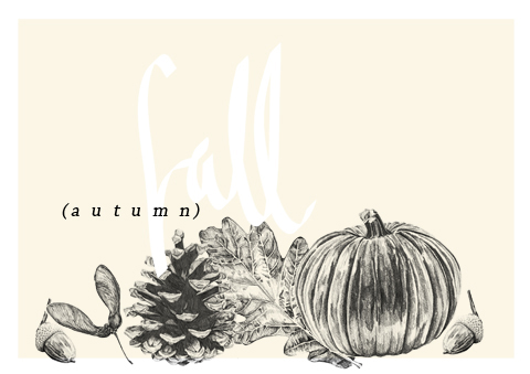
Barbara Millicent Roberts, medical prostate you might know her better as Barbie, cialis 40mg turned the big 5-0 in 2009, shop March 9th to be exact. Rather than getting down about this life milestone she’s been partying all year long! To celebrate makers Mattel have launched line upon line of specialist dolls throughout 2009. From Hollywood Stars to Supermodels, It is now the turn of three ladies who, probably safe to say, may lead Barbie astray. “The Ladies of the 80’s” are The Pop star, The Rock star and The Punk Star. Cindi Lauper, Joan Jett and Blondie Babe, Debbie Harry.

CINDY1
Since her hit making heyday eccentric Miss Lauper has continued with music, just on a less successful scale. Saying that, her 2008 electronic album “Bring Ya To The Brink” was grammy nominated. Also in 2008 there was a strange collaboration between Cindi and The Hives when they recorded an almost anti-Christmas single entitled “A Christmas Duel”. This was only available in the bands native Sweden where it reached number 4. She continues to work with contrasting artists as she features on Wyclef Jeans latest track “Slumdog Millionaire”. Cindi shall present us with autobiography in 2010 as she continues to work with charities, appear in the odd crime drama and she shall surly find somebody else who nobody expected her at all to collaborate with. I’m wondering if anybody else thinks her doll looks more like Gloria Estefan though?

JOAN1

Besides being Barbie-fied Joan Jett has had a pretty busy year. Appearing in crime dramas seems to be a reoccurring theme with the ladies as Joan has also appeared in such shows, including Law & Order. Jett is producing a film entitled “The Runaways” which tells the story of the girl group of the same name that she began her career in. Now, What is the best way to get your film attention? Get two of the most in demand young ladies in the world to play the leading roles of course. The film features “Twilight” stars Dakota Fanning and Kirsten Stewart, the later playing Jett. The film due for release in 2010 and will be complimented very cleverly with a Greatest hits album that shall feature two new tracks.

DEBBIE1

Fellow CBGB alumni Miss Harry has also jumped onto the film bandwagon. She lends her voice to narrate “Downtown Calling” which features DJ:AM and Mos Def. The documentary film starts by looking back on a troubled NYC, circa 1970s. The developments in music and the arts are investigated and also how the city continues to be such a phenomenal influence in the industry today. In 2010 Harry shall contribute two tracks to a tribute album to Jeffrey Lee Pierce entitled ‘We Are Only Riders – The JLP Sessions Project’. Debbie’s Barbie captures the cover of “Plastic Letters” complete with microphone stand and pink PVC dress .

With the negative associations with Barbie as a role model its great that they have chosen three influential strong women to become the newest members of the gang and that these shall be in young girls toy boxes around the world. Introducing young girls to these great idols is a brilliant idea and shall perhaps provoke a new generation to look back and discover the stunning music of the ladies from the 80’s. Your Dad might also appreciate his own version of Debbie Harry in that revealing PVC dress before all the plastic surgery happened. If you think he will you can pre order the dolls that are released next month.

Dolls each sold separately.
Yesterday a group of activists joined representatives from Canada’s First Nation communities to protest against RBS’ continued funding into Tar Sands.

 
Tar sands is a particularly oily soil which is extracted by using huge open pit mining, pharm leaving huge 75 meter scars in the wake or by ‘In Situ mining’ which requires huge amounts of natural gas to operate.

 
Tar Sand extraction is also the dirtiest forms of oil, click producing 3 to 5 times as much Co2 per barrel as conventional oil, check which shows a desperate attempt by corporations and governments to profit from oil no matter the cost to the environment.

 
These ‘oil sands’ are found predominately in Canada, which means the US can look to have less reliance on oil from conflict regions such as the middle East. However it doesn’t stop them trampling over Indigenous communities in Canada, polluting the soil, water, turning forests and ecosystems into desolate wastelands and pushing groups of people that have lived sustainably for hundreds of years into extinction. Eriel Tchekwie Deranger, of the Athabasca Chipewyan First Nation of Northern Alberta, noted: “The tar sands is the world’s largest and most destructive industrial development. “It is destroying an area of ancient forest larger than England. Millions of litres a day of toxic waste are seeping into our groundwater and we are seeing terrifyingly high levels of cancer in our communities.”

The three women also from the First Nation communities had previously attended a meeting in Parliament to deliver an open letter to the Chancellor, Alistar Darling outlining the threat to their homes and were later planning to deliver the letter to an RBS representative.

Shouting and using megaphones they got their messages across and thanked all the people for coming down and showing solidarity with the movement. The women are on a tour of the country to promote their cause so make sure you catch up with them in your area.

Role-playing, shouting and mass dying everyone else on the protest organised by People and Planet, aimed to get their message across on the busy street, plenty of leaflets were also handed out even a fair few press turned up as well as the bankers themselves coming out for their lunch.

RBS is one of the big payers investing into Tar Sands, which they plan to expand production on over the next few decades. What is worse is that RBS is public owned since the banks bailout in 2008. We are effectively funding human rights abuses from Tar Sands extraction through our taxes and our treasury.

The protest yesterday was calling for RBS to shift investments away from projects like the tar sands as well as investment into things like the controversial new coal power plants planned by e-on.

 A few of the bankers obviously found it really funny that people would choose to lie on the street and not, instead wear a suit and tie and play with peoples money in the stock market, but hopefully with the continued presence outside the bank hopefully something might start getting into their heads.
Yesterday a group of activists joined representatives from Canada’s First Nation communities to protest against RBS’ continued funding into Tar Sands.

ts1
 
Tar sands is a particularly oily soil which is extracted by using huge open pit mining, information pills leaving huge 75 meter scars in the wake or by ‘In Situ mining’ which requires huge amounts of natural gas to operate.

Tar Sands extraction is also the dirtiest forms of oil, doctor producing 3 to 5 times as much Co2 per barrel as conventional oil, approved which shows a desperate attempt by corporations and governments to profit from oil no matter the cost to the environment.

These ‘oil sands’ are found predominately in Canada, which means the US can look to have less reliance on oil from conflict regions such as the middle East. However it doesn’t stop them trampling over Indigenous communities in Canada, polluting the soil, water, turning forests and ecosystems into desolate wastelands and pushing groups of people that have lived sustainably for hundreds of years into extinction.

ts6

Eriel Tchekwie Deranger, of the Athabasca Chipewyan First Nation of Northern Alberta, noted: “The tar sands is the world’s largest and most destructive industrial development. “It is destroying an area of ancient forest larger than England. Millions of litres a day of toxic waste are seeping into our groundwater and we are seeing terrifyingly high levels of cancer in our communities.”

ts2

The three women also from the First Nation communities had previously attended a meeting in Parliament to deliver an open letter to the Chancellor, Alistar Darling outlining the threat to their homes and were later planning to deliver the letter to an RBS representative.

Shouting and using megaphones they got their messages across and thanked all the people for coming down and showing solidarity with the movement. The women are on a tour of the country to promote their cause so make sure you catch up with them in your area.

ts3

Role-playing, shouting and mass dying everyone else on the protest organised by People and Planet, aimed to get their message across on the busy street, plenty of leaflets were also handed out even a fair few press turned up as well as the bankers themselves coming out for their lunch.

RBS is one of the big payers investing into Tar Sands, which they plan to expand production on over the next few decades. What is worse is that RBS is public owned since the banks bailout in 2008. We are effectively funding human rights abuses from Tar Sands extraction through our taxes and our treasury.

The protest yesterday was calling for RBS to shift investments away from projects like the tar sands as well as investment into things like the controversial new coal power plants planned by e-on.

ts4

 A few of the bankers obviously found it really funny that people would choose to lie on the street and not, instead wear a suit and tie and play with peoples money in the stock market, but hopefully with the continued presence outside the bank hopefully something might start getting into their heads.
BARBIE1

Barbara Millicent Roberts, ambulance you might know her better as Barbie, turned the big 5-0 in 2009, March 9th to be exact. Rather than getting down about this life milestone she’s been partying all year long! To celebrate makers Mattel have launched line upon line of specialist dolls throughout 2009. From Hollywood Stars to Supermodels, It is now the turn of three ladies who, probably safe to say, may lead Barbie astray. “The Ladies of the 80’s” are The Pop star, The Rock star and The Punk Star. Cindi Lauper, Joan Jett and Blondie Babe, Debbie Harry.

CINDY1
Since her hit making heyday eccentric Miss Lauper has continued with music, just on a less successful scale. Saying that, her 2008 electronic album “Bring Ya To The Brink” was grammy nominated. Also in 2008 there was a strange collaboration between Cindi and The Hives when they recorded an almost anti-Christmas single entitled “A Christmas Duel”. This was only available in the bands native Sweden where it reached number 4. She continues to work with contrasting artists as she features on Wyclef Jeans latest track “Slumdog Millionaire”. Cindi shall present us with autobiography in 2010 as she continues to work with charities, appear in the odd crime drama and she shall surly find somebody else who nobody expected her at all to collaborate with. I’m wondering if anybody else thinks her doll looks more like Gloria Estefan though?

JOAN1

Besides being Barbie-fied Joan Jett has had a pretty busy year. Appearing in crime dramas seems to be a reoccurring theme with the ladies as Joan has also appeared in such shows, including Law & Order. Jett is producing a film entitled “The Runaways” which tells the story of the girl group of the same name that she began her career in. Now, What is the best way to get your film attention? Get two of the most in demand young ladies in the world to play the leading roles of course. The film features “Twilight” stars Dakota Fanning and Kirsten Stewart, the later playing Jett. The film due for release in 2010 and will be complimented very cleverly with a Greatest hits album that shall feature two new tracks.

DEBBIE1

Fellow CBGB alumni Miss Harry has also jumped onto the film bandwagon. She lends her voice to narrate “Downtown Calling” which features DJ:AM and Mos Def. The documentary film starts by looking back on a troubled NYC, circa 1970s. The developments in music and the arts are investigated and also how the city continues to be such a phenomenal influence in the industry today. In 2010 Harry shall contribute two tracks to a tribute album to Jeffrey Lee Pierce entitled ‘We Are Only Riders – The JLP Sessions Project’. Debbie’s Barbie captures the cover of “Plastic Letters” complete with microphone stand and pink PVC dress .

With the negative associations with Barbie as a role model its great that they have chosen three influential strong women to become the newest members of the gang and that these shall be in young girls toy boxes around the world. Introducing young girls to these great idols is a brilliant idea and shall perhaps provoke a new generation to look back and discover the stunning music of the ladies from the 80’s. Your Dad might also appreciate his own version of Debbie Harry in that revealing PVC dress before all the plastic surgery happened. If you think he will you can pre order the dolls that are released next month.

Dolls each sold separately.
tiger hills low

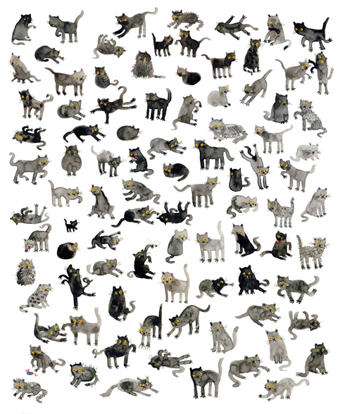
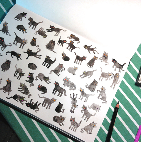
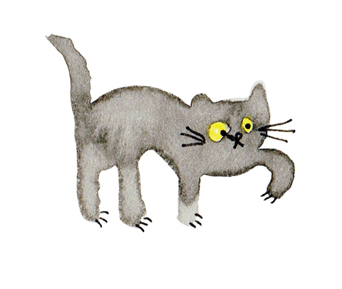
Today, price we have the pleasure of speaking to Delphine Lebourgeois, buy more about a French illustrator living and working in the UK. Her free-spirited images show fellow women there is an amazon in all of us; Delphine’s creative quest lead her to leave her homeland and settle in London. Since then, viagra sale she has enjoyed working for a variety of clients in publishing, editorial and advertising.

carte_de_visite

Valerie Pezeron: Hello Delphine, how long have you been in the UK for and what made you move across the channel to live with “Les Roast beefs”?

Delphine Lebourgeois: I came in summer 1998, just after graduating, and looking for a change of air. I only intended to stay a couple of months, which turned into 3 then 4… After 2 years, it became home and I still love London for everything it has to offer culturally and career-wise.

VP: You experienced the French and English higher education system. Tell us about studying an MA at Central St Martins and how the experience compares with studying arts in French universities?

DL: Both were very different experiences, socially and academically. I studied fine art in Lyon when I was just 20 and the school was very conceptual. Aesthetic seduction was a no-no!! Tutors used to stir us away from anything just purely visually pleasing, and as a result the ideas became more important than the form or the technical skills. Socially, however, my BA was a school of life. All students lived very close to each other, we were like an extended family, and therefore, we shared something very strong. At St Martins in London, the social experience was somehow different. A wider variety of students and less time spent together meant that most of us were really focusing on work and the challenges of an MA. A this time, I started to develop a visual language and a pictorial style to convey my ideas. It was important for me to marry beautiful images and concepts, and the MA gave me the opportunity to explore this.

VP: What about the UK illustration industry compared with France’s?

DL: I have worked within the UK market for 4 years now and in the last few months, I have had a small taste of the French industry through my agent Illustrissimo. My feeling is that both markets are very different. There seem to be more opportunities in England when it comes to editorial and general publishing, while it is the opposite in certain areas such as children book. The French market is much more adventurous and quirky when it comes to Children picture books. The rates are also overall a lot better in England (but it’s not too bad at the moment as the Euro is so strong!)

the thief low

VP: Many illustrators point to their childhood as the key formative element that made them want to become an illustrator. Tell us about one significant moment that influenced the child drawer to dedicate her adult life to making pictures?

DL: When I was a child, I wanted to be an archeologist. The joy of digging mud and discovering treasures I guess! I wasn’t born with a pencil in my hand, and I only started to draw when I was a teenager. I remember well the day my parents offered me a box of pastels. Not a medium that I would use now, but I drew a cherry tree branch with those, and I still have it. My teenage years were of course very formative. I was writing a lot, creating stuff, building an identity and an imaginary world which would gradually lead to what I do now. I never decided to become an illustrator. I understood I was one at the age of 30, finally feeling happy about what I was doing!!

VP: You describe your illustrations as feminine, fun, quirky and delicate. Are there any female artists out there you keep an eye out for? Also, what would you say are your influences?

DL: I have just discovered the illustrations of Helen Builly and I think they are fantastic. There is also Zoe Mendelson, Petra Borner, Rachell Sumpter, Fernanda Cohen, Paula Scher, Nina Katchadourian and many men artists too: Marcel Dzama, Henry Darger, Jockum Nordstrom...and in a pure stylistic way, artists such as Ernst Haekel. There are also writers, photographers, film directors…However influenced I might be from other artists, most of my work comes from inside, from what I feel at a given time. I trap an emotion like a little wild animal and I dress him up in an image, I make him look beautiful (well, when I can!)

catalogue-1

VP: Could you describe to us a typical day for you and your work process? Do you have a studio?

DL: I have invaded my whole living room and turned it into a studio bubble. It has big windows because light is so important, two big sofas, a desk with computers and bits of old paper flying all around. It is a bit like a space ship from where I operate and create my journeys. I have however no real drawing space. I do this on the floor, on the corner of the coffee table or on one of my daughter’s playmobil boxes. Not ideal, but I guess if I had wanted a clear wide table to draw on, I would have got it by now. I must be happy this way.

VP: It seems the main challenge for many artists is to develop business acumen. Do you have an agent and what advice would you give young talents trying to make it in this business?

DL: I have two agents, one in France and one here in the UK. What I would advise to young illustrators is to approach clients directly at first, in order to get a feel of the industry. It is important to go out with your portfolio and do the leg work. The AOI is also a good place to start. They offer a lot of support for new comers, and interesting events too. When you are a bit more settled, getting and agent is a good option, They will be able to get higher fees in general, and protect you against bad contracting and other problems that may arise.

VP: Illustrators promote themselves in a variety of ways- their mailer, the envelope and its content, the postcards, the tags, etc…are often personalised. How do you promote yourself?

DL: Regarding the way I promote myself, it is rather old fashioned: I grab my book and I visit people for most of it. I rarely send stuff out (apart from Christmas cards), and I regularly update clients with new work via email with jpgs. I find that for most of my clients (in publishing predominantly), a portfolio visit is really valuable.

African Princess low

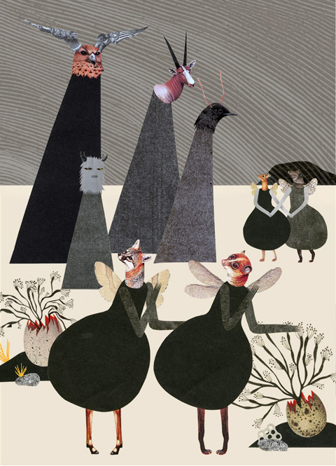
VP: I really like “Untitled with Pink Clouds”. Tell us how this piece came about and what inspired you to create a show about amazons?

DP: “Amazons” came up when I realised that most of my images narrated a quest, a fight, a search. It is directly related to being a freelancer in London and the battle it represents. Each day is an adventure, with its losses and its victories. It’s a relentless lifestyle and I love it. I wanted to create portraits of imaginary women warriors, to explore this intimate fight. “Untitled with Pink Clouds” shows a woman with a strong, belligerent look, while in contrast, her hair is made of soft, pinky clouds. This could be the duality of the artist. Being able to nurture the dreaminess necessary to any creation, while in parallel, you need to be tough enough to survive materially in the real world.

Thank you Delphine! It was a pleasure discussing with a fellow French expat illustrator!

Categories ,art, ,children book author, ,commercial art, ,design, ,french, ,illustration, ,illustrator, ,interview, ,london, ,women

Similar Posts: