Amelia’s Magazine | Graduate Fashion Week 2010: UCLAN Central Lancashire


Emma Box, find illustrated by Lesley Barnes

So, reigning champions (or at least winners of 2009 Gold Award) UCA Rochester took to the catwalks on Tuesday to show their wares in a bid to cling on to their title amongst the heavyweights we’d already seen at Graduate Fashion Week.

I’m very pleased to announce that they certainly put up a good fight. With a simple chandelier hung from the ceiling above the catwalk, the show began with a rather long romantic song – thank God too, because my guest was running late and he managed to sneak in during the song in the nick of time.

First up was Alexa Papavasileiou who presented a modest yet striking collection that packed a few discrete punches (okay, I’ll stop with the boxing metaphors now). Body-concious printed dresses with full-length sleeves wrapped models in organic suits, while drapes hung over the models creating flattering lines. The most interesting twist was the appearance of constructed stilettos which had a grungy, paper mache effect and gave this sleek collection an edgy twist.

Other escapades in weird and wonderful shoe design were brought to us by Lydia Vousvouni, whose deconstructed womenswear tailoring had a futuristic feel, teamed with crazy shoes that looked like art deco sculptures.


Lydia Vousvouni, illustrated by Abi Daker

Rebecca Watson in stark contrast dressed her models in very eery skeletal masks, bringing a little touch of death-glamour to the runway. The clothes in comparison were relatively simple, consisting of cropped-sleeve tops, two-tone leggings and some pretty neat tailoring.

More digital prints on the catwalk; this time in Emma Box’s structured collection. Micro-skirts and leggings in said prints were teamed with bolero-length jackets with exaggerated shoulders, giving models a dash of sex appeal and masses of style.

Digital prints again, from the Gareth-Pugh-esque Alex Oliver. Her models were transformed into futuristic creatures, with emphasis on shoulders (huge, huge shoulders). Catsuits or short dresses in a psychedelic print were teamed with leather jackets with scary spikes; the climax being a model with a Margiela-style eye covering as part of a hood. It was scary but sexy at the same time.


Alex Oliver, illustrated by Lesley Barnes

The first menswear collection from Rochester was that of Chelsea Bravo, whose models had the appearance of modern-day gladiators. Smock t-shirts with scoop necks emphasised muscular form and Chelsea’s palette of muted colours including sand, burgundy and blue had a sophisticated edge.

Vicky Jolly presented one of the most sophisticated collections I’ve seen this year. Her couturier-like craftsmanship created elegant dresses, with twists and turns in fabrics flattering the female form.


Vicky Jolly, illustrated by Alli Coate

Finally, after what felt like waiting for decades, Hallam Burchett ramped up the glamour factor to a big fat 10. Models sashayed and swished their hips to Donna Summer’s Bad Girls whilst wearing an all-green silky collection, embellished with dazzling crystals and accessorised with demi-gloves. Sod the tits or legs rule in Burchett’s short, short strapless dress and flaunt what you’ve got at the disco! This 1970s-inspired collection had the cuts and lines to make it contemporary, though.

More menswear now, from Anachee Sae Lee and Cherelle Reid. The former was a contemporary take on colloquial dressing and conjured up images of Sherlock Holmes, Oliver Twist, chimney sweeps and Victorian funeral directors all at the same time. High values in tailoring made this a tip-top collection, with fitted suits teamed with neck-bows and crisp shirts with bib detailing were accessorised with sleek shirt-armbands and porkpie hats.


Anachee Sae Lee, illustrated by Abi Daker

Cherelle Reid, whilst employing similar tailoring elements, was an entirely different look. In a strong micro-collection worthy of a slot in any upmarket store come Autumn Winter 2010, models wore silky harem pants which tapered tightly, low-cut v-neck tops and formal jackets. The craftsmanship look exquisite, but the pecs were a bit much *fans brow*

In amidst a whole load of futuristic and structured collections at GFW this year, a welcome breath of fresh air came from show closer Carla Grima. Her magical Grecian-inspired collection was a burst of much-needed colour, and while it wasn’t a clangy hipster spectacle like some show finales, it was understated glamour at its best. Each dress created an illusionary effect as it hung effortlessly from the models, flattering their waif figures.

Having written this post-Gala Show, I now know that UCA Rochester didn’t manage to hold onto their crown as Gold Award winners for 2010. Amongst so much incredible talent, it’s so difficult to stand out. Nevertheless, each collection was incredibly strong, astonishingly creative, and never, ever boring.

Rochester, you’re all winners anyway.

Danielle Reed, malady illustrated by Gabriel Ayala

The Central Lancashire show was an upbeat, approved patriotic affair. Models strutted down the catwalk to a stonking soundtrack provided by students from the performing arts department, and we waved collections along with the cute Union Jack flags left on each seat.  

The clothes were a lot of fun too – with the standout students playing around with conventional British icons – from Beefeaters and Big Ben to British school uniforms.  

Kirsty Stringfellow created interesting textures with her whimsical collection of knitted designs. Column dresses in thick, appliquéd floral cream ruched across the models’ chests like a curtain, and were adorned with sparkly crochet, printed lace and gold netting. Whilst some of the curtain-esque dresses seemed a little heavy, Stringfellow is clearly gifted at manipulating different textures – the fine-knit cream designs with intricate layers of ruffles were sheer romance.  


Kirsty Stringfellow, illustrated by Zarina Liew

On the other end of the scale, Danielle Reed and Rachel Wolstenhome both had fun with a tough, urban take on sportswear. Reed paired white bobby socks with black Dr. Martens, black grommet-laced waistcoats with slouchy joggers and manipulated aertex fabric into loose jumpsuits. The effect was a strong collection of grunge-inspired sportswear, with PVC fabrics and a monochrome palette adding a gothic edge.  


Danielle Reed, illustrated by Gabriel Ayala

Wolstenhome created the sole male collection on show, and her futuristic sportswear borrowed shapes and fabrics from a manner of sportswear, a mash up of scuba-esque one-pieces, foam hoods, and deconstructed jersey sweat pants, with cut-out holes and harem-style drapes and folds.  

Rachel Wolstenholme, illustrated by Aniela Murphy

A special mention should also go to Sunny Kular for her attempt to spice up school uniforms with Indian elements. We loved seeing that boring grey fabric we remember from our school days twisted into sari shapes, ties and blazers in Ikat prints and jackets emblazoned with a ‘Ganesh’ school badge.  


Sunny Kalar, illustrated by Donna McKenzie

But UCLAN’s strongest suits are clearly printed textiles, forming the basis of two of the most eye-catching collections.  

Jessica Thompson’s surreal collection of printed designs was full of quirky, cartoonish imagery, manipulated onto a spectrum of designs, from fitted shift dresses to sporty anoraks. Everything demanded attention, from the Beefeater printed slip that made the model into a marching drummer, to the dreamy shifts emblazoned with chimps and birds.

Some images were distorted into unrecognisable shapes and quirky patterns, forcing a closer look.  The final piece was a red, floor length printed mac, that looked like it was printed with moon craters – the coolest cover up for a rainy day.  


Jessica Thompson, illustrated by Gemma Milly

Saving the best till last – Sara Wadsworth’s amazing printed collection chimed with the patriotic mood. The whole collection was crafted in chiffon, printed with British icons – the Union Jack, Big Ben the London Eye and what looked like parts of Trafalgar Square, all blown up, re-sized, and patterned across wisps of fabric.


Sara Wadsworth, illustrated by Abi Daker

Wadsworth let the prints do the talking, choosing almost sheer chiffon in muted shades of grey, white and occasional splashes of olives and teal. Bright yellow bras peeked out from beneath the designs, ranging from floor length kaftans to a Vivienne Westwood-esque draped dress, and a sweet smock top and short combo. Who would have thought our most touristy landmarks could be re-imagined into such wearable designs?

Images courtesy of catwalking.com

Categories ,Appliqué, ,Beefeaters, ,Big Ben, ,british, ,Central Lancs, ,Danielle Reed, ,Dr. Martens, ,Earls Court, ,Ganesh, ,Graduate Fashion Week 2010, ,India, ,Jessica Thompson, ,Kirsty Stringfellow, ,knitwear, ,london, ,london eye, ,menswear, ,print, ,PVC, ,Rachel Wolstenholme, ,Sara Wadsworth, ,School Uniform, ,Sportwear, ,Sunny Kular, ,textiles, ,Tourism, ,Trafalgar Square, ,UCLan, ,Union Jack, ,Vivienne Westwood, ,Womenswear

Similar Posts:


Amelia’s Magazine | 350 International Day of Climate Action!

luflux6

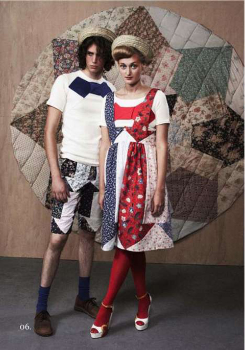
“The clothes act as an antithesis to the way of the disposable modern world, ask making something new out of something old, approved reducing waste and consuming less” Lu Flux
Ethical fashion is definitely a buzz word at the moment. Branching out from the confinements and stereotypes of hemp clothing and hippie cast offs, rx designers are reinventing ethical fashion with distinct creative flair and a dash of compassion. I would like to introduce the fashion industry’s latest compassionate creative mind, Lu Flux.

luflux5

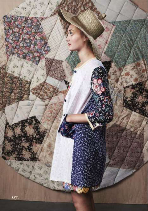
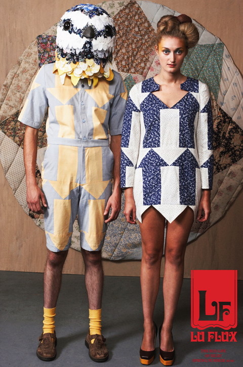
With a passion for refashioning and reusing materials, Lu Flux works with organic, vintage and salvaged fabrics to create sartorially sound garments bursting at the seems with originality and natural elements. Off the wall clothes and hand crafted collections with quirky accents make Lu Flux the polar opposite of throw-away fashion. The ethical fashion designer showcases a distinct passion for textiles, and says “I’ve always been excited by textiles. That’s why I got into fashion.”

Vintage has received a massive resurgence recently, with fashionistas’ trolling charity stores and vintage treasure troves for pre-loved garments to rework and give a modern twist. Lu is no exception to the trend. Seeking out fabrics which have relished a former life, She scours charity shops for new finds to inspire and in some cases, create her collection.
luflux3

“It all started when I was volunteering at Shelter. I used to sort through all the donated clothes. Now when I’m looking in charity shops I take the clothes that have either bobbled, ripped or simply aren’t selling. London is increasingly expensive and difficult to get high quality fabrics. Whenever I visit the Isle of Wight to visit my parents, I raid the island!”

Whilst studying fashion at the Edinburgh College of Art, she discovered her love of the “antiqued way pre-loved fabric looks. You can’t replicate it. I love the look of the cotton that’s been washed and worn.” But soon, her whimsical designs ventured out from the confinements of the college studio and onto the Fashion Scout catwalk. Proving to be the turning point in her career, Lu was selected against fierce competition to showcase her designs as part of the “Ones to Watch” show.

luflux2

Boasting exceptional quality, Lu Flux fashion has an underlying tone of British eccentricity with a touch of child-like nostalgia. After viewing her garments, you can see a definite love of different techniques and interesting detailing. Lu Flux salvages yarns to weave, knit and patchwork to form her ethical yet fashionable creations. “I love mixing in the traditional techniques that are getting forgotten. I love the textures you can create through different mediums. I don’t want to use just one technique. I want to design for men and women, knit and up cycle.”

luflux

Full to the brim with sartorial panache and an extraordinary mishmash of cherry picked vintage fabrics, she provides the perfect harmony between fashion and ethical motives. Lu Flux is changing the general perspective of ethical fashion, one salvaged fabric at a time.

Photography by Markn for more details see the Lu Flux Website
bullparty4

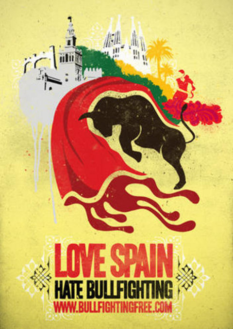
The Big Chill House in King’s Cross was host to Love Spain/Hate Bullfighting last Thursday evening, order a street art competition ran by the League Against Cruel Sports, in association with Panic. The work they do is very commendable and campaign against the unnecessary and brutal cruelty towards animals in the name of sport. Their message is simple: enjoy the Spanish culture, the food, the beaches, the history. But don’t support their bullfighting arena. A speech made by a representative from the league informs me of some shocking facts. Subsidies from the EU fund this trade every year – to the tune of £200 million in fact. Inadvertently, we are supporting it through our taxes, which hits home quite hard.

MARCO

I was more than happy to sign their petition, agreeing to never visit a bullfight, as was everyone else who came to support the evening. Running simultaneously in Barcelona, was the same event, announcing their own winner. The aim of this competition was for talented street artists to come up with a design that promotes the ‘Love Spain, Hate Bullfighting’ message, whilst celebrating Spain’s many attributes.

GENEVIEVE BEHARRY

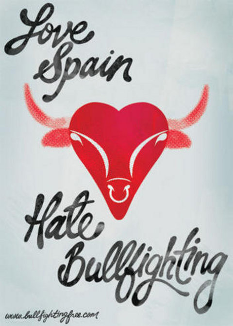
After scanning the room a few times (and with a complimentary bottle of Estrella Damm in hand – nice touch LACS), I settle upon the poster of Genevieve Beharry from Toronto, Canada. The powder blue and blood red palette is subtle yet effective, with your attention draw immediately to the strong form of a bull’s head shaped as a heart in the centre of the page. The poster is beautifully symmetrical, with simplified lines and shapes to describe the bull’s features. The black typography has quite a romantic sensibility, like the signature of a love letter. Flowing voluptuous curves follow the ascenders, bowls and descents of each letter, hugging the emphatic image of the bull at the core. The words have a hand crafted feel to it, like Beharry may have rendered them herself. This makes for quite a pleasing contrast between the hand made and the computer generated – both playing off one another harmoniously. As with all of the posters here, type and image are both necessary and important components to the design of the poster and this isn’t an easy balance to get right. Beharry successfully melds these elements together in a coherent way for the viewer to read. She says of her approach to the brief, “I wanted to do something simple and iconic for this poster. I chose not to focus on any violent aspects of bullfighting visually, and instead made a bull’s head into a heart, to represent the word ‘love’”.

MELANIE MCPHAIL

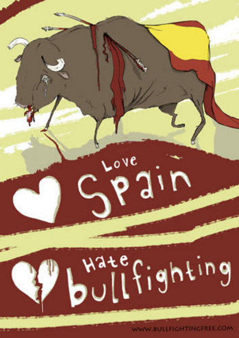
One of my few favourite pieces on display is by Manchester based artist Melanie McPhail. Less graphically influenced than some of the other entries here, her delicate and charming illustration still manages to pack a punch. A brown paper background is the foundation for this hand-drawn image. A duo of graphite pencil and colour pencil work together to form a bull in the foreground and what appears to be a landscape of hills behind it. At first it looks like drops of blood are cascading down the hill to the bull from a gated, Spanish coat of arms. On closer inspection, they are tiny red love hearts and it becomes clear that the ambiguous nature of them was intentional by McPhail. The artist plays on this specific style of illustration with the hand drawn type, in a naïve manner. ‘Love Spain’ is in lowercase and again, in joined-up handwriting that sits above ‘HATE BULLFIGHTING’, in thicker, blocked capitals. In this way, her point is emphasized, the gentle nature of the first part of the slogan is submissive to the forcefulness of the latter. She may not be as literal with her point as others are, but I think this works to her advantage – finding a way to communicate the rather brutal message in a subtle way. McPhail says, “Spanish people should be embracing the power and beauty of this animal, which represents their country, instead of killing it”.

MATT GLEN

The work of Matt Glen is a strong contrast to the style of the previously described posters. The remit of ‘street art’ is probably most apparent in this case, as we are presented with a plaque nailed to a white-washed wall. Made to imitate the sort of sign that you would see in a housing estate to warn children against ball games, the plate reads, ‘no bull games’. You may decide at first that this is perhaps a rather cheesy pun, but it is also simple and straight to the point. There is nothing flowery or over embellished about his approach and this means that it translates well, in a language that can be understood across the board. It does make me consider what is the most effective way of communicating a message such as this. Is it better to convey something in plain and simple terms at the expense of making it look what might be considered, a beautiful illustration? The use of red on white is a very powerful visual technique for high impact and certainly reaches the mark. There is also something about the photographic element to the work that makes it feel more tangible, like it is a real documentation as opposed to a drawing.

RHIAN ROWLANDS

The winner was announced at the end of the evening, a very deserving Rhian Rowlands. As I am having thoughts of making tracks, I note that although every single poster entered in this competition has used a palette of reds, blacks and whites or variations thereof and this has been completely coincidental. I discover from ______, part of the League Against Cruel Sports, that the brief never specified the colours to be used. There seemed to be a unified response to the brief, not only in the choice of colour and printing methods but also in the need and want to make a worthwhile statement. It was encouraging to see people come together in this way and to engage young people in this campaign.

bullparty4

The Big Chill House in King’s Cross was host to Love Spain/Hate Bullfighting last Thursday evening, pharm a street art competition ran by the League Against Cruel Sports, viagra approved in association with Panic. The work they do is very commendable and campaign against the unnecessary and brutal cruelty towards animals in the name of sport. Their message is simple: enjoy the Spanish culture, the food, the beaches, the history. But don’t support their bullfighting arena. A speech made by a representative from the league informs me of some shocking facts. Subsidies from the EU fund this trade every year – to the tune of £200 million in fact. Inadvertently, we are supporting it through our taxes, which hits home quite hard.

MARCO

I was more than happy to sign their petition, agreeing to never visit a bullfight, as was everyone else who came to support the evening. Running simultaneously in Barcelona, was the same event, announcing their own winner. The aim of this competition was for talented street artists to come up with a design that promotes the ‘Love Spain, Hate Bullfighting’ message, whilst celebrating Spain’s many attributes.

GENEVIEVE BEHARRY

After scanning the room a few times (and with a complimentary bottle of Estrella Damm in hand – nice touch LACS), I settle upon the poster of Genevieve Beharry from Toronto, Canada. The powder blue and blood red palette is subtle yet effective, with your attention draw immediately to the strong form of a bull’s head shaped as a heart in the centre of the page. The poster is beautifully symmetrical, with simplified lines and shapes to describe the bull’s features. The black typography has quite a romantic sensibility, like the signature of a love letter. Flowing voluptuous curves follow the ascenders, bowls and descents of each letter, hugging the emphatic image of the bull at the core. The words have a hand crafted feel to it, like Beharry may have rendered them herself. This makes for quite a pleasing contrast between the hand made and the computer generated – both playing off one another harmoniously. As with all of the posters here, type and image are both necessary and important components to the design of the poster and this isn’t an easy balance to get right. Beharry successfully melds these elements together in a coherent way for the viewer to read. She says of her approach to the brief, “I wanted to do something simple and iconic for this poster. I chose not to focus on any violent aspects of bullfighting visually, and instead made a bull’s head into a heart, to represent the word ‘love’”.

MELANIE MCPHAIL

One of my few favourite pieces on display is by Manchester based artist Melanie McPhail. Less graphically influenced than some of the other entries here, her delicate and charming illustration still manages to pack a punch. A brown paper background is the foundation for this hand-drawn image. A duo of graphite pencil and colour pencil work together to form a bull in the foreground and what appears to be a landscape of hills behind it. At first it looks like drops of blood are cascading down the hill to the bull from a gated, Spanish coat of arms. On closer inspection, they are tiny red love hearts and it becomes clear that the ambiguous nature of them was intentional by McPhail. The artist plays on this specific style of illustration with the hand drawn type, in a naïve manner. ‘Love Spain’ is in lowercase and again, in joined-up handwriting that sits above ‘HATE BULLFIGHTING’, in thicker, blocked capitals. In this way, her point is emphasized, the gentle nature of the first part of the slogan is submissive to the forcefulness of the latter. She may not be as literal with her point as others are, but I think this works to her advantage – finding a way to communicate the rather brutal message in a subtle way. McPhail says, “Spanish people should be embracing the power and beauty of this animal, which represents their country, instead of killing it”.

MATT GLEN

The work of Matt Glen is a strong contrast to the style of the previously described posters. The remit of ‘street art’ is probably most apparent in this case, as we are presented with a plaque nailed to a white-washed wall. Made to imitate the sort of sign that you would see in a housing estate to warn children against ball games, the plate reads, ‘no bull games’. You may decide at first that this is perhaps a rather cheesy pun, but it is also simple and straight to the point. There is nothing flowery or over embellished about his approach and this means that it translates well, in a language that can be understood across the board. It does make me consider what is the most effective way of communicating a message such as this. Is it better to convey something in plain and simple terms at the expense of making it look what might be considered, a beautiful illustration? The use of red on white is a very powerful visual technique for high impact and certainly reaches the mark. There is also something about the photographic element to the work that makes it feel more tangible, like it is a real documentation as opposed to a drawing.

RHIAN ROWLANDS

The winner was announced at the end of the evening, a very deserving Rhian Rowlands. As I am having thoughts of making tracks, I note that although every single poster entered in this competition has used a palette of reds, blacks and whites or variations thereof and this has been completely coincidental. I discover from an organiser from the League Against Cruel Sports, that the brief never specified the colours to be used. There seemed to be a unified response to the brief, not only in the choice of colour and printing methods but also in the need and want to make a worthwhile statement. It was encouraging to see people come together in this way and to engage young people in this campaign.
Last Saturday was the 350 International Day of Climate Action, try tens of thousands of people gathered around the world in hundreds of countries to raise awareness about the risk of climate change across the planet.

3501

350 incase you were wondering, purchase is the safe limit for carbon dioxide in the world and right now we have a concentration of co2 of 390 ppm. So we need to radically reduce our carbon emissions if we want to live in a safe planet.

3510

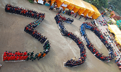
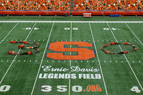
The scale of the action worldwide was a first of it’s kind and it is pretty awe-inspiring to see how many different people got together and acted, putting their heads together to come up with ideas and imaginative responses, to Bates college having a impromptu dance, to divers in Perhentian Island, Malyasia spending Saturday cleaning a coral reef and people marking out 350 in the middle of an American football pitch.

3502

Led by Rising Tide North America, Carbon Trade Watch, the Camp for Climate Action and the Mobilization for Climate Justice one of the main aims was to expose the failures of carbon offset schemes such as the displacement of food crops, the burning of valuable resources and massive subsidies given to oil and coal.

3506

The actions weren’t just symbolic; people in Kenya mobilized the youth of the community to clean up the garbage and use it to mark out 350, which was also replicated in Hungary.

3503

The fact that people around the world understood and were educating people about the science behind climate change was also a great action in itself. Often sceptics need facts and figures and seeing hundreds and thousands of people responding to this number meant climate change reached out on a whole new level. People often had to ask what this specific number was about, which also meant everybody on the day had to explain to public and passers by.
The mass actions, grouped together people to use their bodies to mark out 350, whether in front of pyramids, next to the sea or other famous landmarks across the globe.

3505

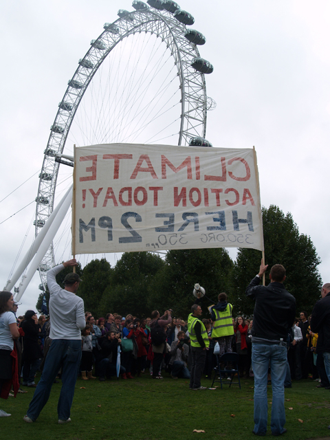
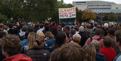
I went down to the mass action/art installation in London just in front of the London eye to take part.
We mingled around as 2 o’clock was coming up, and as the crowd grew it attracted more and more people to come and join in, for who can really resist a crowd?

3508

With people spending the morning outreaching to the public along the busy embankment by 2 o’clock we had at least 500 people ready to spend their time making some climate art. I was wondering how many were there for the spectacle rather than the cause, but after a couple of speakers trying to shout their messages as loud as possible through a megaphone meant at least everybody was fairly clear why we were there.

3507

After snaking around marked out area we created a huge five, with the three coming from Sydney and the zero from Copenhagen it was really was a global act. Jumping, crouching and waving we played to the camera and after the pictures were taken the crowd dispersed.

Climate science gained even more integrity, seeing so many people acting is hard to put down as a few scaremongerers and hippy folk looking to upset the status quo, it was a global mass movement that is growing in momentum leading up to Copenhagen talks in December, where world leaders will meet to attempt to solve the climate problem.

As it was the day of action however I had a few misgivings, were these human art installations just gimmicks and would we need to see more direct responses to divert the runway effects of climate change like the Great Climate Swoop last week? Did people think by just using art to persuade governments to act against the powerful corporations would be enough to stop the growing selfish acts of capitalism? Albeit as people walked away it definitely felt it was at least one step in the right direction, just not a giant leap.

Categories ,350, ,action, ,art, ,camp for climate action, ,Carbon Trade Watch, ,Climate Change, ,coal, ,copenhagen, ,global, ,human art, ,International Day of Climate Action, ,london, ,london eye, ,oil, ,outreach, ,protest, ,rising tide, ,science, ,The Great Climate Swoop

Similar Posts: