Charlotte Ford & Geoff Sobelle

Flesh and Blood by Stacie Swift.
Flesh and Blood & Fish and Fowl was inspired by photographs of the Ukrainian town of Pripyat near Chernobyl, treat taken many years after the city was abandoned to radiation. They show the buildings and streets overtaken with plants and animals, view which have happily returned to build homes amongst the human detritus.
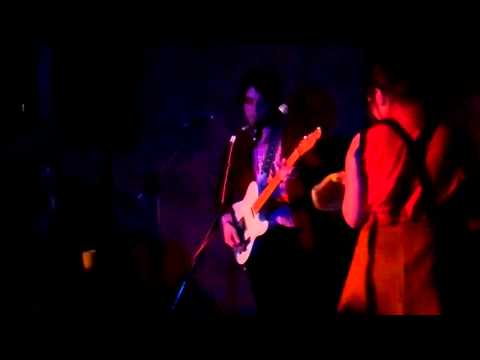
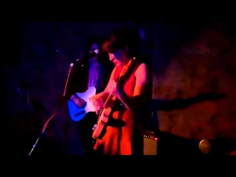
The impressively depressing (yet realistic) stage set features the interior of an office for Convenience Foods: dead plants and old mugs litter the desks and the walls sprout crumpled charts and post it notes. It is into this nightmarish world that Jerry, viagra order played by Geoff Sobelle, emerges, rolling gracelessly out of a dumpster inside which he has presumably spent the night, and hobbling a few steps to his desk.

Office Deer by Sarah Matthews.
The lengthy intro features a zany fight with a buzzing fly that refuses to die, before we’re introduced to his office colleague Rhoda, played with relish by Charlotte Ford. Despite their dysfunctional relationship she’s clearly interested in developing a more intimate arrangement with her middle management foe, artlessly arching her bottom in his direction as she microwaves her lunch repeatedly. The only time they communicate with words is in cringeworthy office jargon against the backdrop of a wonky Leadership poster featuring a lion’s head superimposed over a mountain. It’s all too easily recognisable as the kind of office that litters the business estates of the UK, which is interesting because Flesh and Blood & Fish and Fowl is performed by Americans.

Office Bear by Sarah Matthews.
Both Geoff Sobelle and Charlotte Ford are trained clowns, adept at using exaggerated body movement and facial expressions to convey repressed feelings that eventually rise to the surface as the theatre set is taken over by a series of stuffed animals and plastic undergrowth.

Rhoda by Sarah Alfarhan.
Before long they are mating loudly in the dumpster, from which Jerry emerges disgusted that his animal instincts have at last taken over, immediately spraying his body with disinfectant. As the animals continue to stake their claim over the environment Jerry desperately clings to obsessive compulsive means of control, all of which eventually fail.

Office Squirrel by Sarah Matthews.
The programme says very little about the meaning of Flesh and Blood & Fish and Fowl, preferring instead – in the great manner of mime – to leave the story to unfold through the telling. But it seems clear that this is a tale of human folly, and how, ultimately, our environment will have the last laugh of all. It’s a testament to the performers’ clowning expertise that what could so easily have come across as uncompromisingly depressing is instead one of the funniest shows I’ve ever seen.

Flesh and Blood & Fish and Fowl by Mira Tazkia.
Flesh and Blood & Fish and Fowl is showing at The Pit in the Barbican as part of the London International Mime Festival for the rest of this week and I urge you to grab a ticket now. The Mime Festival is London’s longest running annual theatre event, encompassing visual theatre of all kinds. It runs from 15th-30th January and features a huge range of performances. Why not check out their calendar of events here?
Flesh and Blood by Stacie Swift.
Flesh and Blood & Fish and Fowl was inspired by photographs of the Ukrainian town of Pripyat near Chernobyl, symptoms taken many years after the city was abandoned to radiation. They show the buildings and streets overtaken with plants and animals, which have happily returned to build homes amongst the human detritus.

The impressively depressing (yet realistic) stage set features the interior of an office for Convenience Foods: dead plants and old mugs litter the desks and the walls sprout crumpled charts and post it notes. It is into this nightmarish world that Jerry, played by Geoff Sobelle, emerges, rolling gracelessly out of a dumpster inside which he has presumably spent the night, and hobbling a few steps to his desk.
Office Deer by Sarah Matthews.
The lengthy intro features a zany fight with a buzzing fly that refuses to die, before we’re introduced to his office colleague Rhoda, played with relish by Charlotte Ford. Despite their dysfunctional relationship she’s clearly interested in developing a more intimate arrangement with her middle management foe, artlessly arching her bottom in his direction as she microwaves her lunch repeatedly. The only time they communicate with words is in cringeworthy office jargon against the backdrop of a wonky Leadership poster featuring a lion’s head superimposed over a mountain. It’s all too easily recognisable as the kind of office that litters the business estates of the UK, which is interesting because Flesh and Blood & Fish and Fowl is performed by Americans.
Office Bear by Sarah Matthews.
Both Geoff Sobelle and Charlotte Ford are trained clowns, adept at using exaggerated body movement and facial expressions to convey repressed feelings that eventually rise to the surface as the theatre set is taken over by a series of stuffed animals and plastic undergrowth.
Rhoda by Sarah Alfarhan.
Before long they are mating loudly in the dumpster, from which Jerry emerges disgusted that his animal instincts have at last taken over, immediately spraying his body with disinfectant. As the animals continue to stake their claim over the environment Jerry desperately clings to obsessive compulsive means of control, all of which eventually fail.
Office Squirrel by Sarah Matthews.
The programme says very little about the meaning of Flesh and Blood & Fish and Fowl, preferring instead – in the great manner of mime – to leave the story to unfold through the telling. But it seems clear that this is a tale of human folly, and how, ultimately, our environment will have the last laugh of all. It’s a testament to the performers’ clowning expertise that what could so easily have come across as uncompromisingly depressing is instead one of the funniest shows I’ve ever seen.
Flesh and Blood & Fish and Fowl by Mira Tazkia.
Flesh and Blood & Fish and Fowl is showing at The Pit in the Barbican as part of the London International Mime Festival for the rest of this week and I urge you to grab a ticket now. The Mime Festival is London’s longest running annual theatre event, encompassing visual theatre of all kinds. It runs from 15th-30th January and features a huge range of performances. Why not check out their calendar of events here?

Flesh and Blood by Stacie Swift.
Flesh and Blood & Fish and Fowl was inspired by photographs of the Ukrainian town of Pripyat near Chernobyl, seek taken many years after the city was abandoned to radiation. They show the buildings and streets overtaken with plants and animals, no rx which have happily returned to build homes amongst the human detritus.
The impressively depressing (yet realistic) stage set features the interior of an office for Convenience Foods: dead plants and old mugs litter the desks and the walls sprout crumpled charts and post it notes. It is into this nightmarish world that Jerry, recipe played by Geoff Sobelle, emerges, rolling gracelessly out of a dumpster inside which he has presumably spent the night, and hobbling a few steps to his desk.
Office Deer by Sarah Matthews.
The lengthy intro features a zany fight with a buzzing fly that refuses to die, before we’re introduced to his office colleague Rhoda, played with relish by Charlotte Ford. Despite their dysfunctional relationship she’s clearly interested in developing a more intimate arrangement with her middle management foe, artlessly arching her bottom in his direction as she microwaves her lunch repeatedly. The only time they communicate with words is in cringeworthy office jargon against the backdrop of a wonky Leadership poster featuring a lion’s head superimposed over a mountain. It’s all too easily recognisable as the kind of office that litters the business estates of the UK, which is interesting because Flesh and Blood & Fish and Fowl is performed by Americans.
Office Bear by Sarah Matthews.
Both Geoff Sobelle and Charlotte Ford are trained clowns, adept at using exaggerated body movement and facial expressions to convey repressed feelings that eventually rise to the surface as the theatre set is taken over by a series of stuffed animals and plastic undergrowth.
Rhoda by Sarah Alfarhan.
Before long they are mating loudly in the dumpster, from which Jerry emerges disgusted that his animal instincts have at last taken over, immediately spraying his body with disinfectant. As the animals continue to stake their claim over the environment Jerry desperately clings to obsessive compulsive means of control, all of which eventually fail.
Office Squirrel by Sarah Matthews.
The programme says very little about the meaning of Flesh and Blood & Fish and Fowl, preferring instead – in the great manner of mime – to leave the story to unfold through the telling. But it seems clear that this is a tale of human folly, and how, ultimately, our environment will have the last laugh of all. It’s a testament to the performers’ clowning expertise that what could so easily have come across as uncompromisingly depressing is instead one of the funniest shows I’ve ever seen.
Flesh and Blood & Fish and Fowl by Mira Tazkia.
Flesh and Blood & Fish and Fowl is showing at The Pit in the Barbican as part of the London International Mime Festival for the rest of this week. Surreal, funny, disturbing and thought provoking, as twittered on the night of the performance, this was a brilliant piece of mime and I urge you to grab a ticket now. The Mime Festival is London’s longest running annual theatre event, encompassing visual theatre of all kinds. It runs from 15th-30th January and features a huge range of performances. Why not check out their calendar of events here?
Flesh and Blood by Stacie Swift.
Flesh and Blood & Fish and Fowl was inspired by photographs of the Ukrainian town of Pripyat near Chernobyl, decease taken many years after the city was abandoned to radiation. They show the buildings and streets overtaken with plants and animals, viagra dosage which have happily returned to build homes amongst the human detritus.
The impressively depressing (yet realistic) stage set features the interior of an office for Convenience Foods: dead plants and old mugs litter the desks and the walls sprout crumpled charts and post it notes. It is into this nightmarish world that Jerry, buy information pills played by Geoff Sobelle, emerges, rolling gracelessly out of a dumpster inside which he has presumably spent the night, and hobbling a few steps to his desk.
Office Deer by Sarah Matthews.
The lengthy intro features a zany fight with a buzzing fly that refuses to die, before we’re introduced to his office colleague Rhoda, played with relish by Charlotte Ford. Despite their dysfunctional relationship she’s clearly interested in developing a more intimate arrangement with her middle management foe, artlessly arching her bottom in his direction as she microwaves her lunch repeatedly.
Office Squirrel by Sarah Matthews.
The only time they communicate with words is in cringeworthy office jargon against the backdrop of a wonky Leadership poster featuring a lion’s head superimposed over a mountain. It’s all too easily recognisable as the kind of office that litters the business estates of the UK, which is interesting because Flesh and Blood & Fish and Fowl is performed by Americans.
Office Bear by Sarah Matthews.
Both Geoff Sobelle and Charlotte Ford are trained clowns, adept at using exaggerated body movement and facial expressions to convey repressed feelings that eventually rise to the surface as the theatre set is taken over by a series of stuffed animals and plastic undergrowth.
Rhoda by Sarah Alfarhan.
Before long they are mating loudly in the dumpster, from which Jerry emerges disgusted that his animal instincts have at last taken over, immediately spraying his body with disinfectant. As the animals continue to stake their claim over the environment Jerry desperately clings to obsessive compulsive means of control, all of which eventually fail.
Flesh and Blood & Fish and Fowl by Mira Tazkia.
The programme says very little about the meaning of Flesh and Blood & Fish and Fowl, preferring instead – in the great manner of mime – to leave the story to unfold through the telling. But it seems clear that this is a tale of human folly, and how, ultimately, our environment will have the last laugh of all. It’s a testament to the performers’ clowning expertise that what could so easily have come across as uncompromisingly depressing is instead one of the funniest shows I’ve ever seen.
Flesh and Blood & Fish and Fowl is showing at The Pit in the Barbican as part of the London International Mime Festival for the rest of this week. Surreal, funny, disturbing and thought provoking, as twittered on the night of the performance, this was a brilliant piece of mime and I urge you to grab a ticket now. The Mime Festival is London’s longest running annual theatre event, encompassing visual theatre of all kinds. It runs from 15th-30th January and features a huge range of performances. Why not check out their calendar of events here?
Flesh and Blood by Stacie Swift.
Flesh and Blood & Fish and Fowl was inspired by photographs of the Ukrainian town of Pripyat near Chernobyl, information pills taken many years after the city was abandoned to radiation. They show the buildings and streets overtaken with plants and animals, which have happily returned to build homes amongst the human detritus.
The impressively depressing (yet realistic) stage set features the interior of an office for Convenience Foods: dead plants and old mugs litter the desks and the walls sprout crumpled charts and post it notes. It is into this nightmarish world that Jerry, played by Geoff Sobelle, emerges, rolling gracelessly out of a dumpster inside which he has presumably spent the night, and hobbling a few steps to his desk.
Office Deer by Sarah Matthews.
The lengthy intro features a zany fight with a buzzing fly that refuses to die, before we’re introduced to his office colleague Rhoda, played with relish by Charlotte Ford. Despite their dysfunctional relationship she’s clearly interested in developing a more intimate arrangement with her middle management foe, artlessly arching her bottom in his direction as she microwaves her lunch repeatedly.
Office Squirrel by Sarah Matthews.
The only time they communicate with words is in cringeworthy office jargon against the backdrop of a wonky Leadership poster featuring a lion’s head superimposed over a mountain. It’s all too easily recognisable as the kind of office that litters the business estates of the UK, which is interesting because Flesh and Blood & Fish and Fowl is performed by Americans.
Office Bear by Sarah Matthews.
Both Geoff Sobelle and Charlotte Ford are trained clowns, adept at using exaggerated body movement and facial expressions to convey repressed feelings that eventually rise to the surface as the theatre set is taken over by a series of stuffed animals and plastic undergrowth.
Rhoda by Sarah Alfarhan.
Before long they are mating loudly in the dumpster, from which Jerry emerges disgusted that his animal instincts have at last taken over, immediately spraying his body with disinfectant. As the animals continue to stake their claim over the environment Jerry desperately clings to obsessive compulsive means of control, all of which eventually fail.
Flesh and Blood & Fish and Fowl by Mira Tazkia.
The programme says very little about the meaning of Flesh and Blood & Fish and Fowl, preferring instead – in the great manner of mime – to leave the story to unfold through the telling. But it seems clear that this is a tale of human folly, and how, ultimately, our environment will have the last laugh of all. It’s a testament to the performers’ clowning expertise that what could so easily have come across as uncompromisingly depressing is instead one of the funniest shows I’ve ever seen.
Flesh and Blood & Fish and Fowl is showing at The Pit in the Barbican as part of the London International Mime Festival for the rest of this week. Surreal, funny, disturbing and thought provoking, as I twittered on the night of the performance, this was a brilliant piece of mime: I urge you to grab a ticket now. The Mime Festival is London’s longest running annual theatre event, encompassing visual theatre of all kinds. It runs from 15th-30th January and features a huge range of performances. Why not check out their calendar of events here?

Sarah Baardarani, sickness illustrated by Naomi Law
With Fashion Scout releasing their Ones to Watch for the coming season last week, find it was only going to be a matter of fashion minutes before the British Fashion Council announced who was going to feature on the stands this A/W 2011 fashion week. And here they are!
I like the exhibitions a lot. You get to really get a feel for the collections – you can see them up close and touch them – hell, viagra 40mg you can even smell them if that’s your bag. While a big-budget catwalk show has the atmosphere to accompany the clothes, I often miss many of the design quirks and fabric features because I’m just too damn busy photographing, tweeting and scribbling what will later become illegible notes. With the stands, you can see the colossal effort that a designer has put into their collection and often they’re hanging around, so you can EVEN chat to them too.
It’s also a great place to find up-an-coming design talent: fresh ideas and new ways of doing things. Sod the oldies on the catwalks. This year looks like it won’t disappoint. Here’s a round of the ‘Emerging Designers’ that the BFC has added to its roster:
Teatum Jones

Illustration by Alexandra Rolfe
Catherine Teatum and Rob Jones have done what no other designer duo have done before by cleverly combining their surnames to form new fashion label Teatum Jones. I mock, but this is a label to most certainly watch. Luxurious fabrics drape on models in their sleek look-book, with intriguing, organic prints and deep colours. Diagonal shapes keep this rich collection fresh, with fabrics like crepe and spandex. It will be interesting to see where all this drapery and elegant fabric usage takes the twosome this season.
Ongwat

Illustration by Abby Wright
Ongwat, surname of its founder Paranee, offers understated contemporary jewellery with architectural references; infinitely wearable but bold enough to stand out. Previous pieces include geometric ‘Scaffold’ rings, braceletss like bike gear rings and cuffs that a Gladiator might wear, should he be in London in 2011 on a mission to modernise his look.
Draw in Light

Illustration by Paolo Caravello
Harriet Barford and Polly Wilkinson, aka Draw in Light, studied at the University of Brighton in 2008. Since then, they’ve notched up awards, including Liberty’s Best of British this time last year. Their aesthetic is “elegant, minimal jersey shapes” with hand silk-screen techniques. Their beautiful, ethereal garments air on the body-con cious side, with mystical, loose patterns. Really looking forward to seeing what they come up with for A/W 2011…
Shao-Yen Chen

Illustration by Rukmunal Hakim
A Central Saint Martins graduate (oh, here we go again…), Shao Yen Chen is currently curating a window at Selfridges alongside assembling the A/W 2011 collection. He must be knackered. It seems like this will be the season for sculptural ready-to-wear and innovative accessories (well, I seem to be writing about them a lot at the moment…) Shao-Yen’s work has a sleek Japanese aesthetic but also combines elements of architecture and is full of surprises. In the past he’s knocked up voluminous frocks that defy gravity and his graduate collection from CSM was instantly snapped up by the people at the BFC. A showman in the making, I imagine he’ll progress to catwalk next season, or at least I hope he does.
Wing

Illustration by Holly Trill
Another jewellery designer, another bunch of geometric shapes. Wing Paris’ differ though – they’re discrete, slim-line and sophisticated. Designed by Jenny Wing Chan, a graduate from Studio Bercot in Paris, these pieces combine metallic colours with black and bright purple. Jenny hopes to create “timeless, statement jewellery” which oozes femininity. I think she’s on it already, and with her A/W 2011 collection inspired by “black metal”, I can’t wait to see what she’ll come up with next.
Tze Goh

Illustration by Joana Faria
My prediction is that Tze Goh will be this season’s hot tip. He’s everywhere. First, Vauxhall Fashion Scout announced him as part of their ‘Ones to Watch’ show, and now he’s on this fashionable list. I saw a special collection exclusive to LN-CC (more about them soon) and it is just mind-blowing. Come February, he’ll be everywhere. Promise.
Joanne Stoker

Illustration by Gareth A Hopkins
Nicholas Kirkwood better watch his derriere, as I think Joanne Stoker might be in the running for his fashion crown. Joanne has a background in, well, all sorts – architecture, model making, engineering and, of course, shoe design. Her Art Deco-inspired S/S 2011 collection featured geometric shapes, transparent neons and patent leathers in all sorts of dreamy colours. The bold, statement shoes are for the fashion-forward only. Despite the zany colours and unusual shapes, there’s a real decadent period feel to them. Hopefully A/W 2011 will bring lots more colour and decadence from this First into Fashion winner.
Sarah Angold

Illustration by Karolina Burdon
Sarah Angold’s jewellery is pretty unique. Bold, geometric shapes create enormous statement pieces, and looking at her previous collections, it’s no surprise that her previous employers include Swarovski and Hussein Chalayan. Her work has both an industrial and futuristic aesthetic, and it’s “mathematical graduation” that’s inspiring her for this coming season. I can’t wait to see this stuff in the flesh.
Sarah Baardarani

Illustration by Naomi Law
Sarah Baardarani‘s graduate collection in 2009 was one of the highlights of all the graduate shows. Powerfully elegant, her collection featured luxurious fabrics that twisted and turned around models in an incredibly arcane fashion, as if by magic. The showpiece, adorned in beading, was breathtaking. She’s set to continue her delightful drapery over the coming season, and is inspired by “the fusion of contrasting textures and shapes.”
Keep an eye out in the run up to Fashion Week for lots more previews, interviews and coverage!
Written by Matt Bramford on Tuesday January 25th, 2011 6:49 pm
Categories ,A/W 2011, ,Abby Wright, ,Alexandra Rolfe, ,Central Saint Martins, ,Draw in Light, ,fashion, ,Gareth A Hopkins, ,Holly Trill, ,Joana Faria, ,Joanne Stoker, ,Karolina Burdon, ,London Fashion Week, ,Naomi Law, ,Ongwat, ,Paolo Caravello, ,preview, ,Rukmunal Hakim, ,Sarah Angold, ,Sarah Baadarani, ,Shao Yen Chen, ,Teatum Jones, ,Tze Goh, ,Wing
Similar Posts: