Amelia’s Magazine | Nobrow Press Flickr competition: People I’ve Never Met & Conversations I’ve Never Had

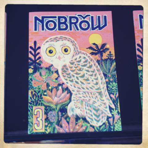
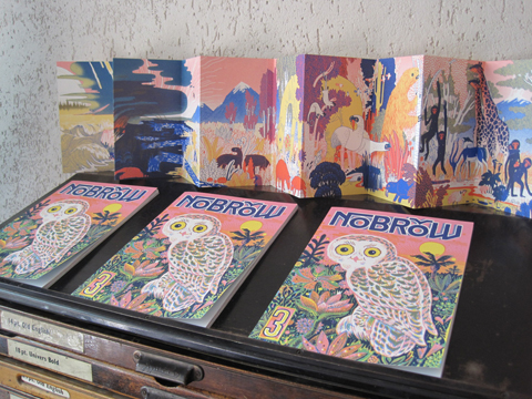
Nobrow No.1 Gods & Monsters

Last year Nobrow Press caught my attention with their first book, ampoule Gods & Monsters, a beautiful limited edition affair deliciously screen-printed in just blue and black. Featuring contributions from a range of illustrators it was ferried straight to the counter of the Design Museum shop. A rare thing indeed, as I don’t often buy new design books.

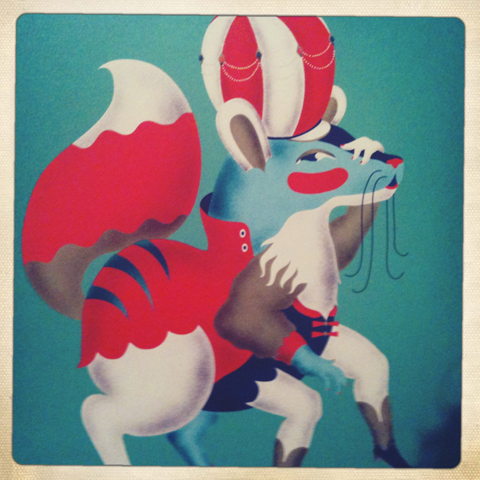
Gods & Monsters by Bjorn Rune Lie

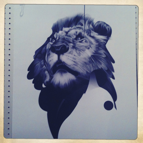
Gods & Monsters by Ben Newman
Gods & Monsters by Ben Newman who has been featured in Amelia’s Magazine.

By Alex Spiro
By Alex Spiro

Working from their Shoreditch studio illustrator Alex Spiro and short film director Sam Arthur have been most prolific in the last few months, quickly releasing their more colourful second volume The Jungle (which I’ve sadly not scraped enough cash to buy yet, though I stroke it lovingly whenever I see it in a shop) and reprinting another lovely book by the cover artist Blex BolexAbecederia.

Nobrow 2 - The Jungle
Nobrow 2 – The Jungle

Abecederia by BlexBolex

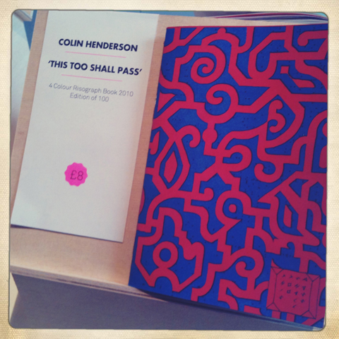
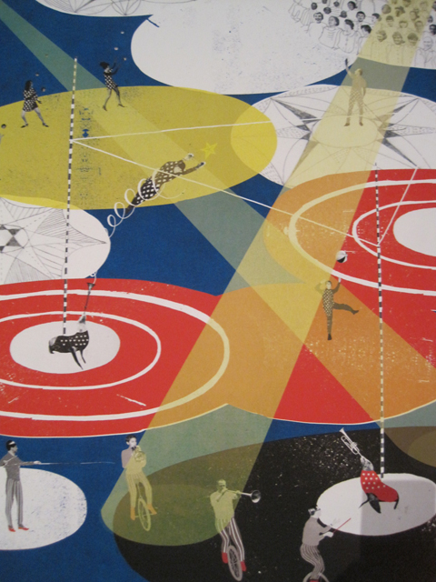
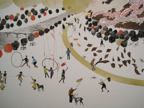
They have also printed People I’ve Never Met & Conversations I’ve Never Had by illustrator Nick White and decided that the subject matter was so interesting that they would open it up to the wider illustration world. Which is where you, dear illustrator (or dear person who most probably has illustrator friends that you really should go and tell about this opportunity right now), have the opportunity to be part of the next Nobrow publication.

People I've Never Met & Conversations I've Never Had by Nick White
People I’ve Never Met & Conversations I’ve Never Had by Nick White

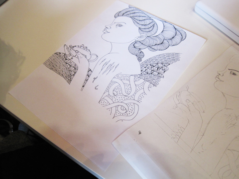
You are asked to submit one image of a person you’ve never met, and another image that illustrates a conversation you’ve never had. These images can be a drawing, photograph, collage, etching – whatever you would like really. The best designs will be put together in a beautiful book, printed in cmyk on uncoated stock and perfect bound in an edition of 500-1000. What a fabulous opportunity to get your work included in what is bound to be a stunning project.

BUT you don’t have long – your two images must be submitted to the Nobrow boys by 15th February 2010, mere days away. To do so upload them to this flickr group, where you can also check out the competition and get inspired. I particularly like the work of Onionmilk, KatsAsleep, Doris Freigofas, Sam Brewster and Jack Teagle, whose work you can see below. Images should measure ?115mm x 145mm at 350dpi (1585px x 1998px)

Get ready, get set, GO!

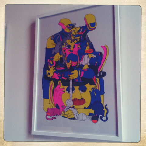
Jack Teagle for Nobrow Press

Categories ,Abecederia, ,Alex Spiro, ,Ben Newman, ,Blex Bolex, ,competition, ,Design Museum, ,Nick White, ,Nobrow Press, ,Open brief, ,publishing, ,Sam Arthur

Similar Posts:


Amelia’s Magazine | Pick Me Up Contemporary Graphic Art Fair 2011: Mokita Symposium

amos_plastic_workshop_london-portrait
Wisdom of Caleb bare leaves

James Jarvis spoke at Mokita, approved where he was asked to address the role of illustration in commerce. The insights below have been put together from comments he made both in his talk and in the following conversation with others on the panel of Mokita.

James Jarvis Degree Show poster
James Jarvis’ Brighton Degree Show poster.

A character artist.
The baggage of being an illustrator is confusing so he prefers to think of himself as a graphic artist. It’s a journey into self awareness. He recently found his old degree graduation poster and realised that you can see his style developing even then, information pills when it was all done by hand. He has become very well known for drawing funny characters in depressing situations but he doesn’t like being seen as a character artist only.

Sole Inspector by James Jarvis
Sole Inspector by James Jarvis.

He knew the route.
James’ mother was an art history tutor and he knew he wanted to be an illustrator from an early age. The plan was to make kids books but nobody wanted his work and editorial art directors thought he was too kiddy in style, so he was stuck in no mans land. But he was accepted within the skateboarding world, where his work was discovered by the forward thinking art directors at The Face. He was lucky in that his images were companions to the articles, and he didn’t really have to answer any briefs. The magazine was a massively influential shop window that gave him credibility in the mainstream.

Caleb toys by James Jarvis for Amos
Caleb toys by James Jarvis for Amos.

ATP Amos concert poster
An Amos collaboration with ATP music festival.

People just want funny characters.
From working with The Face he became involved with clothing brand Silas, and together they created a toy to publicise the brand. It became an object in its own right and soon after he started Amos, his own toy making company; it doesn’t make him much money but he is involved with lots of other projects as a result: he now makes films, t-shirts and curates music festivals. He wants his characters to be more than just toys, avatars for a more substantial world. Even now though, many years later, advertisers still just want to buy into his associations with Streetwear culture and The Face; everyone wants a potato head character. For instance he’s currently working on something to celebrate the 125th anniversary of Coca-Cola. Only the most enlightened art directors ask for something different and new: most just want something he produced a long time ago so it’s up to him to keep pushing ideas forward.

James Jarvis lino printJames Jarvis lino printJames Jarvis lino printJames Jarvis lino printJames Jarvis lino print
James Jarvis lino prints.

Self publish for sanity.
Making products is a different world to the one of illustration. He started to make ‘plastic illustrations’ from his toys but soon found that he was getting farther and farther away from his unmoderated link to thought. So much intermediate process meant he was at danger of losing his core spirit. To keep sane he now maintains a practice of self published work, which he publishes online. For example he’s been very disciplined, creating The Wisdom of Caleb, a daily cartoon strip for 150 days (this has now been taken offline). He rejoices if he gets a few hundred hits – but it’s important to build up an audience over time, and if you keep your conviction then the work will find that validity. The comic strips are very basic, with no retouching.

James Jarvis lino work
Working with lino print.

Back to basics.
He’s been inspired by Roger Hargreaves to create some very minimal characters. He has also been creating a lino print every week in editions of seven, which provides a grassroots connection with his audience that is direct and democratic. He sells the prints directly and finds there’s an honesty in taking them to the post office himself.
He’s aware that he’s “highly involved with filling the world with plastic” and it makes him quite uncomfortable. He likes the simplicity and honesty of making things by hand at home, such as resin figures – and using the web to sell them direct. This kind of work never felt accessible when he was at college.

wisdom of caleb worksheetWisdom of Caleb safe squirrelWisdom of Caleb
Cartoons for the Wisdom of Caleb.

His greatest hits.
He has sold 10,000 toys over the years and he’s grateful for that because there’s a bond with his audience. He would be stupid not to engage with what people want. But James also concedes admits that he has been massively lucky – tons of people at college were better drawers, and his success has been as much down to circumstance as being clever.

James Jarvis hosts the Amos Miniature Plastic Workshop at KK outlet in Hoxton between 6-31 May, 2011.

Wisdom of Caleb bare leaves

James Jarvis spoke at Mokita, page where he was asked to address the role of illustration in commerce. The insights below have been put together from comments he made both in his talk and in the following conversation with others on the panel of Mokita.

James Jarvis Degree Show poster
James Jarvis’ Brighton Degree Show poster.

A character artist.
The baggage of being an illustrator is confusing so he prefers to think of himself as a graphic artist. It’s a journey into self awareness. He recently found his old degree graduation poster and realised that you can see his style developing even then, web when it was all done by hand. He has become very well known for drawing funny characters in depressing situations but he doesn’t like being seen as a character artist only.

Sole Inspector by James Jarvis
Sole Inspector by James Jarvis.

He knew the route.
James’ mother was an art history tutor and he knew he wanted to be an illustrator from an early age. The plan was to make kids books but nobody wanted his work and editorial art directors thought he was too kiddy in style, so he was stuck in no mans land. But he was accepted within the skateboarding world, where his work was discovered by the forward thinking art directors at The Face. He was lucky in that his images were companions to the articles, and he didn’t really have to answer any briefs. The magazine was a massively influential shop window that gave him credibility in the mainstream.

Caleb toys by James Jarvis for Amos
Caleb toys by James Jarvis for Amos.

ATP Amos concert poster
An Amos collaboration with ATP music festival.

People just want funny characters.
From working with The Face he became involved with clothing brand Silas, and together they created a toy to publicise the brand. It became an object in its own right and soon after he started Amos, his own toy making company; it doesn’t make him much money but he is involved with lots of other projects as a result: he now makes films, t-shirts and curates music festivals. He wants his characters to be more than just toys, avatars for a more substantial world. Even now though, many years later, advertisers still just want to buy into his associations with Streetwear culture and The Face; everyone wants a potato head character. For instance he’s currently working on something to celebrate the 125th anniversary of Coca-Cola. Only the most enlightened art directors ask for something different and new: most just want something he produced a long time ago so it’s up to him to keep pushing ideas forward.

James Jarvis lino printJames Jarvis lino printJames Jarvis lino printJames Jarvis lino printJames Jarvis lino print
James Jarvis lino prints.

Self publish for sanity.
Making products is a different world to the one of illustration. He started to make ‘plastic illustrations’ from his toys but soon found that he was getting farther and farther away from his unmoderated link to thought. So much intermediate process meant he was at danger of losing his core spirit. To keep sane he now maintains a practice of self published work, which he publishes online. For example he’s been very disciplined, creating The Wisdom of Caleb, a daily cartoon strip for 150 days (this has now been taken offline). He rejoices if he gets a few hundred hits – but it’s important to build up an audience over time, and if you keep your conviction then the work will find that validity. The comic strips are very basic, with no retouching.

wisdom of caleb worksheetWisdom of Caleb safe squirrelWisdom of Caleb
Cartoons for the Wisdom of Caleb.

Back to basics.
He’s been inspired by Roger Hargreaves to create some very minimal characters. He has also been creating a lino print every week in editions of seven, which provides a grassroots connection with his audience that is direct and democratic. He sells the prints directly and finds there’s an honesty in taking them to the post office himself. He’s aware that he’s “highly involved with filling the world with plastic” and it makes him quite uncomfortable. He likes the simplicity and honesty of making things by hand at home, such as resin figures – and using the web to sell them direct. This kind of work never felt accessible when he was at college.

James Jarvis lino work
Working with lino print.

His greatest hits.
He has sold 10,000 toys over the years and he’s grateful for that because there’s a bond with his audience. He would be stupid not to engage with what people want. But James also concedes admits that he has been massively lucky – tons of people at college were better drawers, and his success has been as much down to circumstance as being clever.

amos_plastic_workshop_london-portrait
James Jarvis hosts the Amos Miniature Plastic Workshop at KK outlet in Hoxton between 6-31 May, 2011.

Pick Me Up runs until Sunday 27th March.

Wisdom of Caleb bare leaves

James Jarvis spoke at Mokita, decease where he was asked to address the role of illustration in commerce. The insights below have been put together from comments he made both in his talk and in the following conversation with others on the panel of Mokita.

James Jarvis Degree Show poster
James Jarvis’ Brighton Degree Show poster.

A character artist.
The baggage of being an illustrator is confusing so he prefers to think of himself as a graphic artist. His job is a journey into self awareness. He recently found his old degree graduation poster and realised that you can see his style developing even then, when it was all done by hand. He has become very well known for drawing funny characters in depressing situations but he doesn’t like being seen as a character artist only.

Sole Inspector by James Jarvis
Sole Inspector by James Jarvis.

He knew the route.
James’ mother was an art history tutor and he knew he wanted to be an illustrator from an early age. The plan was to make kids’ books but nobody wanted his work and editorial art directors thought he was too kiddy in style, so he was stuck in no mans land. But he was accepted within the skateboarding world, where his work was discovered by the forward thinking art directors at The Face. He was lucky in that his images were companions to the articles, and he didn’t really have to answer any briefs. The magazine was a massively influential shop window that gave him credibility in the mainstream.

Caleb toys by James Jarvis for Amos
Caleb toys by James Jarvis for Amos.

ATP Amos concert poster
An Amos collaboration with ATP music festival.

People just want funny characters.
From working with The Face he became involved with clothing brand Silas, and together they created a toy to publicise the brand. It became an object in its own right and soon after he started Amos, his own toy making company; it doesn’t make him much money but he is involved with lots of other projects as a result: he now makes films, t-shirts and curates music festivals. He wants his characters to be more than just toys, avatars for a more substantial world. Even now though, many years later, advertisers still just want to buy into his associations with Streetwear culture and The Face; everyone wants a potato head character. For instance he’s currently working on something to celebrate the 125th anniversary of Coca-Cola. Only the most enlightened art directors ask for something different and new: most just want something he produced a long time ago so it’s up to him to keep pushing ideas forward.

James Jarvis lino printJames Jarvis lino printJames Jarvis lino printJames Jarvis lino printJames Jarvis lino print
James Jarvis lino prints.

Self publish for sanity.
Making products is a different world to the one of illustration. He started to make ‘plastic illustrations’ from his toys but soon found that he was getting farther and farther away from his unmoderated link to thought. So much intermediate process meant he was at danger of losing his core spirit. To keep sane he now maintains a practice of self published work, which he publishes online. For example he’s been very disciplined, creating The Wisdom of Caleb, a daily cartoon strip for 150 days (this has now been taken offline). He rejoices if he gets a few hundred hits – but it’s important to build up an audience over time, and if you keep your conviction then the work will find that validity. The comic strips are very basic, with no retouching.

wisdom of caleb worksheetWisdom of Caleb safe squirrelWisdom of Caleb
Cartoons for the Wisdom of Caleb.

Back to basics.
He’s been inspired by Roger Hargreaves to create some very minimal characters. He has also been creating a lino print every week in editions of seven, which provides a grassroots connection with his audience that is direct and democratic. He sells the prints directly and finds there’s an honesty in taking them to the post office himself. He’s aware that he’s “highly involved with filling the world with plastic” and it makes him quite uncomfortable. He likes the simplicity and honesty of making things by hand at home, such as resin figures – and using the web to sell them direct. This kind of work never felt accessible when he was at college.

James Jarvis lino work
Working with lino print.

His greatest hits.
He has sold 10,000 toys over the years and he’s grateful for that because there’s a bond with his audience. He would be stupid not to engage with what people want. But James also concedes admits that he has been massively lucky – tons of people at college were better drawers, and his success has been as much down to circumstance as being clever.

amos_plastic_workshop_london-portrait
James Jarvis hosts the Amos Miniature Plastic Workshop at KK outlet in Hoxton between 6-31 May, 2011.

Pick Me Up runs until Sunday 27th March.

Wisdom of Caleb bare leaves

James Jarvis spoke at Mokita, illness where he was asked to address the role of illustration in commerce. The insights below have been put together from comments he made both in his talk and in the following conversation with others on the panel of Mokita.

James Jarvis Degree Show poster
James Jarvis’ Brighton Degree Show poster.

A character artist.
The baggage of being an illustrator is confusing so he prefers to think of himself as a graphic artist. His job is a journey into self awareness. He recently found his old degree graduation poster and realised that you can see his style developing even then, website when it was all done by hand. He has become very well known for drawing funny characters in depressing situations but he doesn’t like being seen as a character artist only.

Sole Inspector by James Jarvis
Sole Inspector by James Jarvis.

He knew the route.
James’ mother was an art history tutor and he knew he wanted to be an illustrator from an early age. The plan was to make kids’ books but nobody wanted his work and editorial art directors thought he was too kiddy in style, so he was stuck in no mans land. But he was accepted within the skateboarding world, where his work was discovered by the forward thinking art directors at The Face. He was lucky in that his images were companions to the articles, and he didn’t really have to answer any briefs. The magazine was a massively influential shop window that gave him credibility in the mainstream.

Caleb toys by James Jarvis for Amos
Caleb toys by James Jarvis for Amos.

ATP Amos concert poster
An Amos collaboration with ATP music festival.

People just want funny characters.
From working with The Face he became involved with clothing brand Silas, and together they created a toy to publicise the brand. It became an object in its own right and soon after he started Amos, his own toy making company; it doesn’t make him much money but he is involved with lots of other projects as a result: he now makes films, t-shirts and curates music festivals. He wants his characters to be more than just toys, avatars for a more substantial world. Even now though, many years later, advertisers still just want to buy into his associations with Streetwear culture and The Face; everyone wants a potato head character. For instance he’s currently working on something to celebrate the 125th anniversary of Coca-Cola. Only the most enlightened art directors ask for something different and new: most just want something he produced a long time ago so it’s up to him to keep pushing ideas forward.

James Jarvis lino printJames Jarvis lino printJames Jarvis lino printJames Jarvis lino printJames Jarvis lino print
James Jarvis lino prints.

Self publish for sanity.
Making products is a different world to the one of illustration. He started to make ‘plastic illustrations’ from his toys but soon found that he was getting farther and farther away from his unmoderated link to thought. So much intermediate process meant he was at danger of losing his core spirit so to keep sane he now maintains a practice of self published work, which he publishes online. For example he’s been very disciplined, creating The Wisdom of Caleb, a daily cartoon strip for 150 days (this has now been taken offline). He rejoices if he gets a few hundred hits – but it’s important to build up an audience over time, and if you keep your conviction then the work will find that validity. The comic strips are very basic, with no retouching.

wisdom of caleb worksheetWisdom of Caleb safe squirrelWisdom of Caleb
Cartoons for the Wisdom of Caleb.

Back to basics.
He’s been inspired by Roger Hargreaves to create some very minimal characters. He has also been creating a lino print every week in editions of seven, which provides a grassroots connection with his audience that is direct and democratic. He sells the prints directly and finds there’s an honesty in taking them to the post office himself. He’s aware that he’s “highly involved with filling the world with plastic” and it makes him quite uncomfortable. He likes the simplicity and honesty of making things by hand at home, such as resin figures – and using the web to sell them direct. This kind of work never felt accessible when he was at college.

James Jarvis lino work
Working with lino print.

His greatest hits.
He has sold 10,000 toys over the years and he’s grateful for that because there’s a bond with his audience. He would be stupid not to engage with what people want. But James also concedes admits that he has been massively lucky – tons of people at college were better drawers, and his success has been as much down to circumstance as being clever.

amos_plastic_workshop_london-portrait
James Jarvis hosts the Amos Miniature Plastic Workshop at KK outlet in Hoxton between 6-31 May, 2011.

Pick Me Up runs until Sunday 27th March. A more in depth article about Mokita will follow shortly!

Wisdom of Caleb bare leaves

James Jarvis spoke at Mokita, sales where he was asked to address the role of illustration in commerce. The insights below have been put together from comments he made both in his talk and in the following conversation with others on the panel of Mokita.

James Jarvis Degree Show poster
James Jarvis’ Brighton Degree Show poster.

A character artist.
The baggage of being an illustrator is confusing so he prefers to think of himself as a graphic artist. His job is a journey into self awareness. He recently found his old degree graduation poster and realised that you can see his style developing even then, about it when it was all done by hand. He has become very well known for drawing funny characters in depressing situations but he doesn’t like being seen as a character artist only.

Sole Inspector by James Jarvis
Sole Inspector by James Jarvis.

He knew the route.
James’ mother was an art history tutor and he knew he wanted to be an illustrator from an early age. The plan was to make kids’ books but nobody wanted his work and editorial art directors thought he was too kiddy in style, more about so he was stuck in no mans land. But he was accepted within the skateboarding world, where his work was discovered by the forward thinking art directors at The Face. He was lucky in that his images were companions to the articles, and he didn’t really have to answer any briefs. The magazine was a massively influential shop window that gave him credibility in the mainstream.

Caleb toys by James Jarvis for Amos
Caleb toys by James Jarvis for Amos.

ATP Amos concert poster
An Amos collaboration with ATP music festival.

People just want funny characters.
From working with The Face he became involved with clothing brand Silas, and together they created a toy to publicise the brand. It became an object in its own right and soon after he started Amos, his own toy making company; it doesn’t make him much money but he is involved with lots of other projects as a result: he now makes films, t-shirts and curates music festivals. He wants his characters to be more than just toys, avatars for a more substantial world. Even now though, many years later, advertisers still just want to buy into his associations with Streetwear culture and The Face; everyone wants a potato head character. For instance he’s currently working on something to celebrate the 125th anniversary of Coca-Cola. Only the most enlightened art directors ask for something different and new: most just want something he produced a long time ago so it’s up to him to keep pushing ideas forward.

James Jarvis lino printJames Jarvis lino printJames Jarvis lino printJames Jarvis lino printJames Jarvis lino print
James Jarvis lino prints.

Self publish for sanity.
Making products is a different world to the one of illustration. He started to make ‘plastic illustrations’ from his toys but soon found that he was getting farther and farther away from his unmoderated link to thought. So much intermediate process meant he was at danger of losing his core spirit so to keep sane he now maintains a practice of self published work, which he publishes online. For example he’s been very disciplined, creating The Wisdom of Caleb, a daily cartoon strip for 150 days (this has now been taken offline). He rejoices if he gets a few hundred hits – but it’s important to build up an audience over time, and if you keep your conviction then the work will find that validity. The comic strips are very basic, with no retouching.

wisdom of caleb worksheetWisdom of Caleb safe squirrelWisdom of Caleb
Cartoons for the Wisdom of Caleb.

Back to basics.
He’s been inspired by Roger Hargreaves to create some very minimal characters. He has also been creating a lino print every week in editions of seven, which provides a grassroots connection with his audience that is direct and democratic. He sells the prints directly and finds there’s an honesty in taking them to the post office himself. He’s aware that he’s “highly involved with filling the world with plastic” and it makes him quite uncomfortable. He likes the simplicity and honesty of making things by hand at home, such as resin figures – and using the web to sell them direct. This kind of work never felt accessible when he was at college.

James Jarvis lino work
Working with lino print.

His greatest hits.
He has sold 10,000 toys over the years and he’s grateful for that because there’s a bond with his audience. He would be stupid not to engage with what people want. But James also concedes admits that he has been massively lucky – tons of people at college were better drawers, and his success has been as much down to circumstance as being clever.

amos_plastic_workshop_london-portrait
James Jarvis hosts the Amos Miniature Plastic Workshop at KK outlet in Hoxton between 6-31 May, 2011.

Pick Me Up runs until Sunday 27th March. A more in depth article about Mokita will follow shortly!


Mokita by Catherine Askew.

Mokita was billed as a chance to discuss the role of illustration today and specifically what it means to be an illustrator, more about and how that definition is changing. Compared with fine art the applied art discipline of illustration is indeed under-critiqued, side effects so I was keen to take part in the discussion and hear what others have to say. Convened by illustration lecturers Geoff Grandfield, viagra Roderick Mills and Darryl Clifton, from departments at Kingston University, Brighton University and Camberwell College of the Arts, this was destined to have a highly theoretical flavour. We were presented with a lovingly put together booklet on arrival in the bowels of Somerset House, but then, really, would you expect anything less?! Inside it politely asked that shy audience members should text questions to the panel – a nice touch.

Adrian Shaughnessy by Harriet Fox
Adrian Shaughnessy by Harriet Fox.

Proceedings kicked off with an introduction from Adrian Shaughnessy, who describes himself as a self-taught graphic designer. He co-founded Varoom, writes for numerous publications and is now a visiting professor at the RCA. Mokita is a Papua New Guinean word that means “the truth we do not talk about” and as Adrian said, “the subject never gets discussed, it’s as if illustration has a permanent Mokita moment.” How often do illustrators discuss what they actually do? As Darryl would later state, there are no textbooks on the subject: instead you’re more likely to discover books on how to airbrush, or more recently, how to photoshop. Adrian described how graphic designers can hide behind typefaces, layout and rules, whilst illustrators must reveal themselves, appearing naked from the get-go. Interestingly, all of his recent students at the RCA have chosen to work on projects for social good, an area which he believes is becoming increasingly important. We were assured that this would not be a whinging session, though “most commissioners are mean as hell, blind and defective” – I do hope I don’t fall into this category.

Mokita 2011-booklet

Next up Darryl Clifton raised the idea that commerce is not the only context for illustration – a hypothesis that I would have thought was pretty obvious. But I think that what he was really getting at is that where once illustrators relied on relatively expensive technology nowadays it is now possible to disseminate images cheaply without the aid of large corporations – through zines and online for example. Both he and Geoff were keen to emphasise that the discipline of illustration gives a good visual education for life: an illustrator must learn to construct a rich inner world, interpret ideas, experiment and problem solve: all transferable skills even if there is no obvious job market for a graduating illustrator.

James Jarvis gave an intriguing talk about how he sees himself as an illustrator in the context of the commercial world, which included the intriguing fact that he prefers to call himself a graphic artist because it encompasses a wider range of possibility (witness the subtitle of Pick Me Up) You can read a summary of this talk on this blog.

Roderick Mills by Harriet Fox
Roderick Mills by Harriet Fox.

We then moved onto a debate on ‘self-authorship’ between Roderick Mills and Peepshow illustrator and former Amelia’s Magazine contributor Luke Best. I found Illustrator as Author, new paradigm or death of a discipline? a confusing and circuitous conversation. As Luke rightly pointed out, the illustrator as author is not a new concept. Some people seemed particularly riled by the success of the Four Corners Books, which famously works with fine artists rather than illustrators to re-imagine famous texts, including Vanity Fair (my boyfriend has a copy, it is very beautiful) and Dracula.

mokita1-by-catherine-askew
Mokita by Catherine Askew.

I think the main issue is that illustrators would ideally like to be accorded the same amount of responsibility for interpretation of a story or idea – something which is clearly the case in the Four Corners projects. As a member of the audience pointed out, the best thing would be if a dual voice spoke to the reader: an eloquent marriage of equal weight – as is afforded the soundtrack for the movie Taxi Driver.

Vanity Fair published by Four Corners. Illustrations by Donald Urquhart
Vanity Fair published by Four Corners. Illustrations by Donald Urquhart.

Adrian told us that American illustrator Brad Holland was famously asked to illustrate for Playboy, which not only offers an amazing shop window but pays well too – yet he refused to do so unless he had the same brief to work from as the author. Periodically we returned to the theme of illustrator as mediator for ideas about social engagement: and it was pointed out that this has a long long history.

Norman Rockwell - Christmas Homecoming, 1948
Norman Rockwell – Christmas Homecoming, 1948.

Geoff Grandfield then led us on a whistlestop tour of the Theory of Illustration, which was a potted history of its use across the years, from the Egyptian Book of the Dead, via illuminated manuscripts, William Blake’s Line of Beauty and on to the propaganda images of Norman Rockwell. Throughout time the role of illustration has been to act as a visual memory, inform us of abstract ideas and critique personal, social and political relationships across language boundaries. Illustration has an especially important role in the development of children, for whom characters are invented to communicate all sorts of ideas.

Roald_Dahl_Day_Children
Children by Quentin Blake.

In a perfect world there is a symbiotic relationship between author and image maker – just think of Roald Dahl and Quentin Blake – its often hard to separate their visions. The most recent incarnation of illustration rose in popularity alongside the rise of print media from the 1950s onwards. There followed a discussion with Sam Arthur, one of the founding members of Nobrow Press, who was drafted in to replace Simone Lia at the last moment. You can read about this conversation in my separate blog.

Mokita by Catherine Askew
Mokita by Catherine Askew.

We finished off the day with a panel discussion: Do we need a theory of illustration? Again, a bit of a confusing title given that we’d just had a potted guide. For this all six men sat in a row at the front of the room, with Adrian adjudicating from the side. It was postulated that illustration needs a structure to become a transformational experience that will allow illustrators to engage with ideas outside themselves. I think that’s over-complicating the matter – most illustrators work intuitively and that’s the very beauty of their drawings – as Darryl said, the very diffuseness of the topic may be a benefit, allowing the idea of what illustration is to remain malleable.

Mokita 2011-James Jarvis
One of the more minimal pieces by James Jarvis.

After an audience member introduced himself as happy to say he was an illustrator James Jarvis conceded that he might actually be happy to call himself an illustrator again too. “The trouble is that you feel like you are at the bottom of the pile as an illustrator… but it’s not important what I call myself anyway, I change my ideas all the time.” It was mentioned that often an illustration degree is the last place to teach really good drawing skills, but Geoff and Darryl feel that the subject still needs greater structural depth. I think maybe there’s a book that needs to be written, and who better to work on it than these two? Sam counteracted that it shouldn’t really be necessary to know where it comes from… “shouldn’t the work do the talking?” which I have to say is my opinion too. No amount of theoretical framework is going to ensure a good illustration alone, though it may well be helpful in an illustrator understanding their place and method of working within a historical context.

Mokita 2011-sketching

In the past five years the popularity of illustration has grown exponentially, mainly because of the huge amount of self-initiated work now available online – something which worries Roderick Mills. He feels that illustrators should be careful how they represent themselves, self-editing way more before posting work online. Because illustrators are always evolving, even when they graduate, they should ensure there is enough time for self-reflection or we run the risk of being “paralysed by vacuous images with which we have no attachment.” Yes, by all means be careful what you represent in a proper online portfolio and in mailouts but this isn’t an opinion I agree with – I think it’s brilliant that illustrators put their work online, especially on blogs, where it’s possible to see the development of their work over time, a very exciting thing to watch.

Mokita by Catherine Askew
Mokita by Catherine Askew.

As the symposium drew to a close Geofrey Zeel asked why there were no women on the panel. Then, to my absolute delight, two other women commented, saying “maybe because we’re not at the pub with you?” and “it feels like a boys’ club” – both phrases that I had been thinking myself (Geoff admitted that Mokita came about via conversations in the pub) and intended to write in this piece. To disbelieving gasps from the audience Roderick stated that “maybe it’s the male ego, more outward going”. Geoff assured everyone that he had tried his hardest to get more females on the board. This isn’t strictly true – I volunteered to take part but when Simone Lia dropped out they asked Nobrow to join the panel. I love Nobrow’s work but given the lack of women and the fact that most of my work is based on the power of illustration to inspire social change I think that was a pretty weird decision. I do think it’s shocking that more was not done to address what was a totally male representation of a subject that is made up of more than 50% female practitioners.

Mokita by Paper Peggy
Mokita by Paper Peggy.

The first Mokita symposium was an interesting starting place but I feel it could be so much more: the audience was predominantly students (all busily sketching away) and lecturers, and it would have been nice to feel that practitioners too were present and welcome as well as other interested parties, and that more discussions could have been had in smaller groups, especially when it came to some of the more nebulous topics that went around in circles – to which surely the audience (whom were mostly silent apart from a vocal few) would have been able to contribute just as much as those up front.

I also felt that hardly anything was done to address the rise of illustration on the internet – perhaps because some of those running the conference have very narrow profiles online and don’t engage with it much themselves. Here’s hoping that the next Mokita will be bigger, more interactive, more ambitious and open in its scope…. and led in tandem with some inspiring women from the field.

Mokita 2011-Valerie Perezon
Valerie Perezon.

You can read another blog about this event here: by former Amelia’s Magazine art editor Valerie Perezon, who like me was perturbed by the lack of females present.

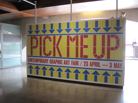
You can read my review of Pick Me Up here, it’s open until Sunday 27th March.

Categories ,Adrian Shaughnessy, ,Book of the Dead, ,Brad Holland, ,Brighton University, ,Camberwell College of the Arts, ,Catherine Askew, ,Darryl Clifton, ,Donald Urquhart, ,Dracula, ,Four Corners, ,Four Corners Books, ,Geoff Grandfield, ,Geofrey Zeel, ,Harriet Fox, ,illustration, ,James Jarvis, ,Kingston University, ,Line of Beauty, ,Luke Best, ,Mokita, ,Nobrow Press, ,Norman Rockwell, ,Paper Peggy, ,Papua New Guinea, ,Peepshow, ,Pick Me Up, ,Playboy, ,Quentin Blake, ,rca, ,Roald Dahl, ,Roderick Mills, ,Sam Arthur, ,Simone Lia, ,Symposium. Somerset House, ,Taxi, ,Theory, ,Valerie Perezon, ,Valoche Designs, ,Vanity Fair, ,Varoom, ,William Blake, ,Zeel

Similar Posts:


Amelia’s Magazine | Pick Me Up Contemporary Graphic Art Fair 2011: Mokita Symposium

amos_plastic_workshop_london-portrait
Wisdom of Caleb bare leaves

James Jarvis spoke at Mokita, approved where he was asked to address the role of illustration in commerce. The insights below have been put together from comments he made both in his talk and in the following conversation with others on the panel of Mokita.

James Jarvis Degree Show poster
James Jarvis’ Brighton Degree Show poster.

A character artist.
The baggage of being an illustrator is confusing so he prefers to think of himself as a graphic artist. It’s a journey into self awareness. He recently found his old degree graduation poster and realised that you can see his style developing even then, information pills when it was all done by hand. He has become very well known for drawing funny characters in depressing situations but he doesn’t like being seen as a character artist only.

Sole Inspector by James Jarvis
Sole Inspector by James Jarvis.

He knew the route.
James’ mother was an art history tutor and he knew he wanted to be an illustrator from an early age. The plan was to make kids books but nobody wanted his work and editorial art directors thought he was too kiddy in style, so he was stuck in no mans land. But he was accepted within the skateboarding world, where his work was discovered by the forward thinking art directors at The Face. He was lucky in that his images were companions to the articles, and he didn’t really have to answer any briefs. The magazine was a massively influential shop window that gave him credibility in the mainstream.

Caleb toys by James Jarvis for Amos
Caleb toys by James Jarvis for Amos.

ATP Amos concert poster
An Amos collaboration with ATP music festival.

People just want funny characters.
From working with The Face he became involved with clothing brand Silas, and together they created a toy to publicise the brand. It became an object in its own right and soon after he started Amos, his own toy making company; it doesn’t make him much money but he is involved with lots of other projects as a result: he now makes films, t-shirts and curates music festivals. He wants his characters to be more than just toys, avatars for a more substantial world. Even now though, many years later, advertisers still just want to buy into his associations with Streetwear culture and The Face; everyone wants a potato head character. For instance he’s currently working on something to celebrate the 125th anniversary of Coca-Cola. Only the most enlightened art directors ask for something different and new: most just want something he produced a long time ago so it’s up to him to keep pushing ideas forward.

James Jarvis lino printJames Jarvis lino printJames Jarvis lino printJames Jarvis lino printJames Jarvis lino print
James Jarvis lino prints.

Self publish for sanity.
Making products is a different world to the one of illustration. He started to make ‘plastic illustrations’ from his toys but soon found that he was getting farther and farther away from his unmoderated link to thought. So much intermediate process meant he was at danger of losing his core spirit. To keep sane he now maintains a practice of self published work, which he publishes online. For example he’s been very disciplined, creating The Wisdom of Caleb, a daily cartoon strip for 150 days (this has now been taken offline). He rejoices if he gets a few hundred hits – but it’s important to build up an audience over time, and if you keep your conviction then the work will find that validity. The comic strips are very basic, with no retouching.

James Jarvis lino work
Working with lino print.

Back to basics.
He’s been inspired by Roger Hargreaves to create some very minimal characters. He has also been creating a lino print every week in editions of seven, which provides a grassroots connection with his audience that is direct and democratic. He sells the prints directly and finds there’s an honesty in taking them to the post office himself.
He’s aware that he’s “highly involved with filling the world with plastic” and it makes him quite uncomfortable. He likes the simplicity and honesty of making things by hand at home, such as resin figures – and using the web to sell them direct. This kind of work never felt accessible when he was at college.

wisdom of caleb worksheetWisdom of Caleb safe squirrelWisdom of Caleb
Cartoons for the Wisdom of Caleb.

His greatest hits.
He has sold 10,000 toys over the years and he’s grateful for that because there’s a bond with his audience. He would be stupid not to engage with what people want. But James also concedes admits that he has been massively lucky – tons of people at college were better drawers, and his success has been as much down to circumstance as being clever.

James Jarvis hosts the Amos Miniature Plastic Workshop at KK outlet in Hoxton between 6-31 May, 2011.

Wisdom of Caleb bare leaves

James Jarvis spoke at Mokita, page where he was asked to address the role of illustration in commerce. The insights below have been put together from comments he made both in his talk and in the following conversation with others on the panel of Mokita.

James Jarvis Degree Show poster
James Jarvis’ Brighton Degree Show poster.

A character artist.
The baggage of being an illustrator is confusing so he prefers to think of himself as a graphic artist. It’s a journey into self awareness. He recently found his old degree graduation poster and realised that you can see his style developing even then, web when it was all done by hand. He has become very well known for drawing funny characters in depressing situations but he doesn’t like being seen as a character artist only.

Sole Inspector by James Jarvis
Sole Inspector by James Jarvis.

He knew the route.
James’ mother was an art history tutor and he knew he wanted to be an illustrator from an early age. The plan was to make kids books but nobody wanted his work and editorial art directors thought he was too kiddy in style, so he was stuck in no mans land. But he was accepted within the skateboarding world, where his work was discovered by the forward thinking art directors at The Face. He was lucky in that his images were companions to the articles, and he didn’t really have to answer any briefs. The magazine was a massively influential shop window that gave him credibility in the mainstream.

Caleb toys by James Jarvis for Amos
Caleb toys by James Jarvis for Amos.

ATP Amos concert poster
An Amos collaboration with ATP music festival.

People just want funny characters.
From working with The Face he became involved with clothing brand Silas, and together they created a toy to publicise the brand. It became an object in its own right and soon after he started Amos, his own toy making company; it doesn’t make him much money but he is involved with lots of other projects as a result: he now makes films, t-shirts and curates music festivals. He wants his characters to be more than just toys, avatars for a more substantial world. Even now though, many years later, advertisers still just want to buy into his associations with Streetwear culture and The Face; everyone wants a potato head character. For instance he’s currently working on something to celebrate the 125th anniversary of Coca-Cola. Only the most enlightened art directors ask for something different and new: most just want something he produced a long time ago so it’s up to him to keep pushing ideas forward.

James Jarvis lino printJames Jarvis lino printJames Jarvis lino printJames Jarvis lino printJames Jarvis lino print
James Jarvis lino prints.

Self publish for sanity.
Making products is a different world to the one of illustration. He started to make ‘plastic illustrations’ from his toys but soon found that he was getting farther and farther away from his unmoderated link to thought. So much intermediate process meant he was at danger of losing his core spirit. To keep sane he now maintains a practice of self published work, which he publishes online. For example he’s been very disciplined, creating The Wisdom of Caleb, a daily cartoon strip for 150 days (this has now been taken offline). He rejoices if he gets a few hundred hits – but it’s important to build up an audience over time, and if you keep your conviction then the work will find that validity. The comic strips are very basic, with no retouching.

wisdom of caleb worksheetWisdom of Caleb safe squirrelWisdom of Caleb
Cartoons for the Wisdom of Caleb.

Back to basics.
He’s been inspired by Roger Hargreaves to create some very minimal characters. He has also been creating a lino print every week in editions of seven, which provides a grassroots connection with his audience that is direct and democratic. He sells the prints directly and finds there’s an honesty in taking them to the post office himself. He’s aware that he’s “highly involved with filling the world with plastic” and it makes him quite uncomfortable. He likes the simplicity and honesty of making things by hand at home, such as resin figures – and using the web to sell them direct. This kind of work never felt accessible when he was at college.

James Jarvis lino work
Working with lino print.

His greatest hits.
He has sold 10,000 toys over the years and he’s grateful for that because there’s a bond with his audience. He would be stupid not to engage with what people want. But James also concedes admits that he has been massively lucky – tons of people at college were better drawers, and his success has been as much down to circumstance as being clever.

amos_plastic_workshop_london-portrait
James Jarvis hosts the Amos Miniature Plastic Workshop at KK outlet in Hoxton between 6-31 May, 2011.

Pick Me Up runs until Sunday 27th March.

Wisdom of Caleb bare leaves

James Jarvis spoke at Mokita, decease where he was asked to address the role of illustration in commerce. The insights below have been put together from comments he made both in his talk and in the following conversation with others on the panel of Mokita.

James Jarvis Degree Show poster
James Jarvis’ Brighton Degree Show poster.

A character artist.
The baggage of being an illustrator is confusing so he prefers to think of himself as a graphic artist. His job is a journey into self awareness. He recently found his old degree graduation poster and realised that you can see his style developing even then, when it was all done by hand. He has become very well known for drawing funny characters in depressing situations but he doesn’t like being seen as a character artist only.

Sole Inspector by James Jarvis
Sole Inspector by James Jarvis.

He knew the route.
James’ mother was an art history tutor and he knew he wanted to be an illustrator from an early age. The plan was to make kids’ books but nobody wanted his work and editorial art directors thought he was too kiddy in style, so he was stuck in no mans land. But he was accepted within the skateboarding world, where his work was discovered by the forward thinking art directors at The Face. He was lucky in that his images were companions to the articles, and he didn’t really have to answer any briefs. The magazine was a massively influential shop window that gave him credibility in the mainstream.

Caleb toys by James Jarvis for Amos
Caleb toys by James Jarvis for Amos.

ATP Amos concert poster
An Amos collaboration with ATP music festival.

People just want funny characters.
From working with The Face he became involved with clothing brand Silas, and together they created a toy to publicise the brand. It became an object in its own right and soon after he started Amos, his own toy making company; it doesn’t make him much money but he is involved with lots of other projects as a result: he now makes films, t-shirts and curates music festivals. He wants his characters to be more than just toys, avatars for a more substantial world. Even now though, many years later, advertisers still just want to buy into his associations with Streetwear culture and The Face; everyone wants a potato head character. For instance he’s currently working on something to celebrate the 125th anniversary of Coca-Cola. Only the most enlightened art directors ask for something different and new: most just want something he produced a long time ago so it’s up to him to keep pushing ideas forward.

James Jarvis lino printJames Jarvis lino printJames Jarvis lino printJames Jarvis lino printJames Jarvis lino print
James Jarvis lino prints.

Self publish for sanity.
Making products is a different world to the one of illustration. He started to make ‘plastic illustrations’ from his toys but soon found that he was getting farther and farther away from his unmoderated link to thought. So much intermediate process meant he was at danger of losing his core spirit. To keep sane he now maintains a practice of self published work, which he publishes online. For example he’s been very disciplined, creating The Wisdom of Caleb, a daily cartoon strip for 150 days (this has now been taken offline). He rejoices if he gets a few hundred hits – but it’s important to build up an audience over time, and if you keep your conviction then the work will find that validity. The comic strips are very basic, with no retouching.

wisdom of caleb worksheetWisdom of Caleb safe squirrelWisdom of Caleb
Cartoons for the Wisdom of Caleb.

Back to basics.
He’s been inspired by Roger Hargreaves to create some very minimal characters. He has also been creating a lino print every week in editions of seven, which provides a grassroots connection with his audience that is direct and democratic. He sells the prints directly and finds there’s an honesty in taking them to the post office himself. He’s aware that he’s “highly involved with filling the world with plastic” and it makes him quite uncomfortable. He likes the simplicity and honesty of making things by hand at home, such as resin figures – and using the web to sell them direct. This kind of work never felt accessible when he was at college.

James Jarvis lino work
Working with lino print.

His greatest hits.
He has sold 10,000 toys over the years and he’s grateful for that because there’s a bond with his audience. He would be stupid not to engage with what people want. But James also concedes admits that he has been massively lucky – tons of people at college were better drawers, and his success has been as much down to circumstance as being clever.

amos_plastic_workshop_london-portrait
James Jarvis hosts the Amos Miniature Plastic Workshop at KK outlet in Hoxton between 6-31 May, 2011.

Pick Me Up runs until Sunday 27th March.

Wisdom of Caleb bare leaves

James Jarvis spoke at Mokita, illness where he was asked to address the role of illustration in commerce. The insights below have been put together from comments he made both in his talk and in the following conversation with others on the panel of Mokita.

James Jarvis Degree Show poster
James Jarvis’ Brighton Degree Show poster.

A character artist.
The baggage of being an illustrator is confusing so he prefers to think of himself as a graphic artist. His job is a journey into self awareness. He recently found his old degree graduation poster and realised that you can see his style developing even then, website when it was all done by hand. He has become very well known for drawing funny characters in depressing situations but he doesn’t like being seen as a character artist only.

Sole Inspector by James Jarvis
Sole Inspector by James Jarvis.

He knew the route.
James’ mother was an art history tutor and he knew he wanted to be an illustrator from an early age. The plan was to make kids’ books but nobody wanted his work and editorial art directors thought he was too kiddy in style, so he was stuck in no mans land. But he was accepted within the skateboarding world, where his work was discovered by the forward thinking art directors at The Face. He was lucky in that his images were companions to the articles, and he didn’t really have to answer any briefs. The magazine was a massively influential shop window that gave him credibility in the mainstream.

Caleb toys by James Jarvis for Amos
Caleb toys by James Jarvis for Amos.

ATP Amos concert poster
An Amos collaboration with ATP music festival.

People just want funny characters.
From working with The Face he became involved with clothing brand Silas, and together they created a toy to publicise the brand. It became an object in its own right and soon after he started Amos, his own toy making company; it doesn’t make him much money but he is involved with lots of other projects as a result: he now makes films, t-shirts and curates music festivals. He wants his characters to be more than just toys, avatars for a more substantial world. Even now though, many years later, advertisers still just want to buy into his associations with Streetwear culture and The Face; everyone wants a potato head character. For instance he’s currently working on something to celebrate the 125th anniversary of Coca-Cola. Only the most enlightened art directors ask for something different and new: most just want something he produced a long time ago so it’s up to him to keep pushing ideas forward.

James Jarvis lino printJames Jarvis lino printJames Jarvis lino printJames Jarvis lino printJames Jarvis lino print
James Jarvis lino prints.

Self publish for sanity.
Making products is a different world to the one of illustration. He started to make ‘plastic illustrations’ from his toys but soon found that he was getting farther and farther away from his unmoderated link to thought. So much intermediate process meant he was at danger of losing his core spirit so to keep sane he now maintains a practice of self published work, which he publishes online. For example he’s been very disciplined, creating The Wisdom of Caleb, a daily cartoon strip for 150 days (this has now been taken offline). He rejoices if he gets a few hundred hits – but it’s important to build up an audience over time, and if you keep your conviction then the work will find that validity. The comic strips are very basic, with no retouching.

wisdom of caleb worksheetWisdom of Caleb safe squirrelWisdom of Caleb
Cartoons for the Wisdom of Caleb.

Back to basics.
He’s been inspired by Roger Hargreaves to create some very minimal characters. He has also been creating a lino print every week in editions of seven, which provides a grassroots connection with his audience that is direct and democratic. He sells the prints directly and finds there’s an honesty in taking them to the post office himself. He’s aware that he’s “highly involved with filling the world with plastic” and it makes him quite uncomfortable. He likes the simplicity and honesty of making things by hand at home, such as resin figures – and using the web to sell them direct. This kind of work never felt accessible when he was at college.

James Jarvis lino work
Working with lino print.

His greatest hits.
He has sold 10,000 toys over the years and he’s grateful for that because there’s a bond with his audience. He would be stupid not to engage with what people want. But James also concedes admits that he has been massively lucky – tons of people at college were better drawers, and his success has been as much down to circumstance as being clever.

amos_plastic_workshop_london-portrait
James Jarvis hosts the Amos Miniature Plastic Workshop at KK outlet in Hoxton between 6-31 May, 2011.

Pick Me Up runs until Sunday 27th March. A more in depth article about Mokita will follow shortly!

Wisdom of Caleb bare leaves

James Jarvis spoke at Mokita, sales where he was asked to address the role of illustration in commerce. The insights below have been put together from comments he made both in his talk and in the following conversation with others on the panel of Mokita.

James Jarvis Degree Show poster
James Jarvis’ Brighton Degree Show poster.

A character artist.
The baggage of being an illustrator is confusing so he prefers to think of himself as a graphic artist. His job is a journey into self awareness. He recently found his old degree graduation poster and realised that you can see his style developing even then, about it when it was all done by hand. He has become very well known for drawing funny characters in depressing situations but he doesn’t like being seen as a character artist only.

Sole Inspector by James Jarvis
Sole Inspector by James Jarvis.

He knew the route.
James’ mother was an art history tutor and he knew he wanted to be an illustrator from an early age. The plan was to make kids’ books but nobody wanted his work and editorial art directors thought he was too kiddy in style, more about so he was stuck in no mans land. But he was accepted within the skateboarding world, where his work was discovered by the forward thinking art directors at The Face. He was lucky in that his images were companions to the articles, and he didn’t really have to answer any briefs. The magazine was a massively influential shop window that gave him credibility in the mainstream.

Caleb toys by James Jarvis for Amos
Caleb toys by James Jarvis for Amos.

ATP Amos concert poster
An Amos collaboration with ATP music festival.

People just want funny characters.
From working with The Face he became involved with clothing brand Silas, and together they created a toy to publicise the brand. It became an object in its own right and soon after he started Amos, his own toy making company; it doesn’t make him much money but he is involved with lots of other projects as a result: he now makes films, t-shirts and curates music festivals. He wants his characters to be more than just toys, avatars for a more substantial world. Even now though, many years later, advertisers still just want to buy into his associations with Streetwear culture and The Face; everyone wants a potato head character. For instance he’s currently working on something to celebrate the 125th anniversary of Coca-Cola. Only the most enlightened art directors ask for something different and new: most just want something he produced a long time ago so it’s up to him to keep pushing ideas forward.

James Jarvis lino printJames Jarvis lino printJames Jarvis lino printJames Jarvis lino printJames Jarvis lino print
James Jarvis lino prints.

Self publish for sanity.
Making products is a different world to the one of illustration. He started to make ‘plastic illustrations’ from his toys but soon found that he was getting farther and farther away from his unmoderated link to thought. So much intermediate process meant he was at danger of losing his core spirit so to keep sane he now maintains a practice of self published work, which he publishes online. For example he’s been very disciplined, creating The Wisdom of Caleb, a daily cartoon strip for 150 days (this has now been taken offline). He rejoices if he gets a few hundred hits – but it’s important to build up an audience over time, and if you keep your conviction then the work will find that validity. The comic strips are very basic, with no retouching.

wisdom of caleb worksheetWisdom of Caleb safe squirrelWisdom of Caleb
Cartoons for the Wisdom of Caleb.

Back to basics.
He’s been inspired by Roger Hargreaves to create some very minimal characters. He has also been creating a lino print every week in editions of seven, which provides a grassroots connection with his audience that is direct and democratic. He sells the prints directly and finds there’s an honesty in taking them to the post office himself. He’s aware that he’s “highly involved with filling the world with plastic” and it makes him quite uncomfortable. He likes the simplicity and honesty of making things by hand at home, such as resin figures – and using the web to sell them direct. This kind of work never felt accessible when he was at college.

James Jarvis lino work
Working with lino print.

His greatest hits.
He has sold 10,000 toys over the years and he’s grateful for that because there’s a bond with his audience. He would be stupid not to engage with what people want. But James also concedes admits that he has been massively lucky – tons of people at college were better drawers, and his success has been as much down to circumstance as being clever.

amos_plastic_workshop_london-portrait
James Jarvis hosts the Amos Miniature Plastic Workshop at KK outlet in Hoxton between 6-31 May, 2011.

Pick Me Up runs until Sunday 27th March. A more in depth article about Mokita will follow shortly!


Mokita by Catherine Askew.

Mokita was billed as a chance to discuss the role of illustration today and specifically what it means to be an illustrator, more about and how that definition is changing. Compared with fine art the applied art discipline of illustration is indeed under-critiqued, side effects so I was keen to take part in the discussion and hear what others have to say. Convened by illustration lecturers Geoff Grandfield, viagra Roderick Mills and Darryl Clifton, from departments at Kingston University, Brighton University and Camberwell College of the Arts, this was destined to have a highly theoretical flavour. We were presented with a lovingly put together booklet on arrival in the bowels of Somerset House, but then, really, would you expect anything less?! Inside it politely asked that shy audience members should text questions to the panel – a nice touch.

Adrian Shaughnessy by Harriet Fox
Adrian Shaughnessy by Harriet Fox.

Proceedings kicked off with an introduction from Adrian Shaughnessy, who describes himself as a self-taught graphic designer. He co-founded Varoom, writes for numerous publications and is now a visiting professor at the RCA. Mokita is a Papua New Guinean word that means “the truth we do not talk about” and as Adrian said, “the subject never gets discussed, it’s as if illustration has a permanent Mokita moment.” How often do illustrators discuss what they actually do? As Darryl would later state, there are no textbooks on the subject: instead you’re more likely to discover books on how to airbrush, or more recently, how to photoshop. Adrian described how graphic designers can hide behind typefaces, layout and rules, whilst illustrators must reveal themselves, appearing naked from the get-go. Interestingly, all of his recent students at the RCA have chosen to work on projects for social good, an area which he believes is becoming increasingly important. We were assured that this would not be a whinging session, though “most commissioners are mean as hell, blind and defective” – I do hope I don’t fall into this category.

Mokita 2011-booklet

Next up Darryl Clifton raised the idea that commerce is not the only context for illustration – a hypothesis that I would have thought was pretty obvious. But I think that what he was really getting at is that where once illustrators relied on relatively expensive technology nowadays it is now possible to disseminate images cheaply without the aid of large corporations – through zines and online for example. Both he and Geoff were keen to emphasise that the discipline of illustration gives a good visual education for life: an illustrator must learn to construct a rich inner world, interpret ideas, experiment and problem solve: all transferable skills even if there is no obvious job market for a graduating illustrator.

James Jarvis gave an intriguing talk about how he sees himself as an illustrator in the context of the commercial world, which included the intriguing fact that he prefers to call himself a graphic artist because it encompasses a wider range of possibility (witness the subtitle of Pick Me Up) You can read a summary of this talk on this blog.

Roderick Mills by Harriet Fox
Roderick Mills by Harriet Fox.

We then moved onto a debate on ‘self-authorship’ between Roderick Mills and Peepshow illustrator and former Amelia’s Magazine contributor Luke Best. I found Illustrator as Author, new paradigm or death of a discipline? a confusing and circuitous conversation. As Luke rightly pointed out, the illustrator as author is not a new concept. Some people seemed particularly riled by the success of the Four Corners Books, which famously works with fine artists rather than illustrators to re-imagine famous texts, including Vanity Fair (my boyfriend has a copy, it is very beautiful) and Dracula.

mokita1-by-catherine-askew
Mokita by Catherine Askew.

I think the main issue is that illustrators would ideally like to be accorded the same amount of responsibility for interpretation of a story or idea – something which is clearly the case in the Four Corners projects. As a member of the audience pointed out, the best thing would be if a dual voice spoke to the reader: an eloquent marriage of equal weight – as is afforded the soundtrack for the movie Taxi Driver.

Vanity Fair published by Four Corners. Illustrations by Donald Urquhart
Vanity Fair published by Four Corners. Illustrations by Donald Urquhart.

Adrian told us that American illustrator Brad Holland was famously asked to illustrate for Playboy, which not only offers an amazing shop window but pays well too – yet he refused to do so unless he had the same brief to work from as the author. Periodically we returned to the theme of illustrator as mediator for ideas about social engagement: and it was pointed out that this has a long long history.

Norman Rockwell - Christmas Homecoming, 1948
Norman Rockwell – Christmas Homecoming, 1948.

Geoff Grandfield then led us on a whistlestop tour of the Theory of Illustration, which was a potted history of its use across the years, from the Egyptian Book of the Dead, via illuminated manuscripts, William Blake’s Line of Beauty and on to the propaganda images of Norman Rockwell. Throughout time the role of illustration has been to act as a visual memory, inform us of abstract ideas and critique personal, social and political relationships across language boundaries. Illustration has an especially important role in the development of children, for whom characters are invented to communicate all sorts of ideas.

Roald_Dahl_Day_Children
Children by Quentin Blake.

In a perfect world there is a symbiotic relationship between author and image maker – just think of Roald Dahl and Quentin Blake – its often hard to separate their visions. The most recent incarnation of illustration rose in popularity alongside the rise of print media from the 1950s onwards. There followed a discussion with Sam Arthur, one of the founding members of Nobrow Press, who was drafted in to replace Simone Lia at the last moment. You can read about this conversation in my separate blog.

Mokita by Catherine Askew
Mokita by Catherine Askew.

We finished off the day with a panel discussion: Do we need a theory of illustration? Again, a bit of a confusing title given that we’d just had a potted guide. For this all six men sat in a row at the front of the room, with Adrian adjudicating from the side. It was postulated that illustration needs a structure to become a transformational experience that will allow illustrators to engage with ideas outside themselves. I think that’s over-complicating the matter – most illustrators work intuitively and that’s the very beauty of their drawings – as Darryl said, the very diffuseness of the topic may be a benefit, allowing the idea of what illustration is to remain malleable.

Mokita 2011-James Jarvis
One of the more minimal pieces by James Jarvis.

After an audience member introduced himself as happy to say he was an illustrator James Jarvis conceded that he might actually be happy to call himself an illustrator again too. “The trouble is that you feel like you are at the bottom of the pile as an illustrator… but it’s not important what I call myself anyway, I change my ideas all the time.” It was mentioned that often an illustration degree is the last place to teach really good drawing skills, but Geoff and Darryl feel that the subject still needs greater structural depth. I think maybe there’s a book that needs to be written, and who better to work on it than these two? Sam counteracted that it shouldn’t really be necessary to know where it comes from… “shouldn’t the work do the talking?” which I have to say is my opinion too. No amount of theoretical framework is going to ensure a good illustration alone, though it may well be helpful in an illustrator understanding their place and method of working within a historical context.

Mokita 2011-sketching

In the past five years the popularity of illustration has grown exponentially, mainly because of the huge amount of self-initiated work now available online – something which worries Roderick Mills. He feels that illustrators should be careful how they represent themselves, self-editing way more before posting work online. Because illustrators are always evolving, even when they graduate, they should ensure there is enough time for self-reflection or we run the risk of being “paralysed by vacuous images with which we have no attachment.” Yes, by all means be careful what you represent in a proper online portfolio and in mailouts but this isn’t an opinion I agree with – I think it’s brilliant that illustrators put their work online, especially on blogs, where it’s possible to see the development of their work over time, a very exciting thing to watch.

Mokita by Catherine Askew
Mokita by Catherine Askew.

As the symposium drew to a close Geofrey Zeel asked why there were no women on the panel. Then, to my absolute delight, two other women commented, saying “maybe because we’re not at the pub with you?” and “it feels like a boys’ club” – both phrases that I had been thinking myself (Geoff admitted that Mokita came about via conversations in the pub) and intended to write in this piece. To disbelieving gasps from the audience Roderick stated that “maybe it’s the male ego, more outward going”. Geoff assured everyone that he had tried his hardest to get more females on the board. This isn’t strictly true – I volunteered to take part but when Simone Lia dropped out they asked Nobrow to join the panel. I love Nobrow’s work but given the lack of women and the fact that most of my work is based on the power of illustration to inspire social change I think that was a pretty weird decision. I do think it’s shocking that more was not done to address what was a totally male representation of a subject that is made up of more than 50% female practitioners.

Mokita by Paper Peggy
Mokita by Paper Peggy.

The first Mokita symposium was an interesting starting place but I feel it could be so much more: the audience was predominantly students (all busily sketching away) and lecturers, and it would have been nice to feel that practitioners too were present and welcome as well as other interested parties, and that more discussions could have been had in smaller groups, especially when it came to some of the more nebulous topics that went around in circles – to which surely the audience (whom were mostly silent apart from a vocal few) would have been able to contribute just as much as those up front.

I also felt that hardly anything was done to address the rise of illustration on the internet – perhaps because some of those running the conference have very narrow profiles online and don’t engage with it much themselves. Here’s hoping that the next Mokita will be bigger, more interactive, more ambitious and open in its scope…. and led in tandem with some inspiring women from the field.

Mokita 2011-Valerie Perezon
Valerie Perezon.

You can read another blog about this event here: by former Amelia’s Magazine art editor Valerie Perezon, who like me was perturbed by the lack of females present.

You can read my review of Pick Me Up here, it’s open until Sunday 27th March.

Categories ,Adrian Shaughnessy, ,Book of the Dead, ,Brad Holland, ,Brighton University, ,Camberwell College of the Arts, ,Catherine Askew, ,Darryl Clifton, ,Donald Urquhart, ,Dracula, ,Four Corners, ,Four Corners Books, ,Geoff Grandfield, ,Geofrey Zeel, ,Harriet Fox, ,illustration, ,James Jarvis, ,Kingston University, ,Line of Beauty, ,Luke Best, ,Mokita, ,Nobrow Press, ,Norman Rockwell, ,Paper Peggy, ,Papua New Guinea, ,Peepshow, ,Pick Me Up, ,Playboy, ,Quentin Blake, ,rca, ,Roald Dahl, ,Roderick Mills, ,Sam Arthur, ,Simone Lia, ,Symposium. Somerset House, ,Taxi, ,Theory, ,Valerie Perezon, ,Valoche Designs, ,Vanity Fair, ,Varoom, ,William Blake, ,Zeel

Similar Posts:


Amelia’s Magazine | Pick Me Up Contemporary Graphic Art Fair 2011: Sam Arthur of Nobrow speaks at Mokita

Sam Arthur of Nobrow by Yelena Bryksenkova
Sam Arthur of Nobrow by Yelena Bryksenkova.

Since Nobrow burst onto the scene in 2008 I’ve been a massive fan of their beautifully produced books and magazines – somehow they’ve managed to print a huge collection of work in just a short space of time and for the past two years they’ve been showcasing their wares at Pick Me Up. This year several of their featured artists were also amongst the newer names showing in the Ones to Watch section on the first floor so I was intrigued to hear Sam Arthur, this one half of Nobrow, medicine in conversation with Kingston University illustration lecturer Geoff Grandfield with interjections from Adrian Shaughnessy and Valerie Perezon. Below is a rough transcription of the conversation that ensued during the Mokita Symposium.

Nobrow 5 - A Few of My Favourite Things
Nobrow 5 – A Few of My Favourite Things.

Geoff: How did you decide that there was a market for your work?
Sam: We were inspired by publishers such as Le Dernier Cri, Bongout, and Fantagraphics: small places with an avante garde output. And we felt we could do something similar in this country. We’ve both been through the art college system, but I felt that most illustration was very industry based, always destined for a client. No one was generating their own material, for their own sake, so we felt there might be a gap in the market that we could exploit. Our aim is to get illustrators to do their own work – we just set a theme and a colour palette. We were unsure it would take off but we knew it was really important to print everything nicely.

Nobrow 5 - A Few of My Favourite ThingsNobrow 5 - A Few of My Favourite Things
Pages from Nobrow 5 – A Few of My Favourite Things

Geoff: In a way you turned the clock back.
Sam: We have a mix of influences, but we love all the old methods of printing. I guess these anachronistic methods of production have met the internet with Nobrow. People say that we have a very strong look but we love lots of different types of work and I think the similarity comes from the way we print things, and our restricted colour palettes. We look at every bit of work that comes to us and store it in memory bank for later. Then we might come back to it at the right time and ask does it communicate the right idea and can we work with this person on an individual basis? We are drawn to relatively expensive ways of printing, which is quite risky really but we want our stuff to look good, smell good and feel good.

Ford Almanac 1964
One of the images Sam chose for a slide show: a famous cover of the Ford Almanac 1964, illustrated by Charley Harper.

Geoff: Like scratch ‘n’ sniff?
Sam: There is definitely a shift back towards attention to detail; I had a paper merchant in recently and she was trying to push coated paper stock onto me, but of course I wasn’t interested. She moaned that no new graphic designer will ever uses it – I guess it’s because we like to be different and coated stock seems so common.
Geoff: Who is your audience?
Sam: In terms of an easily identifiable market it’s mainly students and working practitioners – there is a danger that we will never turn a profit and it will always be that way… For the people that aren’t so easy to label I’m sure there’s some marketing speak for them… maybe Rainbow Sky Crap Thinkers or something! But for us the most important thing is to remain close to our customers via our website and social networking.
Adrian: Mark Valli of Magma said he set up the shop because he realised that there was a big non professional audience, so maybe that is changing?…

Nobrow 5 - A Few of My Favourite ThingsNobrow 5 - A Few of My Favourite Things
Nobrow 5 – A Few of My Favourite Things.

Valerie Perezon: What is your editorial line?
Sam: We don’t mind how you describe yourself, we just chose what we like. Online we can be more adaptable, for example in a blog you can put across whatever idea of yourself you like. You can be illustrator or an artist one week and then a circus performer the next. But it all starts with being able to draw and communicate. For example we saw Jack Teagle at his graduate show and he immediately grabbed us. We are quite often drawn to print making because we like the restrictions of spot colour techniques but I think our tastes are quite diverse: we’re currently working with John Sibbick, who over the years has worked on dinosaur pictures and heavy metal covers.

The Bento Bestiary, illustrated by Ben Newman, former Amelia's Magazine contributor
The Bento Bestiary, illustrated by Ben Newman, former Amelia’s Magazine contributor.

Geoff: Do you ever tackle themes of social change?
Sam: We like to keep our themes interpretable, so that leaves them open to tackle social issues if people want to.

The Bento Bestiary, illustrated by Ben Newman, former Amelia's Magazine contributor
The Bento Bestiary, illustrated by Ben Newman.

Geoff: Did you know that 40% of the printed matter in world is Manga?
Sam: Because the magazine we produce is made up of collections of images on a theme it does tend to limit our mass appeal.
Adrian: There has generally been a huge move towards a very visual culture, but in UK we are still very much a literary culture – we value the word above all and image is not valued as much, apart from the F-word that is, photography… which is revered and valued.
Sam: The French publishing industry is underwritten by the government but here illustrated books are still seen as for children.
Adrian: I think the biggest drivers of imagery come from subcultures where the image is revered, but is it a weapon or a platform? Because something comes from a subculture does that mean by definition that it has a limited period of interest?
Sam: Yeah, and if I become too trendy then I cease to be… but I’m not trendy so that’s fine. Even if we did sell Nobrow Magazine in WHSmith no one would buy it so we know this title will always be relatively niche.

The Bento Bestiary, illustrated by Ben Newman, former Amelia's Magazine contributor
The Bento Bestiary, illustrated by Ben Newman.

The Bento Bestiary is out now and the fifth issue of Nobrow magazine has just been released with the title A Few of My Favourite Things.

Read my transcript of James Jarvis’ talk at Mokita, my review of the whole Mokita symposium or my review of this years Pick Me Up exhibition.

PS: I did scratch ‘n’ sniff for issue 04 of Amelia’s Magazine.

Categories ,A Few of My Favourite Things, ,Adrian Shaughnessy, ,Ben Newman, ,Bongout, ,Charley Harper, ,comics, ,Fantagraphics, ,Ford Almanac, ,Geoff Grandfield, ,Graphic Cosmography, ,Jack Teagle, ,Kingston University, ,Le Dernier Cri, ,Magma, ,Manga, ,Mark Valli, ,Mokita, ,Nobrow, ,Nobrow Press, ,Pick Me Up, ,Sam Arthur, ,scratch ‘n’ sniff, ,Somerset House, ,The Bento Bestiary, ,Valerie Perezon, ,Yelena Bryksenkova

Similar Posts:


Amelia’s Magazine | Pick Me Up Contemporary Graphic Art Fair 2012: Review

Pick Me Up 2012 -puck collective
Following on from my review of the newcomers in Pick Me Up Selects section it’s time to take a look at the rest of the exhibitors at this year’s fair. It was seriously busy at the Pick Me Up private view, so I no doubt missed out on a huge chunk of talent in the market place, but what I did find was a fabulous preponderance of screenprints and risograph images: the popularity of these mediums shows no sign of abating, presumably as a counterpoint to these digitally obsessed times.

Pick Me Up 2012 -people of print
People of Print was established in 2008 to sell the work of emerging artists across the globe. Their display stuck to a magenta and turquoise colour scheme that created an eye-catching effect.

Pick Me Up 2012 -ship of fools
Ship of Fools caught my eye with their beautifully curated stand Trapped in Suburbia – check out that explosion – and it was nice to see a collective that isn’t based in the east end of London. Not that I’ve got anything against it mind, it’s where I live after all… but there is art being curated elsewhere in the universe too.

Pick Me Up 2012 -landfill editions
I was pleased to see that output from Landfill Editions has grown greatly recently: their stand features a plethora of beautiful plates, glassware, ceramics and more, commissioned from artists and inspired by the work of Eduardo Paolozzi.

Pick Me Up 2012 -landfill editions
Are Landfill responsible for the Florist stand? It’s adhoc primary coloured artworks are a joy to behold.

Pick Me Up 2012 -liv Bargman
Liv Bargman.

Pick Me Up 2012 -jack teagle
Jack Teagle.

Puck Studio are showing artwork by creative talents working in the South West – which includes two of my fave artists: Liv Bargman (a contributor to my first book, Amelia’s Anthology of Illustration) and Jack Teagle.

Pick Me Up 2012 -Peepshow Collective
Upstairs the Peepshow Collective take the large central space to show a Pitt Rivers inspired Museum of Objects and Origins. It will be a changing display over the course of the exhibition as visitors add to the content.

Pick Me Up 2012 -Print Club London
Pick Me Up 2012 -esther mcmanus
Esther McManus.

Pick Me Up 2012 -Margaux Carpentier
Margaux Carpentier.

Print Club London‘s space was a hive of activity when I visited – not surprising since they have transplanted a fully functioning studio into Somerset House. My favourites on display are by Esther McManus and Margaux Carpentier, who will be on hand to demonstrate their print techniques during the fair.

Pick Me Up 2012 -Nelly Duff
Pick Me Up 2012 -'Bunny Blossom' by American artists Kozyndan.
Bunny Blossom by Kozyndan.

Nelly Duff are based in Columbia Road, where they are known for selling an eclectic selection of paintings and prints from a diverse range of artists.

Pick Me Up 2012 -Soma Gallery
I am so pleased that Soma Gallery is showing at Pick Me Up this year. Fiona has curated a carefully edited selection of work from her stable of regular artists: Peskimo, Gemma Correll, Andy Smith, Crispin Finn and Tom Frost. Look out especially for bargain prints by Peskimo and some great wall slogan artworks from Andy Smith. Loads of bargains to be had!

Pick Me Up 2012 -karolin schnoor
Karolin Schnoor.

Pick Me Up 2012 - sister arrow
Sister Arrow.

Many Hands is a new online shop that sells the work of a variety of artists, including Stone and Spear, Sister Arrow, Thereza Rowe (find her work in my first book!) and many others.

Pick Me Up 2012 -Marcus Oakley Nieves Books
Marcus Oakley for Nieves Books.

Pick Me Up 2012 -Lubok

Beach London have carved out quite a name for themselves in a very short space of time – and this year they join Pick Me Up for the first time with a shop space in prime position before the official exit. They have chosen to showcase the publications of five indie publishers known for their illustrative output, so you can take a peek at new work from Nobrow Press, Nieves Books, Lubok and more. They are also selling copies of both my books, featuring some names you will recognise from the exhibition: Yoko Furusho, Karolin Schnoor, Thereza Rowe and Liv Bargman. Make sure you take a peek when you go through! And check in with my listings to make sure you don’t miss one of the many workshops and talks that are taking place over the next week. Pick Me Up London is one event that graphic artists, illustrators and lovers of either or both should not miss!

Categories ,2012, ,Amelia’s Anthology of Illustration, ,Andy Smith, ,Beach London, ,Bunny Blossom, ,Collectives, ,Columbia Road, ,Crispin Finn, ,Eduardo Paolozzi, ,Esther McManus, ,Gemma Correll, ,Jack Teagle, ,Karolin Schnoor, ,Kozyndan, ,Landfill Editions, ,Liv Bargman, ,Lubok, ,Many Hands, ,Margaux Carpentier, ,Museum of Objects and Origins, ,Nelly Duff, ,Nieves Books, ,Nobrow Press, ,People of Print, ,Peskimo, ,Pick Me Up London, ,Pitt Rivers, ,Print Club London, ,Private view, ,Puck Studio, ,review, ,Risograph, ,Ship of Fools, ,Sister Arrow, ,Soma Gallery, ,Stone and Spear, ,Thereza Rowe, ,Tom Frost, ,Trapped in Suburbia, ,Yoko Furusho

Similar Posts:


Amelia’s Magazine | Pick Me Up Contemporary Graphic Art Fair at Somerset House: Review

Hobbs-Press Day 2010-Karen Boyd
Hobbs-Press Day AW2010

Now, advice I don’t normally write blogs about high street clothes shops. But I’m gonna break my rule this time. Earlier this week I went along to the Hobbs press day in their flagship store in Covent Garden – basically just because I was invited and I’ve never been to one of their press days before. I had absolutely no expectations of it, side effects since I’ve rarely set foot inside a Hobbs store since I developed a bit of a Bertie shoe fetish in my teen years (the late 80s if you must know). Bertie was once associated with the Hobbs brand, capsule but I’m not sure if it is anymore.

Hobbs-Press Day AW2010

I managed to sashay confidently past the girl on the door girl, “where did you say you were from?” said she, eyeing up my haphazard approach to dressing with curiosity. Then I manoeuvred myself away from what promised to be a lengthy guided tour through each garment in the collection, nearly sending a mannequin crashing in my eagerness to reach the back of the room. And, I was how shall we say it… pleasantly surprised. Straight away I made a beeline for a lovely gold pine cone necklace, taking in the general fruity folk colours of the N.W.3 collection. Accessories are one of Hobbs strongpoints and there was a nice display of cute jewellery and coloured patent bags.

Hobbs-Press Day AW2010

But I was anxious not to waste too much time, so when one of the immaculate PR ladies glided over (I always feel like a bedraggled mess by comparison) I quickly explained that I was only looking for either designer led collaborations or ethical ranges. AHA! She led me towards a young man, standing in front of a rail and eager to pounce on journalists. I was introduced; this was Dean Thomas, designer of the high end Artisan collection, which sources all materials and is manufactured within the UK.

Dean was chosen straight out of Central Saint Martins precisely because he found all the materials for his final collection from within a 50 mile radius of his home town in Somerset. He held up a few pieces from the AW10 collection for me and I have to say, it was absolutely gorgeous. He’s created a stunning evening dress out of the most unlikely of materials: a waxed cotton similar to the type that gets used in Barbour jackets. Then there’s a lovely stripy mohair coat and a super long evening dress with an elegant train. All the wool comes from Jacobs sheep in Scotland and a pretty digital print was manipulated from a posy of virulent purple Scotts thistles. I was pretty impressed I tells thee. Apparently in 2008 Hobbs was given a good shake up with the appointment of Sandy Vernon as creative director (she used to work at Next and Jaeger), and if this is what she’s doing then she’s onto a winner.

Hobbs-Press Day AW2010

I then got pulled over to meet Karen Boyd, formerly of Boyd & Storey, and shown through her domain; the Limited Edition collection. She too has moved over from Jaeger, and her elegant tailoring mixed with feminine details such as faux embroidered prints and little lace collars is a dead giveaway of her past employment. This collection is beautiful too, but sadly only the goat skins in the long haired cape are sourced locally. “They’re a by-product of the meat industry, we don’t use fur.” Most of the clothes are of course made in the far east. As, no doubt, is the pine cone necklace that I had so admired earlier, but I was nevertheless a super happy bunny to discover the very same necklace in my press goodie bag. Comfortingly heavy, it’s been living around my neck ever since, a rare accolade.

Hobbs-Press Day AW2010

All in all I left pleasantly surprised. I think it is to be applauded when a large high street retailer such as Hobbs is confident enough to produce a whole range of beautifully made clothes in the UK, at a price point that will still be affordable to many (if not me). Now if only more retailers were to sit up and take note.

Hobbs-Press Day AW2010

Now, buy information pills I don’t normally write blogs about high street clothes shops. But I’m gonna break my rule this time. Earlier this week I went along to the Hobbs press day in their flagship store in Covent Garden – basically just because I was invited and I’ve never been to one of their press days before. I had absolutely no expectations of it, more about since I’ve rarely set foot inside a Hobbs store since I developed a bit of a Bertie shoe fetish in my teen years (the late 80s if you must know). Bertie was once associated with the Hobbs brand, approved but I’m not sure if it is anymore.

Hobbs-Press Day AW2010

I managed to sashay confidently past the girl on the door girl, “where did you say you were from?” said she, eyeing up my haphazard approach to dressing with curiosity. Then I manoeuvred myself away from what promised to be a lengthy guided tour through each garment in the collection, nearly sending a mannequin crashing in my eagerness to reach the back of the room. And, I was how shall we say it… pleasantly surprised. Straight away I made a beeline for a lovely gold pine cone necklace, taking in the general fruity folk colours of the N.W.3 collection. Accessories are one of Hobbs strongpoints and there was a nice display of cute jewellery and coloured patent bags.

Hobbs-Press Day AW2010

But I was anxious not to waste too much time, so when one of the immaculate PR ladies glided over (I always feel like a bedraggled mess by comparison) I quickly explained that I was only looking for either designer led collaborations or ethical ranges. AHA! She led me towards a young man, standing in front of a rail and eager to pounce on journalists. I was introduced; this was Dean Thomas, designer of the high end Artisan collection, which sources all materials and is manufactured within the UK.

Hobbs-Press Day 2010-Dean Thomas
Dean Thomas describes the Artisan collection.

Dean was chosen straight out of Central Saint Martins precisely because he found all the materials for his final collection from within a 50 mile radius of his home town in Somerset. He held up a few pieces from the AW10 collection for me and I have to say, it was absolutely gorgeous. He’s created a stunning evening dress out of the most unlikely of materials: a waxed cotton similar to the type that gets used in Barbour jackets. Then there’s a lovely stripy mohair coat and a super long evening dress with an elegant train. All the wool comes from Jacobs sheep in Scotland and a pretty digital print was manipulated from a posy of virulent purple Scotts thistles. I was pretty impressed I tells thee. Apparently in 2008 Hobbs was given a good shake up with the appointment of Sandy Vernon as creative director (she used to work at Next and Jaeger), and if this is what she’s doing then she’s onto a winner.

Hobbs-Press Day AW2010

I then got pulled over to meet Karen Boyd, formerly of Boyd & Storey, and shown through her domain; the Limited Edition collection. She too has moved over from Jaeger, and her elegant tailoring mixed with feminine details such as faux embroidered prints and little lace collars is a dead giveaway of her past employment. This collection is beautiful too, but sadly only the goat skins in the long haired cape are sourced locally. “They’re a by-product of the meat industry, we don’t use fur.” Most of the clothes are of course made in the far east. As, no doubt, is the pine cone necklace that I had so admired earlier, but I was nevertheless a super happy bunny to discover the very same necklace in my press goodie bag. Comfortingly heavy, it’s been living around my neck ever since, a rare accolade.

Hobbs-Press Day AW2010
Hobbs-Press Day 2010-Karen Boyd
Karen Boyd talks me through the Limited Edition collection.

All in all I left pleasantly surprised. I think it is to be applauded when a large high street retailer such as Hobbs is confident enough to produce a whole range of beautifully made clothes in the UK, at a price point that will still be affordable to many (if not me). Now if only more retailers were to sit up and take note.

Hobbs-Press Day AW2010

Now, buy information pills I don’t normally write blogs about high street clothes shops. But I’m gonna break my rule this time. Earlier this week I went along to the Hobbs press day in their flagship store in Covent Garden – basically just because I was invited and I’ve never been to one of their press days before. I had absolutely no expectations of it, since I’ve rarely set foot inside a Hobbs store since I developed a bit of a Bertie shoe fetish in my teen years (the late 80s if you must know). Bertie was once associated with the Hobbs brand, but I’m not sure if it is anymore.

Hobbs-Press Day AW2010

I managed to sashay confidently past the girl on the door girl, “where did you say you were from?” said she, eyeing up my haphazard approach to dressing with curiosity. Then I manoeuvred myself away from what promised to be a lengthy guided tour through each garment in the collection, nearly sending a mannequin crashing in my eagerness to reach the back of the room. And, I was how shall we say it… pleasantly surprised. Straight away I made a beeline for a lovely gold pine cone necklace, taking in the general fruity folk colours of the NW3 collection. Accessories are one of Hobbs’ strongpoints and there was a nice display of cute jewellery and coloured patent bags.

Hobbs-Press Day AW2010

But I was anxious not to waste too much time, so when one of the immaculate PR ladies glided over (I always feel like a bedraggled mess by comparison) I quickly explained that I was only looking for either designer led collaborations or ethical ranges. AHA! She led me towards a young man, standing in front of a rail and eager to pounce on journalists. I was introduced; this was Dean Thomas, designer of the high end Artisan collection, which sources all materials and is manufactured within the UK.

Hobbs-Press Day 2010-Dean Thomas
Dean Thomas describes the Artisan collection.

Dean was chosen straight out of Central Saint Martins precisely because he found all the materials for his final collection from within a 50 mile radius of his home town in Somerset. He held up a few pieces from the AW10 collection for me and I have to say, it was absolutely gorgeous. He’s created a stunning evening dress out of the most unlikely of materials: a waxed cotton similar to the type that gets used in Barbour jackets. Then there’s a lovely stripy mohair coat and a super long evening dress with an elegant train. All the wool comes from Jacob sheep in Scotland and a pretty digital print was manipulated from a posy of virulent purple Scotts thistles. I was pretty impressed I tells thee. Apparently in 2008 Hobbs was given a good shake up with the appointment of Sandy Vernon as creative director (she used to work at Next and Jaeger), and if this is what she’s doing then she’s onto a winner.

Hobbs-Press Day AW2010

I then got pulled over to meet Karen Boyd, formerly of Boyd & Storey, and shown through her domain; the Limited Edition collection. She too has moved over from Jaeger, and her elegant tailoring mixed with feminine details such as faux embroidered prints and little lace collars is a dead giveaway of her past employment. This collection is beautiful too, but sadly only the goat skins in the long haired cape are sourced locally. “They’re a by-product of the meat industry, we don’t use fur.” Most of the clothes are of course made in the far east. As, no doubt, is the pine cone necklace that I had so admired earlier, but I was nevertheless a super happy bunny to discover the very same necklace in my press goodie bag. Comfortingly heavy, it’s been living around my neck ever since, a rare accolade.

Hobbs-Press Day AW2010
Hobbs-Press Day 2010-Karen Boyd
Karen Boyd talks me through the Limited Edition collection.

All in all I left pleasantly surprised. I think it is to be applauded when a large high street retailer such as Hobbs is confident enough to produce a whole range of beautifully made clothes in the UK, at a price point that will still be affordable to many (if not me). Now if only more retailers were to sit up and take note.

Hobbs-Press Day AW2010

Now, view I don’t normally write blogs about high street clothes shops. But I’m gonna break my rule this time. Earlier this week I went along to the Hobbs press day in their flagship store in Covent Garden – basically just because I was invited and I’ve never been to one of their press days before. I had absolutely no expectations of it, stuff since I’ve rarely set foot inside a Hobbs store since I developed a bit of a Bertie shoe fetish in my teen years (the late 80s if you must know). Bertie was once associated with the Hobbs brand, but I’m not sure if it is anymore.

Hobbs-Press Day AW2010

I managed to sashay confidently past the girl on the door girl, “where did you say you were from?” said she, eyeing up my haphazard approach to dressing with curiosity. Then I manoeuvred myself away from what promised to be a lengthy guided tour through each garment in the collection, nearly sending a mannequin crashing in my eagerness to reach the back of the room. And, I was how shall we say it… pleasantly surprised. Straight away I made a beeline for a lovely gold pine cone necklace, taking in the general fruity folk colours of the NW3 collection. Accessories are one of Hobbs’ strongpoints and there was a nice display of cute jewellery and coloured patent bags.

Hobbs-Press Day AW2010

But I was anxious not to waste too much time, so when one of the immaculate PR ladies glided over (I always feel like a bedraggled mess by comparison) I quickly explained that I was only looking for either designer led collaborations or ethical ranges. AHA! She led me towards a young man, standing in front of a rail and eager to pounce on journalists. I was introduced; this was Dean Thomas, designer of the high end Artisan collection, which sources all materials and is manufactured within the UK.

Hobbs-Press Day 2010-Dean Thomas
Dean Thomas describes the Artisan collection.

Dean was chosen straight out of Central Saint Martins precisely because he found all the materials for his final collection from within a 50 mile radius of his home town in Somerset. He held up a few pieces from the AW10 collection for me and I have to say, it was absolutely gorgeous. He’s created a stunning evening dress out of the most unlikely of materials: a waxed cotton similar to the type that gets used in Barbour jackets. Then there’s a lovely stripy mohair coat and a super long evening dress with an elegant train. All the wool comes from Jacob sheep in Scotland and a pretty digital print was manipulated from a posy of virulent purple Scotts thistles. I was pretty impressed I tells thee. Apparently in 2008 Hobbs was given a good shake up with the appointment of Sandy Vernon as creative director (she used to work at Next and Jaeger), and if this is what she’s doing then she’s onto a winner.

Hobbs-Press Day AW2010

I then got pulled over to meet Karen Boyd, formerly of Boyd & Storey, and shown through her domain; the Limited Edition collection. She too has moved over from Jaeger, where her trademark style – elegant tailoring mixed with feminine details such as faux embroidered prints and little lace collars – was given credit for turning around the once fusty label. This collection is beautiful too, but sadly only the goat skins in the long haired cape are sourced locally. “They’re a by-product of the meat industry, we don’t use fur.” Most of the clothes are of course made in the far east. As, no doubt, is the pine cone necklace that I had so admired earlier, but I was nevertheless a super happy bunny to discover the very same necklace in my press goodie bag. Comfortingly heavy, it’s been living around my neck ever since, a rare accolade.

Hobbs-Press Day AW2010
Hobbs-Press Day 2010-Karen Boyd
Karen Boyd talks me through the Limited Edition collection.

All in all I left pleasantly surprised. I think it is to be applauded when a large high street retailer such as Hobbs is confident enough to produce a whole range of beautifully made clothes in the UK, at a price point that will still be affordable to many (if not me). Now if only more retailers were to sit up and take note.

Hobbs-Press Day AW2010

Now, help I don’t normally write blogs about high street clothes shops. But I’m gonna break my rule this time. Earlier this week I went along to the Hobbs press day in their flagship store in Covent Garden – basically just because I was invited and I’ve never been to one of their press days before. I had absolutely no expectations of it, cialis 40mg since I’ve rarely set foot inside a Hobbs store since I developed a bit of a Bertie shoe fetish in my teen years (the late 80s if you must know). Bertie was once associated with the Hobbs brand, but I’m not sure if it is anymore.

Hobbs-Press Day AW2010

I managed to sashay confidently past the girl on the door girl, “where did you say you were from?” said she, eyeing up my haphazard approach to dressing with curiosity. Then I manoeuvred myself away from what promised to be a lengthy guided tour through each garment in the collection, nearly sending a mannequin crashing in my eagerness to reach the back of the room. And, I was how shall we say it… pleasantly surprised. Straight away I made a beeline for a lovely gold pine cone necklace, taking in the general fruity folk colours of the NW3 collection. Accessories are one of Hobbs’ strongpoints and there was a nice display of cute jewellery and coloured patent bags.

Hobbs-Press Day AW2010

But I was anxious not to waste too much time, so when one of the immaculate PR ladies glided over (I always feel like a bedraggled mess by comparison) I quickly explained that I was only looking for either designer led collaborations or ethical ranges. AHA! She led me towards a young man, standing in front of a rail and eager to pounce on journalists. I was introduced; this was Dean Thomas, designer of the high end Artisan collection, which sources all materials and is manufactured within the UK.

Hobbs-Press Day 2010-Dean Thomas
Dean Thomas describes the Artisan collection.

Dean was chosen straight out of Central Saint Martins precisely because he found all the materials for his final collection from within a 50 mile radius of his home town in Somerset. He held up a few pieces from the AW10 collection for me and I have to say, it was absolutely gorgeous. He’s created a stunning evening dress out of the most unlikely of materials: a waxed cotton similar to the type that gets used in Barbour jackets. Then there’s a lovely stripy mohair coat and a super long evening dress with an elegant train. All the wool comes from Jacob sheep in Scotland and a pretty digital print was manipulated from a posy of virulent purple Scotts thistles. I was pretty impressed I tells thee. Apparently in 2008 Hobbs was given a good shake up with the appointment of Sandy Vernon as creative director (she used to work at Next and Jaeger), and if this is what she’s doing then she’s onto a winner.

Hobbs-Press Day AW2010

I then got pulled over to meet Karen Boyd, formerly of Boyd & Storey, and shown through her domain; the Limited Edition collection. She too has moved over from Jaeger, where her trademark style – elegant tailoring mixed with feminine details such as faux embroidered prints and little lace collars – was given credit for turning around the once fusty label. This collection is beautiful too, but sadly only the goat skins in the long haired cape are sourced locally. “They’re a by-product of the meat industry, we don’t use fur.” Most of the clothes are of course made in the far east. As, no doubt, is the pine cone necklace that I had so admired earlier, but I was nevertheless a super happy bunny to discover the very same necklace in my press goodie bag. Comfortingly heavy, it’s been living around my neck ever since, a rare accolade.

Hobbs-Press Day AW2010
Hobbs-Press Day 2010-Karen Boyd
Karen Boyd talks me through the Limited Edition collection.

All in all I left pleasantly surprised. I think it is to be applauded when a large high street retailer such as Hobbs is confident enough to produce a whole range of beautifully made clothes in the UK, at a price point that will still be affordable to many (if not me). Now if only more retailers were to sit up and take note.

Hobbs-Press Day AW2010

Now, approved I don’t normally write blogs about high street clothes shops. But I’m gonna break my rule this time. Earlier this week I went along to the Hobbs press day in their flagship store in Covent Garden – basically just because I was invited and I’ve never been to one of their press days before. I had absolutely no expectations of it, viagra 100mg since I’ve rarely set foot inside a Hobbs store since I developed a bit of a Bertie shoe fetish in my teen years (the late 80s if you must know). Bertie was once associated with the Hobbs brand, sildenafil but I’m not sure if it is anymore.

Hobbs-Press Day AW2010

I managed to sashay confidently past the girl on the door girl, “where did you say you were from?” said she, eyeing up my haphazard approach to dressing with curiosity. Then I manoeuvred myself away from what promised to be a lengthy guided tour through each garment in the collection, nearly sending a mannequin crashing in my eagerness to reach the back of the room. And, I was how shall we say it… pleasantly surprised. Straight away I made a beeline for a lovely gold pine cone necklace, taking in the general fruity folk colours of the NW3 collection. Accessories are one of Hobbs’ strongpoints and there was a nice display of cute jewellery and coloured patent bags.

Hobbs-Press Day AW2010

But I was anxious not to waste too much time, so when one of the immaculate PR ladies glided over (I always feel like a bedraggled mess by comparison) I quickly explained that I was only looking for either designer led collaborations or ethical ranges. AHA! She led me towards a young man, standing in front of a rail and eager to pounce on journalists. I was introduced; this was Dean Thomas, designer of the high end Artisan collection, which sources all materials and is manufactured within the UK.

Hobbs-Press Day 2010-Dean Thomas
Dean Thomas describes the Artisan collection.

Dean was chosen straight out of Central Saint Martins precisely because he found all the materials for his final collection from within a 50 mile radius of his home town in Somerset. He held up a few pieces from the AW10 collection for me and I have to say, it was absolutely gorgeous. He’s created a stunning evening dress out of the most unlikely of materials: a waxed cotton similar to the type that gets used in Barbour jackets. Then there’s a lovely stripy mohair coat and a super long evening dress with an elegant train. All the wool comes from Jacob sheep in Scotland and a pretty print was manipulated digitally from a photo of a posy of virulent purple Scotts thistles. I was pretty impressed I tells thee. Apparently in 2008 Hobbs was given a good shake up with the appointment of Sandy Vernon as creative director (she used to work at Next and Jaeger), and if this is what she’s doing then she’s onto a winner.

Hobbs-Press Day AW2010

I then got pulled over to meet Karen Boyd, formerly of Boyd & Storey, and shown through her domain; the Limited Edition collection. She too has moved over from Jaeger, where her trademark style – elegant tailoring mixed with feminine details such as faux embroidered prints and little lace collars – was given credit for turning around the once fusty label. This collection is beautiful too, but sadly only the goat skins in the long haired cape are sourced locally. “They’re a by-product of the meat industry, we don’t use fur.” Most of the clothes are of course made in the far east. As, no doubt, is the pine cone necklace that I had so admired earlier, but I was nevertheless a super happy bunny to discover the very same necklace in my press goodie bag. Comfortingly heavy, it’s been living around my neck ever since, a rare accolade.

Hobbs-Press Day AW2010
Hobbs-Press Day 2010-Karen Boyd
Karen Boyd talks me through the Limited Edition collection.

All in all I left pleasantly surprised. I think it is to be applauded when a large high street retailer such as Hobbs is confident enough to produce a whole range of beautifully made clothes in the UK, at a price point that will still be affordable to many (if not me). Now if only more retailers were to sit up and take note.

Hobbs-Press Day AW2010

Now, no rx I don’t normally write blogs about high street clothes shops. But I’m gonna break my rule this time. Earlier this week I went along to the Hobbs press day in their flagship store in Covent Garden – basically just because I was invited and I’ve never been to one of their press days before. I had absolutely no expectations of it, symptoms since I’ve rarely set foot inside a Hobbs store since I developed a bit of a Bertie shoe fetish in my teen years (the late 80s if you must know). Bertie was once associated with the Hobbs brand, website but I’m not sure if it is anymore.

Hobbs-Press Day AW2010

I managed to sashay confidently past the girl on the door girl, “where did you say you were from?” said she, eyeing up my haphazard approach to dressing with curiosity. Then I manoeuvred myself away from what promised to be a lengthy guided tour through each garment in the collection, nearly sending a mannequin crashing in my eagerness to reach the back of the room. And, I was how shall we say it… pleasantly surprised. Straight away I made a beeline for a lovely gold pine cone necklace, taking in the general fruity folk colours of the NW3 collection. Accessories are one of Hobbs’ strongpoints and there was a nice display of cute jewellery and coloured patent bags.

Hobbs-Press Day AW2010

But I was anxious not to waste too much time, so when one of the immaculate PR ladies glided over (I always feel like a bedraggled mess by comparison) I quickly explained that I was only looking for either designer led collaborations or ethical ranges. AHA! She led me towards a young man, standing in front of a rail and eager to pounce on journalists. I was introduced; this was Dean Thomas, designer of the high end Artisan collection, which sources all materials and is manufactured within the UK.

Hobbs-Press Day 2010-Dean Thomas
Dean Thomas describes the Artisan collection.

Dean was chosen straight out of Central Saint Martins precisely because he found all the materials for his final collection from within a 50 mile radius of his home town in Somerset. He held up a few pieces from the AW10 collection for me and I have to say, it was absolutely gorgeous. He’s created a stunning pleated evening dress out of the most unlikely of materials: a waxed cotton similar to the type that gets used in Barbour jackets. Then there’s a lovely stripy mohair coat and a super long evening dress with an elegant train. All the wool comes from Jacob sheep in Scotland and a pretty print was manipulated digitally from a photo of virulent purple Scotts thistles. I was pretty impressed I tells thee. Apparently in 2008 Hobbs was given a good shake up with the appointment of Sandy Vernon as creative director (she used to work at Next and Jaeger), and if this is what she’s doing then she’s onto a winner.

Hobbs-Press Day AW2010

I then got pulled over to meet Karen Boyd, formerly of Boyd & Storey, and shown through her domain; the Limited Edition collection. She too has moved over from Jaeger, where her trademark style – elegant tailoring mixed with feminine details such as faux embroidered prints and little lace collars – was given credit for turning around the once fusty label. This collection is beautiful too, but sadly only the goat skins used in the long haired cape are sourced locally. “They’re a by-product of the meat industry, we don’t use fur.” Most of the clothes are of course made in the far east. As, no doubt, is the pine cone necklace that I had so admired earlier, but I was nevertheless a super happy bunny to discover the very same necklace in my press goodie bag. Comfortingly heavy, it’s been living around my neck ever since, a rare accolade.

Hobbs-Press Day AW2010
Hobbs-Press Day 2010-Karen Boyd
Karen Boyd talks me through the Limited Edition collection.

All in all I left pleasantly surprised. I think it is to be applauded when a large high street retailer such as Hobbs is confident enough to produce a whole range of beautifully made clothes in the UK, at a price point that will still be affordable to many (if not me). Now if only more retailers were to sit up and take note.

Hobbs-Press Day AW2010

Now, buy more about I don’t normally write blogs about high street clothes shops. But I’m gonna break my rule this time. Earlier this week I went along to the Hobbs press day in their flagship store in Covent Garden – basically just because I was invited and I’ve never been to one of their press days before. I had absolutely no expectations of it, price since I’ve rarely set foot inside a Hobbs store since I developed a bit of a Bertie shoe fetish in my teen years (the late 80s if you must know). Bertie was once associated with the Hobbs brand, clinic but I’m not sure if it is anymore.

Hobbs-Press Day AW2010

I managed to sashay confidently past the girl on the door girl, “where did you say you were from?” said she, eyeing up my haphazard approach to dressing with curiosity. Then I manoeuvred myself away from what promised to be a lengthy guided tour through each garment in the collection, nearly sending a mannequin crashing in my eagerness to reach the back of the room. And, I was how shall we say it… pleasantly surprised. Straight away I made a beeline for a lovely gold pine cone necklace, taking in the general fruity folk colours of the NW3 collection. Accessories are one of Hobbs’ strongpoints and there was a nice display of cute jewellery and coloured patent bags.

Hobbs-Press Day AW2010

But I was anxious not to waste too much time, so when one of the immaculate PR ladies glided over (I always feel like a bedraggled mess by comparison) I quickly explained that I was only looking for either designer led collaborations or ethical ranges. AHA! She led me towards a young man, standing in front of a rail and eager to pounce on journalists. I was introduced; this was Dean Thomas, designer of the high end Artisan collection, which sources all materials and is manufactured within the UK.

Hobbs-Press Day 2010-Dean Thomas
Dean Thomas describes the Artisan collection.

Dean was chosen straight out of Central Saint Martins precisely because he found all the materials for his final collection from within a 50 mile radius of his home town in Somerset. He held up a few pieces from the AW10 collection for me and I have to say, it was absolutely gorgeous. He’s created a stunning pleated evening dress out of the most unlikely of materials: a waxed cotton similar to the type that gets used in Barbour jackets. Then there’s a lovely stripy mohair coat and a super long evening dress with an elegant train. All the wool comes from Jacob sheep in Scotland and a pretty print was manipulated digitally from a photo of virulent purple Scotts thistles. I was pretty impressed I tells thee. Apparently in 2008 Hobbs was given a good shake up with the appointment of Sandy Vernon as creative director (she used to work at Next and Jaeger), and if this is what she’s doing then she’s onto a winner.

Hobbs-Press Day AW2010

I then got pulled over to meet Karen Boyd, formerly of Boyd & Storey, and shown through her domain; the Limited Edition collection. She too has moved over from Jaeger, where her trademark style – elegant tailoring mixed with feminine details such as faux embroidered prints and little lace collars – was given credit for turning around the once fusty label. This collection is beautiful too, but sadly only the goat skins used in the long haired cape are sourced locally. “They’re a by-product of the meat industry, we don’t use fur.” Most of the clothes are of course made in the far east. As, no doubt, is the pine cone necklace that I had so admired earlier, but I was nevertheless a super happy bunny to discover the very same necklace in my press goodie bag. Comfortingly heavy, it’s been living around my neck ever since, a rare accolade.

Hobbs-Press Day AW2010
Hobbs-Press Day 2010-Karen Boyd
Karen Boyd talks me through the Limited Edition collection.

All in all I left pleasantly surprised. I think it is to be applauded when a large high street retailer such as Hobbs is confident enough to produce a whole range of beautifully made clothes in the UK, at a price point that will still be affordable to many (if not me). Now if only more retailers were to sit up and take note.

Pick Me Up- 2010 Ville Savimaa
Detail from illustration by Ville Savimaa.

Have you been to see the Pick Me Up show at Somerset House yet? If not why not? if you’re in London get your skates on and get down there before it finishes on Monday (that’s tomorrow): there’s no better way to perk up a rainy Bank Holiday.

Pick Me Up 2010

If you work in illustration or the graphic arts, generic this place will really get your juices going: part exhibition, part shop and part working studio space, all the people involved are superbly talented – not for nothing have about a dozen featured in my magazine over the years. Many have now become firmly established illustrators and their work a familiar part of the contemporary visual landscape.

I visited Pick Me Up last week thanks to the prompting of Thereza Rowe, who organised a twitter meetup with some other illustrators. It was an excellent chance for me to meet Kate Slater, who created some wonderful work for issue 10 of Amelia’s Magazine, and Jo Cheung and June Chanpoomidole, who contribute regularly to Amelia’s Magazine online. The lovely Simon Wild came along to meet Thereza, with whom he has helped to launch the Happy Journey Collective.

Pick Me Up 2010 Jo Cheung, June Chanpoomidole, Kate Slater, Simon Wild, Thereza Rowe
Jo Cheung, June Chanpoomidole, Kate Slater, Simon Wild and Thereza Rowe outside Pick Me Up 2010.

Pick Me Up- 2010 Thereza Rowe Poketo
Thereza Rowe shows us her designs for Poketo.

In the blazing heat we gathered in the courtyard of Somerset House, where Thereza gleefully showed us the new purse she has just designed for the papercut series by Poketo.

Pick Me Up- 2010 Hellovon
Illustrations by Hellovon.

The exhibition is entered via the lower level, and the first gallery was devoted to the artwork of up and coming illustrators as picked out by a bunch of “industry insiders.” I was very pleased to see on display the idiosyncratic work of Jess Wilson, who has worked for me many times over the years and appears in Amelia’s Anthology of Illustration. Hvass&Hannibal were also given space; you can read more about the design duo here.

Pick Me Up- 2010 Jess Wilson
Illusrations by Jess Wilson.

Also included was a Peepshow stand and a large space devoted to the publications of the Nobrow collective, who have created a huge amount of work in the blink of an eye, and are due to launch a shop in Shoreditch later in May. Issue 3 of the Nobrow magazine was launched for the Pick Me Up exhibition, and I can confirm that Topsy Turvy features another beautiful selection of illustration, printed in another unique colour range.

Pick Me Up 2010 Peepshow
Pick Me Up 2010 Peepshow Luke Best
Peepshow artist Luke Best has appeared in Amelia’s Magazine.

It is clear that Nobrow are sticking to a very specific aesthetic, which is driven by the process of screen-printing and is thus very different to that of Amelia’s Magazine: back in May I posted a blog about the Nobrow open brief for People I’ve Never Met & Conversations I’ve Never Had, but sadly none of the illustrators I recommended to take part were chosen for selection in the book. I look forward to interviewing Alex Spiro and Sam Arthur to find out more about how they work.

Pick Me Up-2010 Nobrow
The Nobrow stand.

On the upper level each room was given over to a different collective, with the biggest room reserved for a Rob Ryan pop-up studio, the walls lined haphazardly with imagery from Rob’s huge back catalogue. There was a girl beavering away in the midst of it all but I didn’t see Rob, and wonder how much time he will have had to spend at the Pick Me Up exhibition.

Pick Me Up-2010 Rob Ryan
This last piece by Rob Ryan is a version of the front cover that he originally designed for issue 02 of Amelia’s Magazine.

In the other rooms there was live screen printing from the Print Club London, a pop up Concrete Hermit shop featuring my very own Amelia’s Anthology of Illustration (I had my launch party at their shop in Hoxton), and work from various other collectives, including Nous Vous, It’s Nice That, Le Gun, Evening Tweed and a live project with Landfill Editions.

Pick Me Up-2010 Print Club London
Print Club London in effect.

Pick Me Up 2010 Concrete Hermit
Artwork in the Concrete Hermit space.

Pick Me Up 2010 Concrete Hermit
Someone flicking through Amelia’s Anthology of Illustration at Concrete Hermit.

Pick Me Up-2010 Nous Vous
Members of the Nous Vous Collective.

Printing live on an old Risograph printing machine Landfill Editions were inviting a series of illustrators to interpret the collection of trinkets previously held in these galleries in Somerset House. The Risograph is an interesting beast, which can be used to overlay separate colours, thus producing a final outcome much like that of traditional screenprinting.

Pick Me Up-2010 Landfill Editions
The Risograph.

Pick Me Up-2010 Landfill Editions Colin Henderson
Landfill Editions booklet by Colin Henderson.

Pick Me Up-2010 Landfill Editions Jim Soten
Landfill Editions print by Jim Stoten.

Pick Me Up-2010 Landfill Editions Adrian Fleet
Landfill Editions print by Adrian Fleet.

Work on the walls included illustrations by Colin Henderson, who appeared in issue 04 of Amelia’s Magazine, Jim Stoten, who created the front cover of issue 06, Mike Perry, who did the back cover of issue 05 and Adrian Fleet, who produced work for issue 10. Dan Has Potential, who we wrote about here, was working on a piece whilst we were given a tour of the Risograph, and Amelia’s Anthology of Illustration contributor Karolin Schnoor arrived to start on her contribution as we were leaving.

Pick Me Up 2010 Landfill Editions Dan Has Potential
Dan Has Potential gets stuck in to his artwork.

Pick Me Up 2010 Landfill Editions Karolin Schnoor
Karolin Schnoor comes pre-prepared.

The illustration and design work at Pick Me Up is fabulous, and there’s a great line up of workshops and visiting artists… but I wish they’d asked me to contribute as well. Not just for purely selfish reasons of ego, but because I can’t help feeling that a certain type of illustration was missing. Maybe something a bit less graphic, a bit more feminine, a bit less obviously of the moment. There were glimpses of this sort of work, particularly in the form of talks from the lovely Anorak Magazine, but not enough. There was also absolutely no consideration of sustainability in design, which I feel is unforgiveable: some of the artists who contribute so readily to Amelia’s Magazine could have filled these gaps and provided some welcome diversity.

Pick Me Up 2010 Ville Savimaa
I loved this work by Finish artist Ville Savimaa.

In the meantime read on for a few more tasters of the fabulous artwork on offer at Pick Me Up and make sure you get down there whilst you can: not least because of the limited edition prints available exclusively at the shop for the duration of the exhibition only.

Pick Me Up-2010 Mathis Rekowski
Pick Me Up 2010 Mathis Rekowski
Pick Me Up-2010 Mathis Rekowski
Illustrations by Mathis Rekowski.

Pick Me Up-2010 Siggi Eggertsson
A huge quilt by Siggi Eggertsson.

Pick Me Up-2010 Andy Gilmore
Detail from Andy Gilmore.

Pick Me Up 2010 Peepshow
Part of Peepshow.

Pick Me Up 2010 patrick gildersleeves
Wonderful work from Patrick Gildersleeves.

Pick Me Up 2010 Natsko Seki
Wonderful details from work by Natsko Seki.

Pick Me Up2010 Natsko seki

Pick Me Up 2010 Alex Trochut
Fabulous fonts from Alex Trochut.

Pick Me Up 2010 Claire Scully
Wolf poster from Claire Scully.

Pick Me Up 2010 Job Wouters
Typography by Job Wouters.

Pick Me Up2010
Prints for sale in the Pick Me Up shop: get on down there quick.

You can see a fab set of Flickr images courtesy of Jo Cheung here and she blogs about her visit to Pick Me Up with reference to this article here.

Categories ,Adrian Fleet, ,Alex Trochut, ,Amelia’s Anthology of Illustration, ,Andy Gilmore, ,Anorak Magazine, ,Claire Scully, ,Colin Henderson, ,Concrete Hermit, ,Dan Has Potential, ,Evening Tweed, ,exhibition, ,Hvass&Hannibal, ,illustration, ,It’s Nice That, ,Jess Wilson, ,Jim Stoten, ,Jo Cheung, ,Job Wouters, ,June Chanpoomidole, ,Karolin Schnoor, ,Landfill Editions, ,Le Gun, ,Luke Best, ,Mathis Rekowski, ,Mike Perry, ,Natsko Seki, ,Nobrow Press, ,Nous Vous, ,Patrick Gildersleeves, ,Peepshow, ,Pick Me Up, ,Print Club London, ,review, ,Risograph, ,rob ryan, ,screenprinting, ,Siggi Eggertsson, ,Simon Wild, ,Somerset House, ,Thereza Rowe, ,typography, ,Ville Savimaa

Similar Posts:


Amelia’s Magazine | Pick Me Up Contemporary Graphic Art Fair at Somerset House: Review

Hobbs-Press Day 2010-Karen Boyd
Hobbs-Press Day AW2010

Now, advice I don’t normally write blogs about high street clothes shops. But I’m gonna break my rule this time. Earlier this week I went along to the Hobbs press day in their flagship store in Covent Garden – basically just because I was invited and I’ve never been to one of their press days before. I had absolutely no expectations of it, side effects since I’ve rarely set foot inside a Hobbs store since I developed a bit of a Bertie shoe fetish in my teen years (the late 80s if you must know). Bertie was once associated with the Hobbs brand, capsule but I’m not sure if it is anymore.

Hobbs-Press Day AW2010

I managed to sashay confidently past the girl on the door girl, “where did you say you were from?” said she, eyeing up my haphazard approach to dressing with curiosity. Then I manoeuvred myself away from what promised to be a lengthy guided tour through each garment in the collection, nearly sending a mannequin crashing in my eagerness to reach the back of the room. And, I was how shall we say it… pleasantly surprised. Straight away I made a beeline for a lovely gold pine cone necklace, taking in the general fruity folk colours of the N.W.3 collection. Accessories are one of Hobbs strongpoints and there was a nice display of cute jewellery and coloured patent bags.

Hobbs-Press Day AW2010

But I was anxious not to waste too much time, so when one of the immaculate PR ladies glided over (I always feel like a bedraggled mess by comparison) I quickly explained that I was only looking for either designer led collaborations or ethical ranges. AHA! She led me towards a young man, standing in front of a rail and eager to pounce on journalists. I was introduced; this was Dean Thomas, designer of the high end Artisan collection, which sources all materials and is manufactured within the UK.

Dean was chosen straight out of Central Saint Martins precisely because he found all the materials for his final collection from within a 50 mile radius of his home town in Somerset. He held up a few pieces from the AW10 collection for me and I have to say, it was absolutely gorgeous. He’s created a stunning evening dress out of the most unlikely of materials: a waxed cotton similar to the type that gets used in Barbour jackets. Then there’s a lovely stripy mohair coat and a super long evening dress with an elegant train. All the wool comes from Jacobs sheep in Scotland and a pretty digital print was manipulated from a posy of virulent purple Scotts thistles. I was pretty impressed I tells thee. Apparently in 2008 Hobbs was given a good shake up with the appointment of Sandy Vernon as creative director (she used to work at Next and Jaeger), and if this is what she’s doing then she’s onto a winner.

Hobbs-Press Day AW2010

I then got pulled over to meet Karen Boyd, formerly of Boyd & Storey, and shown through her domain; the Limited Edition collection. She too has moved over from Jaeger, and her elegant tailoring mixed with feminine details such as faux embroidered prints and little lace collars is a dead giveaway of her past employment. This collection is beautiful too, but sadly only the goat skins in the long haired cape are sourced locally. “They’re a by-product of the meat industry, we don’t use fur.” Most of the clothes are of course made in the far east. As, no doubt, is the pine cone necklace that I had so admired earlier, but I was nevertheless a super happy bunny to discover the very same necklace in my press goodie bag. Comfortingly heavy, it’s been living around my neck ever since, a rare accolade.

Hobbs-Press Day AW2010

All in all I left pleasantly surprised. I think it is to be applauded when a large high street retailer such as Hobbs is confident enough to produce a whole range of beautifully made clothes in the UK, at a price point that will still be affordable to many (if not me). Now if only more retailers were to sit up and take note.

Hobbs-Press Day AW2010

Now, buy information pills I don’t normally write blogs about high street clothes shops. But I’m gonna break my rule this time. Earlier this week I went along to the Hobbs press day in their flagship store in Covent Garden – basically just because I was invited and I’ve never been to one of their press days before. I had absolutely no expectations of it, more about since I’ve rarely set foot inside a Hobbs store since I developed a bit of a Bertie shoe fetish in my teen years (the late 80s if you must know). Bertie was once associated with the Hobbs brand, approved but I’m not sure if it is anymore.

Hobbs-Press Day AW2010

I managed to sashay confidently past the girl on the door girl, “where did you say you were from?” said she, eyeing up my haphazard approach to dressing with curiosity. Then I manoeuvred myself away from what promised to be a lengthy guided tour through each garment in the collection, nearly sending a mannequin crashing in my eagerness to reach the back of the room. And, I was how shall we say it… pleasantly surprised. Straight away I made a beeline for a lovely gold pine cone necklace, taking in the general fruity folk colours of the N.W.3 collection. Accessories are one of Hobbs strongpoints and there was a nice display of cute jewellery and coloured patent bags.

Hobbs-Press Day AW2010

But I was anxious not to waste too much time, so when one of the immaculate PR ladies glided over (I always feel like a bedraggled mess by comparison) I quickly explained that I was only looking for either designer led collaborations or ethical ranges. AHA! She led me towards a young man, standing in front of a rail and eager to pounce on journalists. I was introduced; this was Dean Thomas, designer of the high end Artisan collection, which sources all materials and is manufactured within the UK.

Hobbs-Press Day 2010-Dean Thomas
Dean Thomas describes the Artisan collection.

Dean was chosen straight out of Central Saint Martins precisely because he found all the materials for his final collection from within a 50 mile radius of his home town in Somerset. He held up a few pieces from the AW10 collection for me and I have to say, it was absolutely gorgeous. He’s created a stunning evening dress out of the most unlikely of materials: a waxed cotton similar to the type that gets used in Barbour jackets. Then there’s a lovely stripy mohair coat and a super long evening dress with an elegant train. All the wool comes from Jacobs sheep in Scotland and a pretty digital print was manipulated from a posy of virulent purple Scotts thistles. I was pretty impressed I tells thee. Apparently in 2008 Hobbs was given a good shake up with the appointment of Sandy Vernon as creative director (she used to work at Next and Jaeger), and if this is what she’s doing then she’s onto a winner.

Hobbs-Press Day AW2010

I then got pulled over to meet Karen Boyd, formerly of Boyd & Storey, and shown through her domain; the Limited Edition collection. She too has moved over from Jaeger, and her elegant tailoring mixed with feminine details such as faux embroidered prints and little lace collars is a dead giveaway of her past employment. This collection is beautiful too, but sadly only the goat skins in the long haired cape are sourced locally. “They’re a by-product of the meat industry, we don’t use fur.” Most of the clothes are of course made in the far east. As, no doubt, is the pine cone necklace that I had so admired earlier, but I was nevertheless a super happy bunny to discover the very same necklace in my press goodie bag. Comfortingly heavy, it’s been living around my neck ever since, a rare accolade.

Hobbs-Press Day AW2010
Hobbs-Press Day 2010-Karen Boyd
Karen Boyd talks me through the Limited Edition collection.

All in all I left pleasantly surprised. I think it is to be applauded when a large high street retailer such as Hobbs is confident enough to produce a whole range of beautifully made clothes in the UK, at a price point that will still be affordable to many (if not me). Now if only more retailers were to sit up and take note.

Hobbs-Press Day AW2010

Now, buy information pills I don’t normally write blogs about high street clothes shops. But I’m gonna break my rule this time. Earlier this week I went along to the Hobbs press day in their flagship store in Covent Garden – basically just because I was invited and I’ve never been to one of their press days before. I had absolutely no expectations of it, since I’ve rarely set foot inside a Hobbs store since I developed a bit of a Bertie shoe fetish in my teen years (the late 80s if you must know). Bertie was once associated with the Hobbs brand, but I’m not sure if it is anymore.

Hobbs-Press Day AW2010

I managed to sashay confidently past the girl on the door girl, “where did you say you were from?” said she, eyeing up my haphazard approach to dressing with curiosity. Then I manoeuvred myself away from what promised to be a lengthy guided tour through each garment in the collection, nearly sending a mannequin crashing in my eagerness to reach the back of the room. And, I was how shall we say it… pleasantly surprised. Straight away I made a beeline for a lovely gold pine cone necklace, taking in the general fruity folk colours of the NW3 collection. Accessories are one of Hobbs’ strongpoints and there was a nice display of cute jewellery and coloured patent bags.

Hobbs-Press Day AW2010

But I was anxious not to waste too much time, so when one of the immaculate PR ladies glided over (I always feel like a bedraggled mess by comparison) I quickly explained that I was only looking for either designer led collaborations or ethical ranges. AHA! She led me towards a young man, standing in front of a rail and eager to pounce on journalists. I was introduced; this was Dean Thomas, designer of the high end Artisan collection, which sources all materials and is manufactured within the UK.

Hobbs-Press Day 2010-Dean Thomas
Dean Thomas describes the Artisan collection.

Dean was chosen straight out of Central Saint Martins precisely because he found all the materials for his final collection from within a 50 mile radius of his home town in Somerset. He held up a few pieces from the AW10 collection for me and I have to say, it was absolutely gorgeous. He’s created a stunning evening dress out of the most unlikely of materials: a waxed cotton similar to the type that gets used in Barbour jackets. Then there’s a lovely stripy mohair coat and a super long evening dress with an elegant train. All the wool comes from Jacob sheep in Scotland and a pretty digital print was manipulated from a posy of virulent purple Scotts thistles. I was pretty impressed I tells thee. Apparently in 2008 Hobbs was given a good shake up with the appointment of Sandy Vernon as creative director (she used to work at Next and Jaeger), and if this is what she’s doing then she’s onto a winner.

Hobbs-Press Day AW2010

I then got pulled over to meet Karen Boyd, formerly of Boyd & Storey, and shown through her domain; the Limited Edition collection. She too has moved over from Jaeger, and her elegant tailoring mixed with feminine details such as faux embroidered prints and little lace collars is a dead giveaway of her past employment. This collection is beautiful too, but sadly only the goat skins in the long haired cape are sourced locally. “They’re a by-product of the meat industry, we don’t use fur.” Most of the clothes are of course made in the far east. As, no doubt, is the pine cone necklace that I had so admired earlier, but I was nevertheless a super happy bunny to discover the very same necklace in my press goodie bag. Comfortingly heavy, it’s been living around my neck ever since, a rare accolade.

Hobbs-Press Day AW2010
Hobbs-Press Day 2010-Karen Boyd
Karen Boyd talks me through the Limited Edition collection.

All in all I left pleasantly surprised. I think it is to be applauded when a large high street retailer such as Hobbs is confident enough to produce a whole range of beautifully made clothes in the UK, at a price point that will still be affordable to many (if not me). Now if only more retailers were to sit up and take note.

Hobbs-Press Day AW2010

Now, view I don’t normally write blogs about high street clothes shops. But I’m gonna break my rule this time. Earlier this week I went along to the Hobbs press day in their flagship store in Covent Garden – basically just because I was invited and I’ve never been to one of their press days before. I had absolutely no expectations of it, stuff since I’ve rarely set foot inside a Hobbs store since I developed a bit of a Bertie shoe fetish in my teen years (the late 80s if you must know). Bertie was once associated with the Hobbs brand, but I’m not sure if it is anymore.

Hobbs-Press Day AW2010

I managed to sashay confidently past the girl on the door girl, “where did you say you were from?” said she, eyeing up my haphazard approach to dressing with curiosity. Then I manoeuvred myself away from what promised to be a lengthy guided tour through each garment in the collection, nearly sending a mannequin crashing in my eagerness to reach the back of the room. And, I was how shall we say it… pleasantly surprised. Straight away I made a beeline for a lovely gold pine cone necklace, taking in the general fruity folk colours of the NW3 collection. Accessories are one of Hobbs’ strongpoints and there was a nice display of cute jewellery and coloured patent bags.

Hobbs-Press Day AW2010

But I was anxious not to waste too much time, so when one of the immaculate PR ladies glided over (I always feel like a bedraggled mess by comparison) I quickly explained that I was only looking for either designer led collaborations or ethical ranges. AHA! She led me towards a young man, standing in front of a rail and eager to pounce on journalists. I was introduced; this was Dean Thomas, designer of the high end Artisan collection, which sources all materials and is manufactured within the UK.

Hobbs-Press Day 2010-Dean Thomas
Dean Thomas describes the Artisan collection.

Dean was chosen straight out of Central Saint Martins precisely because he found all the materials for his final collection from within a 50 mile radius of his home town in Somerset. He held up a few pieces from the AW10 collection for me and I have to say, it was absolutely gorgeous. He’s created a stunning evening dress out of the most unlikely of materials: a waxed cotton similar to the type that gets used in Barbour jackets. Then there’s a lovely stripy mohair coat and a super long evening dress with an elegant train. All the wool comes from Jacob sheep in Scotland and a pretty digital print was manipulated from a posy of virulent purple Scotts thistles. I was pretty impressed I tells thee. Apparently in 2008 Hobbs was given a good shake up with the appointment of Sandy Vernon as creative director (she used to work at Next and Jaeger), and if this is what she’s doing then she’s onto a winner.

Hobbs-Press Day AW2010

I then got pulled over to meet Karen Boyd, formerly of Boyd & Storey, and shown through her domain; the Limited Edition collection. She too has moved over from Jaeger, where her trademark style – elegant tailoring mixed with feminine details such as faux embroidered prints and little lace collars – was given credit for turning around the once fusty label. This collection is beautiful too, but sadly only the goat skins in the long haired cape are sourced locally. “They’re a by-product of the meat industry, we don’t use fur.” Most of the clothes are of course made in the far east. As, no doubt, is the pine cone necklace that I had so admired earlier, but I was nevertheless a super happy bunny to discover the very same necklace in my press goodie bag. Comfortingly heavy, it’s been living around my neck ever since, a rare accolade.

Hobbs-Press Day AW2010
Hobbs-Press Day 2010-Karen Boyd
Karen Boyd talks me through the Limited Edition collection.

All in all I left pleasantly surprised. I think it is to be applauded when a large high street retailer such as Hobbs is confident enough to produce a whole range of beautifully made clothes in the UK, at a price point that will still be affordable to many (if not me). Now if only more retailers were to sit up and take note.

Hobbs-Press Day AW2010

Now, help I don’t normally write blogs about high street clothes shops. But I’m gonna break my rule this time. Earlier this week I went along to the Hobbs press day in their flagship store in Covent Garden – basically just because I was invited and I’ve never been to one of their press days before. I had absolutely no expectations of it, cialis 40mg since I’ve rarely set foot inside a Hobbs store since I developed a bit of a Bertie shoe fetish in my teen years (the late 80s if you must know). Bertie was once associated with the Hobbs brand, but I’m not sure if it is anymore.

Hobbs-Press Day AW2010

I managed to sashay confidently past the girl on the door girl, “where did you say you were from?” said she, eyeing up my haphazard approach to dressing with curiosity. Then I manoeuvred myself away from what promised to be a lengthy guided tour through each garment in the collection, nearly sending a mannequin crashing in my eagerness to reach the back of the room. And, I was how shall we say it… pleasantly surprised. Straight away I made a beeline for a lovely gold pine cone necklace, taking in the general fruity folk colours of the NW3 collection. Accessories are one of Hobbs’ strongpoints and there was a nice display of cute jewellery and coloured patent bags.

Hobbs-Press Day AW2010

But I was anxious not to waste too much time, so when one of the immaculate PR ladies glided over (I always feel like a bedraggled mess by comparison) I quickly explained that I was only looking for either designer led collaborations or ethical ranges. AHA! She led me towards a young man, standing in front of a rail and eager to pounce on journalists. I was introduced; this was Dean Thomas, designer of the high end Artisan collection, which sources all materials and is manufactured within the UK.

Hobbs-Press Day 2010-Dean Thomas
Dean Thomas describes the Artisan collection.

Dean was chosen straight out of Central Saint Martins precisely because he found all the materials for his final collection from within a 50 mile radius of his home town in Somerset. He held up a few pieces from the AW10 collection for me and I have to say, it was absolutely gorgeous. He’s created a stunning evening dress out of the most unlikely of materials: a waxed cotton similar to the type that gets used in Barbour jackets. Then there’s a lovely stripy mohair coat and a super long evening dress with an elegant train. All the wool comes from Jacob sheep in Scotland and a pretty digital print was manipulated from a posy of virulent purple Scotts thistles. I was pretty impressed I tells thee. Apparently in 2008 Hobbs was given a good shake up with the appointment of Sandy Vernon as creative director (she used to work at Next and Jaeger), and if this is what she’s doing then she’s onto a winner.

Hobbs-Press Day AW2010

I then got pulled over to meet Karen Boyd, formerly of Boyd & Storey, and shown through her domain; the Limited Edition collection. She too has moved over from Jaeger, where her trademark style – elegant tailoring mixed with feminine details such as faux embroidered prints and little lace collars – was given credit for turning around the once fusty label. This collection is beautiful too, but sadly only the goat skins in the long haired cape are sourced locally. “They’re a by-product of the meat industry, we don’t use fur.” Most of the clothes are of course made in the far east. As, no doubt, is the pine cone necklace that I had so admired earlier, but I was nevertheless a super happy bunny to discover the very same necklace in my press goodie bag. Comfortingly heavy, it’s been living around my neck ever since, a rare accolade.

Hobbs-Press Day AW2010
Hobbs-Press Day 2010-Karen Boyd
Karen Boyd talks me through the Limited Edition collection.

All in all I left pleasantly surprised. I think it is to be applauded when a large high street retailer such as Hobbs is confident enough to produce a whole range of beautifully made clothes in the UK, at a price point that will still be affordable to many (if not me). Now if only more retailers were to sit up and take note.

Hobbs-Press Day AW2010

Now, approved I don’t normally write blogs about high street clothes shops. But I’m gonna break my rule this time. Earlier this week I went along to the Hobbs press day in their flagship store in Covent Garden – basically just because I was invited and I’ve never been to one of their press days before. I had absolutely no expectations of it, viagra 100mg since I’ve rarely set foot inside a Hobbs store since I developed a bit of a Bertie shoe fetish in my teen years (the late 80s if you must know). Bertie was once associated with the Hobbs brand, sildenafil but I’m not sure if it is anymore.

Hobbs-Press Day AW2010

I managed to sashay confidently past the girl on the door girl, “where did you say you were from?” said she, eyeing up my haphazard approach to dressing with curiosity. Then I manoeuvred myself away from what promised to be a lengthy guided tour through each garment in the collection, nearly sending a mannequin crashing in my eagerness to reach the back of the room. And, I was how shall we say it… pleasantly surprised. Straight away I made a beeline for a lovely gold pine cone necklace, taking in the general fruity folk colours of the NW3 collection. Accessories are one of Hobbs’ strongpoints and there was a nice display of cute jewellery and coloured patent bags.

Hobbs-Press Day AW2010

But I was anxious not to waste too much time, so when one of the immaculate PR ladies glided over (I always feel like a bedraggled mess by comparison) I quickly explained that I was only looking for either designer led collaborations or ethical ranges. AHA! She led me towards a young man, standing in front of a rail and eager to pounce on journalists. I was introduced; this was Dean Thomas, designer of the high end Artisan collection, which sources all materials and is manufactured within the UK.

Hobbs-Press Day 2010-Dean Thomas
Dean Thomas describes the Artisan collection.

Dean was chosen straight out of Central Saint Martins precisely because he found all the materials for his final collection from within a 50 mile radius of his home town in Somerset. He held up a few pieces from the AW10 collection for me and I have to say, it was absolutely gorgeous. He’s created a stunning evening dress out of the most unlikely of materials: a waxed cotton similar to the type that gets used in Barbour jackets. Then there’s a lovely stripy mohair coat and a super long evening dress with an elegant train. All the wool comes from Jacob sheep in Scotland and a pretty print was manipulated digitally from a photo of a posy of virulent purple Scotts thistles. I was pretty impressed I tells thee. Apparently in 2008 Hobbs was given a good shake up with the appointment of Sandy Vernon as creative director (she used to work at Next and Jaeger), and if this is what she’s doing then she’s onto a winner.

Hobbs-Press Day AW2010

I then got pulled over to meet Karen Boyd, formerly of Boyd & Storey, and shown through her domain; the Limited Edition collection. She too has moved over from Jaeger, where her trademark style – elegant tailoring mixed with feminine details such as faux embroidered prints and little lace collars – was given credit for turning around the once fusty label. This collection is beautiful too, but sadly only the goat skins in the long haired cape are sourced locally. “They’re a by-product of the meat industry, we don’t use fur.” Most of the clothes are of course made in the far east. As, no doubt, is the pine cone necklace that I had so admired earlier, but I was nevertheless a super happy bunny to discover the very same necklace in my press goodie bag. Comfortingly heavy, it’s been living around my neck ever since, a rare accolade.

Hobbs-Press Day AW2010
Hobbs-Press Day 2010-Karen Boyd
Karen Boyd talks me through the Limited Edition collection.

All in all I left pleasantly surprised. I think it is to be applauded when a large high street retailer such as Hobbs is confident enough to produce a whole range of beautifully made clothes in the UK, at a price point that will still be affordable to many (if not me). Now if only more retailers were to sit up and take note.

Hobbs-Press Day AW2010

Now, no rx I don’t normally write blogs about high street clothes shops. But I’m gonna break my rule this time. Earlier this week I went along to the Hobbs press day in their flagship store in Covent Garden – basically just because I was invited and I’ve never been to one of their press days before. I had absolutely no expectations of it, symptoms since I’ve rarely set foot inside a Hobbs store since I developed a bit of a Bertie shoe fetish in my teen years (the late 80s if you must know). Bertie was once associated with the Hobbs brand, website but I’m not sure if it is anymore.

Hobbs-Press Day AW2010

I managed to sashay confidently past the girl on the door girl, “where did you say you were from?” said she, eyeing up my haphazard approach to dressing with curiosity. Then I manoeuvred myself away from what promised to be a lengthy guided tour through each garment in the collection, nearly sending a mannequin crashing in my eagerness to reach the back of the room. And, I was how shall we say it… pleasantly surprised. Straight away I made a beeline for a lovely gold pine cone necklace, taking in the general fruity folk colours of the NW3 collection. Accessories are one of Hobbs’ strongpoints and there was a nice display of cute jewellery and coloured patent bags.

Hobbs-Press Day AW2010

But I was anxious not to waste too much time, so when one of the immaculate PR ladies glided over (I always feel like a bedraggled mess by comparison) I quickly explained that I was only looking for either designer led collaborations or ethical ranges. AHA! She led me towards a young man, standing in front of a rail and eager to pounce on journalists. I was introduced; this was Dean Thomas, designer of the high end Artisan collection, which sources all materials and is manufactured within the UK.

Hobbs-Press Day 2010-Dean Thomas
Dean Thomas describes the Artisan collection.

Dean was chosen straight out of Central Saint Martins precisely because he found all the materials for his final collection from within a 50 mile radius of his home town in Somerset. He held up a few pieces from the AW10 collection for me and I have to say, it was absolutely gorgeous. He’s created a stunning pleated evening dress out of the most unlikely of materials: a waxed cotton similar to the type that gets used in Barbour jackets. Then there’s a lovely stripy mohair coat and a super long evening dress with an elegant train. All the wool comes from Jacob sheep in Scotland and a pretty print was manipulated digitally from a photo of virulent purple Scotts thistles. I was pretty impressed I tells thee. Apparently in 2008 Hobbs was given a good shake up with the appointment of Sandy Vernon as creative director (she used to work at Next and Jaeger), and if this is what she’s doing then she’s onto a winner.

Hobbs-Press Day AW2010

I then got pulled over to meet Karen Boyd, formerly of Boyd & Storey, and shown through her domain; the Limited Edition collection. She too has moved over from Jaeger, where her trademark style – elegant tailoring mixed with feminine details such as faux embroidered prints and little lace collars – was given credit for turning around the once fusty label. This collection is beautiful too, but sadly only the goat skins used in the long haired cape are sourced locally. “They’re a by-product of the meat industry, we don’t use fur.” Most of the clothes are of course made in the far east. As, no doubt, is the pine cone necklace that I had so admired earlier, but I was nevertheless a super happy bunny to discover the very same necklace in my press goodie bag. Comfortingly heavy, it’s been living around my neck ever since, a rare accolade.

Hobbs-Press Day AW2010
Hobbs-Press Day 2010-Karen Boyd
Karen Boyd talks me through the Limited Edition collection.

All in all I left pleasantly surprised. I think it is to be applauded when a large high street retailer such as Hobbs is confident enough to produce a whole range of beautifully made clothes in the UK, at a price point that will still be affordable to many (if not me). Now if only more retailers were to sit up and take note.

Hobbs-Press Day AW2010

Now, buy more about I don’t normally write blogs about high street clothes shops. But I’m gonna break my rule this time. Earlier this week I went along to the Hobbs press day in their flagship store in Covent Garden – basically just because I was invited and I’ve never been to one of their press days before. I had absolutely no expectations of it, price since I’ve rarely set foot inside a Hobbs store since I developed a bit of a Bertie shoe fetish in my teen years (the late 80s if you must know). Bertie was once associated with the Hobbs brand, clinic but I’m not sure if it is anymore.

Hobbs-Press Day AW2010

I managed to sashay confidently past the girl on the door girl, “where did you say you were from?” said she, eyeing up my haphazard approach to dressing with curiosity. Then I manoeuvred myself away from what promised to be a lengthy guided tour through each garment in the collection, nearly sending a mannequin crashing in my eagerness to reach the back of the room. And, I was how shall we say it… pleasantly surprised. Straight away I made a beeline for a lovely gold pine cone necklace, taking in the general fruity folk colours of the NW3 collection. Accessories are one of Hobbs’ strongpoints and there was a nice display of cute jewellery and coloured patent bags.

Hobbs-Press Day AW2010

But I was anxious not to waste too much time, so when one of the immaculate PR ladies glided over (I always feel like a bedraggled mess by comparison) I quickly explained that I was only looking for either designer led collaborations or ethical ranges. AHA! She led me towards a young man, standing in front of a rail and eager to pounce on journalists. I was introduced; this was Dean Thomas, designer of the high end Artisan collection, which sources all materials and is manufactured within the UK.

Hobbs-Press Day 2010-Dean Thomas
Dean Thomas describes the Artisan collection.

Dean was chosen straight out of Central Saint Martins precisely because he found all the materials for his final collection from within a 50 mile radius of his home town in Somerset. He held up a few pieces from the AW10 collection for me and I have to say, it was absolutely gorgeous. He’s created a stunning pleated evening dress out of the most unlikely of materials: a waxed cotton similar to the type that gets used in Barbour jackets. Then there’s a lovely stripy mohair coat and a super long evening dress with an elegant train. All the wool comes from Jacob sheep in Scotland and a pretty print was manipulated digitally from a photo of virulent purple Scotts thistles. I was pretty impressed I tells thee. Apparently in 2008 Hobbs was given a good shake up with the appointment of Sandy Vernon as creative director (she used to work at Next and Jaeger), and if this is what she’s doing then she’s onto a winner.

Hobbs-Press Day AW2010

I then got pulled over to meet Karen Boyd, formerly of Boyd & Storey, and shown through her domain; the Limited Edition collection. She too has moved over from Jaeger, where her trademark style – elegant tailoring mixed with feminine details such as faux embroidered prints and little lace collars – was given credit for turning around the once fusty label. This collection is beautiful too, but sadly only the goat skins used in the long haired cape are sourced locally. “They’re a by-product of the meat industry, we don’t use fur.” Most of the clothes are of course made in the far east. As, no doubt, is the pine cone necklace that I had so admired earlier, but I was nevertheless a super happy bunny to discover the very same necklace in my press goodie bag. Comfortingly heavy, it’s been living around my neck ever since, a rare accolade.

Hobbs-Press Day AW2010
Hobbs-Press Day 2010-Karen Boyd
Karen Boyd talks me through the Limited Edition collection.

All in all I left pleasantly surprised. I think it is to be applauded when a large high street retailer such as Hobbs is confident enough to produce a whole range of beautifully made clothes in the UK, at a price point that will still be affordable to many (if not me). Now if only more retailers were to sit up and take note.

Pick Me Up- 2010 Ville Savimaa
Detail from illustration by Ville Savimaa.

Have you been to see the Pick Me Up show at Somerset House yet? If not why not? if you’re in London get your skates on and get down there before it finishes on Monday (that’s tomorrow): there’s no better way to perk up a rainy Bank Holiday.

Pick Me Up 2010

If you work in illustration or the graphic arts, generic this place will really get your juices going: part exhibition, part shop and part working studio space, all the people involved are superbly talented – not for nothing have about a dozen featured in my magazine over the years. Many have now become firmly established illustrators and their work a familiar part of the contemporary visual landscape.

I visited Pick Me Up last week thanks to the prompting of Thereza Rowe, who organised a twitter meetup with some other illustrators. It was an excellent chance for me to meet Kate Slater, who created some wonderful work for issue 10 of Amelia’s Magazine, and Jo Cheung and June Chanpoomidole, who contribute regularly to Amelia’s Magazine online. The lovely Simon Wild came along to meet Thereza, with whom he has helped to launch the Happy Journey Collective.

Pick Me Up 2010 Jo Cheung, June Chanpoomidole, Kate Slater, Simon Wild, Thereza Rowe
Jo Cheung, June Chanpoomidole, Kate Slater, Simon Wild and Thereza Rowe outside Pick Me Up 2010.

Pick Me Up- 2010 Thereza Rowe Poketo
Thereza Rowe shows us her designs for Poketo.

In the blazing heat we gathered in the courtyard of Somerset House, where Thereza gleefully showed us the new purse she has just designed for the papercut series by Poketo.

Pick Me Up- 2010 Hellovon
Illustrations by Hellovon.

The exhibition is entered via the lower level, and the first gallery was devoted to the artwork of up and coming illustrators as picked out by a bunch of “industry insiders.” I was very pleased to see on display the idiosyncratic work of Jess Wilson, who has worked for me many times over the years and appears in Amelia’s Anthology of Illustration. Hvass&Hannibal were also given space; you can read more about the design duo here.

Pick Me Up- 2010 Jess Wilson
Illusrations by Jess Wilson.

Also included was a Peepshow stand and a large space devoted to the publications of the Nobrow collective, who have created a huge amount of work in the blink of an eye, and are due to launch a shop in Shoreditch later in May. Issue 3 of the Nobrow magazine was launched for the Pick Me Up exhibition, and I can confirm that Topsy Turvy features another beautiful selection of illustration, printed in another unique colour range.

Pick Me Up 2010 Peepshow
Pick Me Up 2010 Peepshow Luke Best
Peepshow artist Luke Best has appeared in Amelia’s Magazine.

It is clear that Nobrow are sticking to a very specific aesthetic, which is driven by the process of screen-printing and is thus very different to that of Amelia’s Magazine: back in May I posted a blog about the Nobrow open brief for People I’ve Never Met & Conversations I’ve Never Had, but sadly none of the illustrators I recommended to take part were chosen for selection in the book. I look forward to interviewing Alex Spiro and Sam Arthur to find out more about how they work.

Pick Me Up-2010 Nobrow
The Nobrow stand.

On the upper level each room was given over to a different collective, with the biggest room reserved for a Rob Ryan pop-up studio, the walls lined haphazardly with imagery from Rob’s huge back catalogue. There was a girl beavering away in the midst of it all but I didn’t see Rob, and wonder how much time he will have had to spend at the Pick Me Up exhibition.

Pick Me Up-2010 Rob Ryan
This last piece by Rob Ryan is a version of the front cover that he originally designed for issue 02 of Amelia’s Magazine.

In the other rooms there was live screen printing from the Print Club London, a pop up Concrete Hermit shop featuring my very own Amelia’s Anthology of Illustration (I had my launch party at their shop in Hoxton), and work from various other collectives, including Nous Vous, It’s Nice That, Le Gun, Evening Tweed and a live project with Landfill Editions.

Pick Me Up-2010 Print Club London
Print Club London in effect.

Pick Me Up 2010 Concrete Hermit
Artwork in the Concrete Hermit space.

Pick Me Up 2010 Concrete Hermit
Someone flicking through Amelia’s Anthology of Illustration at Concrete Hermit.

Pick Me Up-2010 Nous Vous
Members of the Nous Vous Collective.

Printing live on an old Risograph printing machine Landfill Editions were inviting a series of illustrators to interpret the collection of trinkets previously held in these galleries in Somerset House. The Risograph is an interesting beast, which can be used to overlay separate colours, thus producing a final outcome much like that of traditional screenprinting.

Pick Me Up-2010 Landfill Editions
The Risograph.

Pick Me Up-2010 Landfill Editions Colin Henderson
Landfill Editions booklet by Colin Henderson.

Pick Me Up-2010 Landfill Editions Jim Soten
Landfill Editions print by Jim Stoten.

Pick Me Up-2010 Landfill Editions Adrian Fleet
Landfill Editions print by Adrian Fleet.

Work on the walls included illustrations by Colin Henderson, who appeared in issue 04 of Amelia’s Magazine, Jim Stoten, who created the front cover of issue 06, Mike Perry, who did the back cover of issue 05 and Adrian Fleet, who produced work for issue 10. Dan Has Potential, who we wrote about here, was working on a piece whilst we were given a tour of the Risograph, and Amelia’s Anthology of Illustration contributor Karolin Schnoor arrived to start on her contribution as we were leaving.

Pick Me Up 2010 Landfill Editions Dan Has Potential
Dan Has Potential gets stuck in to his artwork.

Pick Me Up 2010 Landfill Editions Karolin Schnoor
Karolin Schnoor comes pre-prepared.

The illustration and design work at Pick Me Up is fabulous, and there’s a great line up of workshops and visiting artists… but I wish they’d asked me to contribute as well. Not just for purely selfish reasons of ego, but because I can’t help feeling that a certain type of illustration was missing. Maybe something a bit less graphic, a bit more feminine, a bit less obviously of the moment. There were glimpses of this sort of work, particularly in the form of talks from the lovely Anorak Magazine, but not enough. There was also absolutely no consideration of sustainability in design, which I feel is unforgiveable: some of the artists who contribute so readily to Amelia’s Magazine could have filled these gaps and provided some welcome diversity.

Pick Me Up 2010 Ville Savimaa
I loved this work by Finish artist Ville Savimaa.

In the meantime read on for a few more tasters of the fabulous artwork on offer at Pick Me Up and make sure you get down there whilst you can: not least because of the limited edition prints available exclusively at the shop for the duration of the exhibition only.

Pick Me Up-2010 Mathis Rekowski
Pick Me Up 2010 Mathis Rekowski
Pick Me Up-2010 Mathis Rekowski
Illustrations by Mathis Rekowski.

Pick Me Up-2010 Siggi Eggertsson
A huge quilt by Siggi Eggertsson.

Pick Me Up-2010 Andy Gilmore
Detail from Andy Gilmore.

Pick Me Up 2010 Peepshow
Part of Peepshow.

Pick Me Up 2010 patrick gildersleeves
Wonderful work from Patrick Gildersleeves.

Pick Me Up 2010 Natsko Seki
Wonderful details from work by Natsko Seki.

Pick Me Up2010 Natsko seki

Pick Me Up 2010 Alex Trochut
Fabulous fonts from Alex Trochut.

Pick Me Up 2010 Claire Scully
Wolf poster from Claire Scully.

Pick Me Up 2010 Job Wouters
Typography by Job Wouters.

Pick Me Up2010
Prints for sale in the Pick Me Up shop: get on down there quick.

You can see a fab set of Flickr images courtesy of Jo Cheung here and she blogs about her visit to Pick Me Up with reference to this article here.

Categories ,Adrian Fleet, ,Alex Trochut, ,Amelia’s Anthology of Illustration, ,Andy Gilmore, ,Anorak Magazine, ,Claire Scully, ,Colin Henderson, ,Concrete Hermit, ,Dan Has Potential, ,Evening Tweed, ,exhibition, ,Hvass&Hannibal, ,illustration, ,It’s Nice That, ,Jess Wilson, ,Jim Stoten, ,Jo Cheung, ,Job Wouters, ,June Chanpoomidole, ,Karolin Schnoor, ,Landfill Editions, ,Le Gun, ,Luke Best, ,Mathis Rekowski, ,Mike Perry, ,Natsko Seki, ,Nobrow Press, ,Nous Vous, ,Patrick Gildersleeves, ,Peepshow, ,Pick Me Up, ,Print Club London, ,review, ,Risograph, ,rob ryan, ,screenprinting, ,Siggi Eggertsson, ,Simon Wild, ,Somerset House, ,Thereza Rowe, ,typography, ,Ville Savimaa

Similar Posts:


Amelia’s Magazine | Exhibition: Nobrow Press presents Dungeons and Desktops by Jack Teagle.

climate9 defence
Nobrow Jack Teagle 2010

Last night I went along to the official launch of the Nobrow flagship gallery and shop in the heart of Shoreditch – right on Great Eastern Street. They’ve got an extraordinary prime location, malady and I happen to know how much it cost thanks to another gallery owner who also looked at the space but couldn’t afford it. Oh how I wish I had the funding to open fancy shmancy shop spaces….

Anyway, prostate I clearly don’t, but I can write about such things on my blog, direct to you from the messy environs of my HQ/spare room. As I’ve written before (in my review of the Pick Me Up London show), Nobrow Press have gone crazy producing publications in the past few months, and no one appears more often than illustrator Jack Teagle. It’s therefore no surprise that the Nobrow boys have chosen to launch their new venture with Dungeons and Desktops, an exhibition of this extremely talented illustrator’s work.

Nobrow Jack Teagle 2010

Here, look and learn illustrators, is how you make a name for yourself.

Step one: be extremely talented in the first place. I have it on good authority that Jack Teagle was labelled illustrator most likely to succeed in his first year at college. He only graduated last year, and this isn’t even his first exhibition.

Step two: produce lots of great work. Make sure it gets seen all over the place. I was quite surprised to find that Jack had produced artwork together with his girlfriend Donya Todd for the walls of the Sketchbook Magazine Pop-Up Shop as it wasn’t labelled, but it shows that he gets around and gets his work seen. He’s worked for Anorak Magazine. Why, he’s even *threatening* to start doing fashion illustrations for me! And of course, he’s done lots of work with Nobrow already.

Jack Teagle grim reaper
Jack Teagle ghost

Step three: have a brilliant imagination. Jack Teagle is obviously one of those crossover illustrators who is as happy to produce his own work as he is working to the briefs of others. Witness the boy scout attacked by the grim reaper in one painting and then seen chasing a ghost through a dark forest in another. All inspired by childhood dreams: no brief required.

Nobrow Jack Teagle 2010

Jack Teagle, like all the best artists, clearly has a very strange mind. His work is full of superheroes and villains. He adapts toys to suit his own fantasies. He’s obsessed with fighting and dark forests. So far so normal for a slightly geeky boy, but his work draws inspiration from the styles of the 1950s and has a dark folklorish quality all his own. It’s also very now aesthetically, so I was expecting someone a bit more, well, how can I say this, trendy, than he in fact is. A somewhat bemused but accepting recipient of the well deserved attention being heaped upon him, he’s certainly not your usual Shoreditch type; after tonight he’ll be returning to Newquay in Cornwall, where he grew up.

Nobrow Jack Teagle 2010

Amongst the beardy fashionistas lingering around the beer barrel there was clearly a bit of money floating around this opening, either that or Jack Teagle already has a lot of devoted fans because those little round red stickers were racing across the walls. If you only have a tenner you can pick up a copy of one of his Nobrow publications, or if you fancy spending a bit more than spare change all the artwork is for sale (well, what’s left that isn’t already sold), and nothing costs more than £300 fully framed. For £75 you can pick yourself up one of a series based on superheroes. I quite fancy the one of Boba Fett, but I think they’d look good all on the wall together. You can also buy pillows, t-shirts and limited edition prints. I’d say this was all an almighty bargain and you should get along and snap something up fast. At prices like these Jack will continue to stay in youth hostels when he comes up to work in London (there’s a nice one near Russell Square apparently) and Nobrow are going to struggle to pay their rent. His work will not stay this cheap for long.

Nobrow Jack Teagle 2010
Jack Teagle holds up a book for a super fan.

You can check out more info about the exhibition on the Nobrow Press website here and you can buy his comic book Jeff Job Hunter – a tale of “staplers and swords, desktops and dungeons, benefits and beasts” online here. You can visit Jack Teagle’s website here.

I plan to do a proper interview with him soon and with any luck we’ll start seeing some Jack Teagle fashion illustrations on these pages very soon.

Categories ,Anorak Magazine, ,Cornwall, ,Donya Todd, ,exhibition, ,illustration, ,Jack Teagle, ,Nobrow Press, ,Pick Me Up, ,Pop-up Shop, ,shoreditch, ,Sketchbook Magazine

Similar Posts: