Amelia’s Magazine | Corinne Day 1965 – 2010


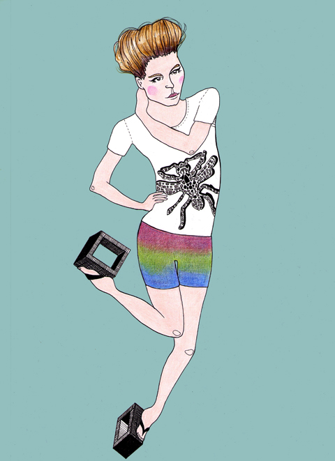
ADZ, capsule drug illustrated by Jess Stokes

Whilst eco-couture has always been ahead of the times in terms of sustainability, click it’s often been left behind in the style stakes, unable to compete with mainstream, high fashion. Gradually though, a new breed of designer has emerged who is equally concerned with creating a cutting edge aesthetic as they are utilising sustainable and organic materials.

At the forefront of this movement is Ada Zanditon, whose designs experiment with shape and texture in a way that is unsurprising once you learn that she originally interned with Alexander McQueen and Gareth Pugh. After establishing her own eco-luxury womenswear line in March 2008, Ada has gone on to raise awareness of everything from eco fashion to politics through the likes of the Think Act Vote campaign. Ada took the time to answer a few questions for us about the inspiration behind her new range ADZ, and the future of eco fashion. ? 


ADZ S/S 2011

You’ve really established yourself as a pioneer of eco-fashion, giving the movement a younger, sexier image than it had in the past. How did you go about this?  
I think that I had two very strong passions that I was determined to make work together – fashion and sustainability. I enjoy the innovative aspect that comes into every part of the process, my main how-to part of it I think comes from a basic viewpoint that anything is possible. It’s equally possible to make a beautiful fashionable dress from an ecological material as it is from one that is not. It’s equally possible to create fashion that considers its full life span and even decay as it is to create something that does not. It’s a question of awareness, choice and aesthetics. 

Tell us about your new collection, ADZ?  
ADZ by Ada Zanditon is the bridging line to my main collection, it’s contemporary, resort urban wear that combines strikingly unique prints with casual yet sophisticated pieces that are focussed around bold geometric detailing in fluid soft fabrics such as tencel, silk jersey and chiffon. The SS 2011 debut collection of ADZ is titled Nebulayan. My inspiration came from creating illustrations of satellite images of the Himalayas mountain range which I then layered with Hubble telescope imagery of deep space nebulae. We now have achieved the technology to see the Earth from space and also to see deep into outer space. I like the idea of contrasting these perspectives with each other. 


ADZ, illustrated by Aniela Murphy

How do you cope with the volume of work and your nerves in the build up to London Fashion Week? Any trade secrets?
I am always aware that I am so fortunate to be in the position to be running my own label, I don’t really want to complain. Everyday always has its challenges, but I try to see that as opportunity. I think gratitude is vastly underrated these days…. don’t you? 

Absolutely! Amelia’s magazine have always been a big fan of your illustrations, any plans to design your own prints based on your work?
Actually, all my prints are based on my illustration work and photography and as well as that I use watercolour then layer all these elements together. ? 
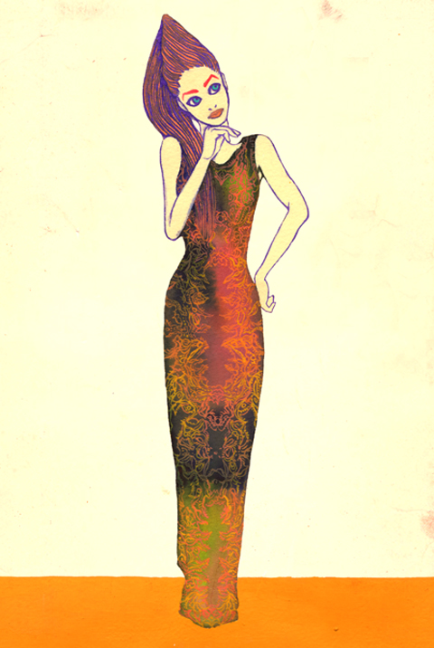

ADZ, illustrated by Natsuki Otani

Musician Viktoria Modesta is your muse; how did you end up working together? You’ll be contributing to her showcase next month; what will that involve?
Soon after we first met we found we had a good creative rapport. I think Viktoria has incredible elegance and style with a real sense of grace. As for the showcase – I don’t want to give to much away but it will be a great evening. 

How do you think the public can be convinced of the importance of sustainability? Do you think there is more designers, magazine editors and celebrities could be doing to highlight its significance?
I only think the planet can truly convince people of the importance of sustainability. I’m sure most people living on the coast of Bangladesh are highly convinced that we need to live in a more sustainable way as they are effected daily by climate change. However, I think that people can encourage and inspire, and have a really good try at convincing. What worries me, though, is that catastrophic events only really shake people into action. I think everyone in every walk of life can do more, no matter what you do.

To see the entire ADZ S/S 2011 collection, visit Ada’s website.
To read more about Think Act Vote, see our interview with Amisha Ghadiali here.
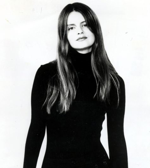
Corrine Day pictured in 1996

The fashion world is in mourning over the loss of another of its brightest stars. Corinne Day, decease the fashion photographer known for shooting Kate Moss at the beginning of her career, information pills has died aged 45.

Her documentary-style photography shook up the fashion world in the nineties, mind at a time when the industry was looking for an antidote to the gloss and glamour of the eighties.  

Born in Ickenham, west London, Day she was raised by her grandmother (her mother, she said, ran a brothel, and her father was not in the picture), and after failing school, worked as a courier. A chance meeting with a photographer led to a short-lived modeling career – Corinne knew she was no cover girl – but through it she met her lifetime partner Mark Szaszy, who taught her how to use a camera.  

It was behind the lens that Corinne shone, and whilst modeling in Milan, she started snapping ‘what she knew’ – her friends – teenage models, hanging around cramped, dingy flats, dressed in charity shop finds.  

This was before the age of street style or fashion bloggers, where anyone with a camera and a passport could jet set around the world, snapping chic from the sidewalks. Her subversive shots caught the eye of Phil Bicker, then art director of The Face, who commissioned a shoot that was to become the stuff of fashion legend.  

The story of Corinne and Kate is well-documented. Day saw promise in a polaroid of the wannabe model, just 16. The ‘3rd Summer of Love’ in July 1990, saw Kate frolicking on a beach in Camber Sands, dressed in a mismatch of high-end designer and cheap market finds. The shoot caused a sensation. The two became firm friends, sharing a flat for three years – this closeness was something Corinne shared with many of her subjects, enabling her to capture them at their most natural.  

Shoots for Vogue followed – (Day was the first to shoot Kate for one of her countless Vogue covers) with Corinne teaming up the stylist Melanie Ward to create the now infamous ‘waif’ look. Her ‘Underexposed’ sequence saw Kate Moss languishing in a bedsit festooned with fairy lights, skinny in saggy tights, creating outrage in the national press for encouraging anorexia and heroin use.  

But nothing could stop Day’s rise to stardom. Her stark, fearlessly honest photographs welcomed in a new mood suited to a country recovering from a recession.  
After a decade of supermodels with their Amazonian bodies and diva demands, Day’s idea of perfection was imperfection. She hated retouching photographs, and favoured quirky models with only traces of makeup, exposed to natural light. Her shots of street kids in second-hand clothes summed up the anti-glamour aesthetic of Generation X. It was an answer to Seattle’s grunge movement – but uniquely British, and effortlessly cool.   

Influenced by the work of documentary artists like Nan Goldin, she sought to capture people’s “most intimate moments”, when “we’re not having such a good time”. This extended to her own life, when she was diagnosed with a brain tumour in 1996, and asked her partner to photograph her battling with the illness. The result was published as ‘Diary’ in 2001.  

After recovering from her first bout of illness, Corinne continued to shoot for fashion magazines, as well as documenting her own friends and family. Her work was commissioned by the National Portrait Gallery, exhibited everywhere from the V&A to the Saatchi, and even the subject of a BBC Four documentary.  

Corinne will always be known as the girl who kick-started heroin chic, but her legacy will be something greater. Writing in The Telegraph, stylist Belinda White commented how, growing up as a working class girl, she “had no business” looking at Vogue and “couldn’t relate” to the stories on the magazine pages. The Kate Moss shoot made her “stop in her tracks” and realize that for the first time, normal girls ‘like her’ could be a part of this world.  

Corinne Day’s photographs democratized fashion, and made it ‘real’ and relevant to a girl on the street. Only under her guise could Kate Moss, a short, flat-chested girl from Croydon, rise up the echelons of the fashion world.  

All images © Corinne Day

Categories ,3rd Summer of Love, ,Amazonian, ,Britain, ,Camber Sands, ,corinne day, ,Croydon, ,fashion, ,Generation X, ,grunge, ,Ickenham, ,Kate Moss, ,london, ,Mark Szaszy, ,Melanie Ward, ,Milan, ,Nan Goldin, ,national portrait gallery, ,Obituary, ,Phil Bicker, ,photography, ,Saatchi Gallery, ,seattle, ,The Face, ,Underexposed, ,va, ,vogue

Similar Posts:


Amelia’s Magazine | An interview with jewellery designer and gemologist expert Milena Kovanovic

Milena Kovanovic by Laura Hickman
Milena Kovanovic by Laura Hickman.

I was blown away by the unusual jewels of Milena Kovanovic when I first discovered her at The Craft Market last year, curated by Megan Taylor as part of Tent London during the 2012 London Design Festival. It’s taken me awhile to catch up with this Central Saint Martins graduate, gemologist and self confessed hoarder, who explores ideas of science and antiquity to create her unique designs – but I didn’t forget her. Her new Ursula’s Hoard Collection features rough precious gems such as Lapis Lazuli, Carnelian and Baroque Pearls set in swathes of bubbled gold, all inspired by the potential spoils of a sunken galleon: forgotten gems that Milena Kovanovic imagines lie encrusted in coral reefs on the depths of the ocean floor. Customers with a very healthy budget can commission from her high end Luxe Reef collection, featuring even more exotic jewels. I spoke to Milena about her inspiration, design process and knowledge as a qualified gemologist.

Tent London Oct 2012-Milena Kovanovic gem
Tent London Oct 2012-Milena Kovanovic
Spessartine Garnet and Smokey Quartz necklace from the Krystalline collection. Discovered at Tent London 2012.

When did you first realise that you wanted to be a jewellery designer, and what has been the best thing about following this career path?
I came across jewellery design whilst doing my art and design foundation course, really enjoyed working in metal and decided I’d apply to the degree course after my tutor convinced me I’d be perfect for it. It must have been fate as I used to make jewellery as a teenager and sell it at Greenwich Market to earn some extra cash, though I never considered it as a career at the time. The best thing about following this career path is that it encompasses all the things I love – making and gems and minerals.

Milena Kovanovic Ursula's Hoard red gems
What was the best bit about studying at CSM?
For me the best part about studying at CSM was the freedom you got to explore and experiment within your degree course. It also have one of the best libraries for books and materials that is an invaluable resource for any designer.

Milena Kovanovic Jewelry by Veronica Rowlands
Milena Kovanovic Jewellery by Veronica Rowlands.

The Ursula’s Hoard collection features gems that are encrusted with molten gold that looks like coral – how did you achieve this effect?
I enjoy exploring new processes and techniques in my work, so for my last two collections I have been doing a lot of electroforming. This is a process which uses an electrical current to take metal in a solution and deposit/grow it onto the surface of whatever you want. This method was perfect for the Ursula’s Hoard collection as I wanted the pieces to look like they’d been under the sea for centuries, becoming encrusted in barnacles and corals.

Milena Kovanovic Ursula's Hoard La Belle Ring
La Belle Ring.

Where do you go for inspiration when you start designing a new collection?
Inspiration can come from anywhere, it’s all around us. I’m very visual and take a lot of photographs of things that catch my eye, especially focusing on the details. Sometimes it can be from something I’ve read or an exhibition I’ve seen. I also love to travel which is a great influence for new ideas.

Milena Kovanovic Ursula's Hoard Golden Hind Necklace
Golden Hind Necklace.

Where did you study and how long did it take you to become a qualified gemologist?
I trained as a gemmologist at the Gemmological Association of Great Britain in Hatton Garden. They have a fast track course which combines the foundation and diploma into a 1 year full time programme, which is what I did.

Milena Kovanovic Ursula's Hoard rings
What amazing and little known gemological fact can you share with us?
The gemstone Tourmaline is pyroelectric – meaning that when it is rubbed or heated, it will develop a static charge that attracts lightweight particles to its surface like dust. This effect could be one probable source of it’s name, which originates from the Sinhalese word Turmali which means both “coloured stone” and “attractor of ashes“.

Milena Kovanovic Ursula's Hoard Mayflower Ring
Mayflower Ring.

What are your favourite kind of gems to work with?
That’s a tough one, there are so many it’s hard to choose! I’m really drawn to vibrant coloured gems such as Rubellites, Spessartine Garnets and Emeralds to name but a few. The gems are always the starting point from which I will create a piece of jewellery as they usually inform the design.

Milena Kovanovic Ursula's Hoard earrings
How and when are you able to use your gemological expertise these days? (apart from in jewellery design)
I regularly utilise my gemmological knowledge to source and supply gemstones for clients and trade, as well as offering specialised training in gemstones and jewellery production to staff in retail businesses.

I can’t wait to see what the talented Milena Kovanovic designs next. Visit her website here to explore her wonderful world of gems.

Categories ,2012, ,Baroque Pearls, ,Carnelian, ,Central Saint Martins, ,electroforming, ,Emerald, ,Gemmological Association of Great Britain, ,Gemologist, ,Gems, ,Golden Hind Necklace, ,Greenwich Market, ,Hatton Garden, ,jewellery, ,Krystalline, ,La Belle Ring, ,Lapis Lazuli, ,Laura Hickman, ,London Design Festival, ,Luxe Reef, ,Mayflower Ring, ,Megan Taylor, ,Milena Kovanovic, ,pyroelectric, ,Rubellite, ,Sinhalese, ,Spessartine Garnet, ,Spessartine Garnet and Smokey Quartz necklace, ,Tent London, ,The Craft Market, ,Tourmaline, ,Turmali, ,Ursula’s Hoard Collection, ,Veronica Rowlands

Similar Posts:


Amelia’s Magazine | Tent London 2011 Review: Best Furniture Design

Tent London 2012 review -anthony hartley
Furniture by Anthony Hartley.

This year I once again visited Tent London hot on the heels of London Fashion Week. At the end of September the creme de la creme of the product design world held court at the Truman Brewery, look and I’m here to bring you the best of the bunch. First up my favourite bits of furniture design.

Tent London 2012 review -anthony hartley
Beautiful and very unique furniture from Anthony Hartley; waves of colour splashed across drawers and curved around walls in long shelving units.

Tent London 2012 review -jan plechac
Czech designer Jan Plechac showcased versions of his favourite chair designs in wire.

Tent London 2012 review -senufo
The A & Z Design furniture stand was attracting people with a very cute dog. I liked their senUFO side table the most. It would be very cool in a kid’s bedroom.

Tent London 2012 review -squint
Furniture makers Squint were showcasing a collaboration with the London Transport Museum – using classic hardwearing Moquette fabrics (familiar from the tube) within their trademark patchwork upholstery designs.

Tent London 2012 review -nobody and co
What a brilliant idea for a chair cum bookcase from Italian company Nobody&Co. Obviously inspired by the same problems I have: an overwhelming number of books with no home.

Tent London 2012 review -ercol
What a hit: bold 50s influenced textile designs on simple modernist furniture from the well established brand Ercol.

Tent London 2012 review -nobody and co
Tent London 2012 review alex garnett
Oversized household objects become kitsch furniture thanks to Goldsmiths trained Alex Garnett.

Tent London 2012 review -shell thomas
Tetronimoes by Shell Thomas were created by invitation from JJAM Curators’ Collective – what an ace idea for a kids’ playroom. Visitors were encouraged to use the velcro strips to rearrange the cushions and create new shapes of furniture.

Tent London 2012 review -rex chair
My new favourite new chair comes from the Rex range, straight out of Slovenia. So comfortable, I want this rocker now.

Tent London 2012 review -spellner milner
Alison of Speller Milner design is a RCA graduate who makes elegant furniture topped with pretty graphic decoration.

Categories ,2011, ,50s, ,A & Z Design, ,Alex Garnett, ,Alison, ,Anthony Hartley, ,Chair, ,Czech, ,design, ,designer, ,Ercol, ,Furniture, ,goldsmiths, ,Jan Plechac, ,JJAM Curators Collective, ,London Design Festival, ,London Transport Museum, ,Moquette, ,Nobody&Co, ,Oversized, ,Pillhead, ,review, ,Rex, ,Rocking Chair, ,senUFO, ,Shell Thomas, ,Slovenia, ,Speller Milner, ,squint, ,Tent London, ,Tetronimoes, ,textiles, ,Truman Brewery, ,Upholstery

Similar Posts:


Amelia’s Magazine | Tent London 2011 Review: Best Lighting Design

Tent London 2012 review -Curiousa & Curiousa
Hand blown glass lighting by Curiousa & Curiousa.

I have been collecting fabulous lamps since I first started to scavenge second hand stores as a teenager. Here’s what caught my eye at Tent London this year.

Tent London 2012 review -Curiousa & Curiousa
I adored these jewel-like blown glass lamps by Curiousa & Curiousa from the Derbyshire town of Wirksworth. Each lampshade is traditionally blown without moulds so that any shape, check size or colour can be achieved according to a client’s wishes.

Tent London 2012 review -Kaspa REthinkthings
I was immediately attracted to the Kaspa glow-in-the-dark lamp by REthinkthings on the 5ml stand. What fun, viagra and a great xmas present for kids, both small and slightly larger… The 5ml Design Collective is a partnership between Ilsa Parry, Michael Cloke and Tom Sutton that aims so support and nurture up and coming design.

Tent London 2012 review -Rachel Powell
I first spotted Rachel Powell‘s clever wood veneer lampshades at the New Designers graduate showcase this summer. Since then her business has been growing at such a rate that she was able to take part in this much more professional industry showcase.

Take a peek at my review of the ceramic design at Tent London, the surface design at Tent London and the best furniture at Tent London too.

Categories ,2011, ,5ml Design Collective, ,Curiousa & Curiousa, ,Derbyshire, ,Ghost, ,Glow-in-the-Dark, ,Ilsa Parry, ,Kaspa, ,Lamp, ,Lampshades, ,Laser Etched, ,Lighting, ,London Design Festival, ,Michael Cloke, ,New Designers, ,Rachel Powell, ,REthinkthings, ,review, ,Tent London, ,Tom Sutton, ,Wirksworth, ,Wood Veneer

Similar Posts:


Amelia’s Magazine | Tent London 2011 Review: Best Surface Design

Kate Usher wallpaper
Wallpaper by Kate Usher Studio.

The printed textile designer in me will always be a sucker for great decorative surface design. Here’s some fabulous stuff that I found at Tent London this year.

Kate Usher Meerkat wallpaper
At the Designed and Made stand I was immediately drawn to Kate Usher‘s marvellous wallpaper designs with names such as Sharkbait and Hang About. She has set out with an admirable mission to shake up the tired old cliches that appear on most children’s bedroom decor, story so expect bold designs, thumb all printed to order on FSC approved base papers… and with the possibility to add a bespoke Swarovski crystal topping. Wow-wee.

Tent London 2012 review -kate usher and sarah blood
Also at Designed and Made I liked the neon Duck lights by Sarah Blood which offer a fun updated version of this kitsch classic.

Tent London 2012 review -flavor paper
Brookyln’s Flavor Paper had flown to the UK to showcase their unique wares. What fun! I particularly loved their hot air balloon display and given their provocative name I couldn’t help asking if any of their designs were actually scratch ‘n’ sniff – to my delight I discovered that indeed the cherries were. All their designs are created to buyer specifications, either digitally or via traditional screenprinting.

Tent London 2012 review -bluebellgray
Digital printing was used to great effect by Scottish designer Fi Douglas of Bluebellgray, retaining the feel of pretty hand painted floral watercolour textiles.

Tent London 2012 review -happy happy bows
I am not sure which section these Happy Happy oversized bows fit into since they are essentially an entirely useless bit of decor. Made by RCA trained designer Stephen Johnson, these kitsch creations are intended to bring a bit of happiness into the world.

Tent London 2012 review -3form tiles
Gorgeous (but very expensive) irridescent sculpted bespoke tiles were on display from 3Form solutions.

Tent London 2012 review -Lisa Grue avantgarden
And then I chanced upon Lisa Grue, who I last met in Copenhagen a year ago. She was taking in part in Tent London with a group of artist/designers working in multiple disciplines under the name avantGarden.

Tent London 2012 review -Lisa Grue avantgarden
Titled Beautiful Mortality, all of avantGarden‘s work was inspired by the beauty of life, death and decay and all the designs were rendered in a limited colourway of cream and browns – quite a departure from Lisa’s usual colourful work. I loved her moth and fox designs and her huge hand-appliqued wall hanging.

Tent London 2012 review -Meyer-Lavigne
Bulbous painted ceramic plant pots from Meyer-Lavigne were also particularly wonderful.

Tent London 2012 review -Louise Gaarmann
Louise Gaarmann presented some tactile ceramics in imaginative combinations of shapes. Together with textile designer Tina Ratzer she had created Mr.Craftsman, a huge tribal coat in pure wool accessorised with hanging ceramic talismans.

Our Man_ratzermeetsgaarmann mr craftsman
Don’t forget to take a peek at my pick of this years furniture design too.

Categories ,2011, ,3Form, ,avantGarden, ,Beautiful Mortality, ,Bluebellgray, ,brooklyn, ,ceramic, ,copenhagen, ,Danish, ,Designed and Made, ,digital, ,Duck, ,Fi Douglas, ,Flavor Paper, ,Happy Happy, ,kitsch, ,Lisa Grue, ,London Design Festival, ,Louise Gaarmann, ,Meyer-Lavigne, ,Neon Lights, ,rca, ,review, ,Sarah Blood, ,scratch ‘n’ sniff, ,screenprinting, ,Stephen Johnson, ,surface design, ,Swarovski, ,Tent London, ,textiles, ,Tiles, ,Tina Ratzer, ,Underwerket Projects, ,Wallpaper

Similar Posts:


Amelia’s Magazine | Tent London 2013 Preview: Best of Tent London 2012

Tent London Oct 2012
It comes on hard after London Fashion Week, but I always make sure to get along to Tent London at the Truman Brewery: for this huge and sprawling exhibition is a great place to find the best in design, from homeware and lighting to furniture, wall art, rugs and beyond. Even though I have run individual blogs on some of my favourite discoveries I was most remiss in writing up our usual review last year, so as the 2013 edition rolls around I bring you a further selection of the best things I found in 2012. Make sure you check out my listing for more details of this year’s event.

Tent London Oct 2012 Jon Male
Upcycled lights by Studio Jon Male.

Tent London Oct 2012-tamasyn gambell
Cushions by Tamasyn Gambell.

Tent London Oct 2012-rug
Tent London Oct 2012-lights
Fab rug and lights, not sure by whom!

Tent London Oct 2012-Anthony Hartley
Furniture by Anthony Hartley. Read my interview here.

Tent London Oct 2012- Zoe Murphy
Cushions by Zoe Murphy.

Tent London Oct 2012-wallpaper by Rachel Powell
Wallpaper by Rachel Powell.

Tent London Oct 2012-beautiful wooden object
Sadly I don’t have any information for this beautiful wooden object, but I think it could be used as a decorative wall hanging or as a pot mat in the kitchen.

Tent London Oct 2012-Claire Anne O'Brien
Knitted furniture by Claire Anne O’Brien.

Tent London Oct 2012-venus by cupertino
Scott Eaton‘s Venus of Cupertino ipad docking stations.

Tent London Oct 2012-Laszlo Tompa
Sculptural wooden furniture by Laszlo Tompa. Read our interview here.

Tent London Oct 2012-Réka Molnár, Moringa, Hungarian
Heat sensitive mug designs by Hungarian designer Réka Molnár of Moringa.

Tent London Oct 2012-Magnetic rings by Grace Hancock
Magnetic rings by Grace Hancock.

Tent London Oct 2012-Front rug monster
Front rugs: monster.

Tent London Oct 2012-Ginger and Jagger
Stools by Ginger & Jagger.

Tent London Oct 2012-CYMK lamp by Dennis Parren
CYMK lamp by Dennis Parren.

Tent London Oct 2012-Candlesticks by Victoria Delaney
Candlesticks by Victoria Delaney.

Tent London Oct 2012-Architectural miniature by Chisel and Mouse
Architectural miniature by Chisel and Mouse.

Tent London Oct 2012-Milena Kovanovic
Necklace by Milena Kovanovic. Read my interview here.

Tent London Oct 2012-Lars Beller Fjetland for Discipline
Wooden birds by Lars Beller Fjetland for Discipline.

I wonder who I will discover this year? Make sure you follow me on instagram to share in my favourite finds first.

Categories ,2012, ,2013, ,Anthony Hartley, ,Chisel and Mouse, ,Claire Anne O’Brien, ,Dennis Parren, ,design, ,Front rugs, ,Furniture, ,Ginger & Jagger, ,Grace Hancock, ,Hungarian, ,Lars-Beller Fjetland, ,Laszlo Tompa, ,Lighting, ,London Design Festival, ,Milena Kovanovic, ,Moringa, ,Rachel Powell, ,Réka Molnár, ,review, ,Scott Eaton, ,Studio Jon Male, ,Tamasyn Gambell, ,Tent London, ,Truman Brewery, ,Upcycled, ,Venus of Cupertino, ,Victoria Delaney, ,Zoe Murphy

Similar Posts:


Amelia’s Magazine | Typographica – this magazine was built to last

TYPOGRAPHICA2

Not too far away from Amelia HQ is the current exhibition now on at the Kemistry Gallery in Shoreditch. I would introduce this event with some kind of drum roll if I could. The godfather of typography, Herbert Spencer, was the founder and editor of Typographica magazine that ran from 1949 to 1967 and is considered to be one of the most significant and visually outstanding design journals ever to be published. He far preceded his age – he was only 25 years old when he started out as a freelance typographic designer. The magazine saw 32 issues printed and with the help of his team they campaigned to transform the face of British typography. The second series (1960-67) shapes the centre of this exhibition where photography is noticeably more prevalent, used as a visual means of making a more flexible and involving way of creating the magazine.

TYPOGRAPHICA3

The gallery itself is contained to one small room. Strange, as you feel a grander space would be more befitting to something so iconic and influential. One wall is dedicated to more photographic examples from the journal. They are all taken in the outside world, in the streets among us. Many of the components that make up our surroundings, in the built up areas we inhabit, can often go unnoticed. Many of us are too busy looking down instead of around and these photographs show us what we’re missing. There are beautiful examples of shop signs, ‘Corseteria’, ‘Sanchez Guaza’ and ‘Camiseria’ in “Spanish Street Lettering” by Alan Bartram (New Series no.15 June 1967). These photos show an early instance of a category of documentary that is now quite common in today’s photography and graphic design. It is only when you see them arranged together in this way that you can start to build up an idea of how much symbols play a part in our daily lives.

TYPOGRAPHICA5

Other pieces are comprised of different road signs, a patchwork of various symbols, that when put together, begin to form a pattern. One is specifically built up of arrows, laid on the road, painted on the walls of buildings and pinned to tree trunks. All the photographs are black and white, which strips them down to their basic forms. I think that it is clearer to see the symbols themselves in this instance and the way in which they integrate into the world around us.

TYPOGRAPHICA4

The opposing wall is dedicated to the printed letter. The pages are predominantly made up of primary colours on a background of black and white. “Piet Zwart” (New Series no.7 May 1963) by Herbert Spencer is a spread from an 8-page article. Spencer would fully engross himself when presenting the work of others in his magazine. In this article about the Dutch modernist Piet Zwart, he bleeds copies of his work off the page without any suggestion of what the dimensions or parameters may be. Spencer chose to use a wide variety of different paper stocks adjacent to each other on the spreads, offering each featured designer a unique look. It also gives a sense of urgency and makes for impressive visual impact.

TYPOGRAPHICA6

The centre of the exhibition is focused on the adjoining second wall. Three issues of original Typographica magazines are displayed in a large glass case, like sacred artefacts in a museum. The Kemistry Gallery have specially created three prints from the original journals. They have chosen what they consider to be the most “iconic and arresting” images from the series, which is available to buy exclusively from the gallery. Pleasantly enough, no one came into the gallery for the two hours that I was there, having the luxury of immersing myself in the work without contending with hoards of other people. This is probably down to the fairly secluded location of the gallery and an optimum time slot of 11 o’clock in the morning. Sedate music (the dulcet tones of Yellow Submarine no less) is played in the background – an agreeable companion to a two-hour stroll around the gallery.

spencer_pioneers

The exhibition is curated by Rick Poynor, prolific author of the book Typographica and founder of Eye magazine and is also part of the London Design Festival and the Icon Design Trail. This exhibition is an exceptional opportunity for any typography or graphic design aficionado to be in the presence of the legendary Typographica magazine. You might already be a die-hard Herbert Spencer fan, in which case you may be the proud owner of ‘Pioneers of Modern Typography’. I would strongly vouch for the Lund Humphries/Hastings House first edition, this wonderful book is best read in its original form. If not, this typography tome is definitely worth some of your time and pocket money.

Categories ,alan bartram, ,eye magazine, ,herbert spencer, ,icon design trail, ,Kemistry gallery, ,London Design Festival, ,lund humphries, ,piet zwart, ,pioneers of modern typography, ,rick poynor, ,typographica, ,typography

Similar Posts:


Amelia’s Magazine | Tent London 2011 Review: Best Ceramics Design

Tent London 2012 review -Bodo Sperlein for Niko
The ceramics on display at Tent London were wonderfully varied. I loved these curvy stacks of bowls inspired by the shapes of blossoms, treatment by Bodo Sperlein for Niko. The pastel hues made the plates seem edible in themselves.

Tent London 2012 review -Makiko Nakamura
Tent London 2012 review Wenhui Li.
I was very pleased to see the work from two ceramicists that I picked up on at the graduate shows: RCA graduate Makiko Nakamura and Central Saint Martins graduate Wenhui Li.

Tent London 2012 review -Kitty and Dude
Edinburgh’s Kitty and Dude had styled their stand to perfection with old school treats. On closer inspection all their goodies were revealed to be new.

Tent London 2012 review -Ikuko Iwamoto Ceramics
Ladybirds on a plate and a vaguely phallic display of pots from Ikuko Iwamoto Ceramics. Apparently intended for a surreal tea ceremony.

Tent London 2012 review -Richard Brendon
Sussed is a platform for sustainable innovation and featured these gorgeous reclaimed mismatched cups and saucers which had been dipped in reflective luster to create a newly matching pairs. Created by Kingston graduate Richard Brendon, page who sells in Wolf & Badger.

bettinanissen-makeawish-gold-crop
For those who are looking into non traditional ways of creating objects 3D printing provides another option to explore. At the Shapeways stand I was most taken by the designs of Bettina Nissen. I loved the idea of Make A Wish, which is designed as a keepsake birthday gift. It can be placed on a cake like a traditional candle and then the candle holder itself makes a curiously pretty ring design to keep.

Don’t forget to take a look at my reviews of furniture at Tent London and surface design at Tent London this year.

Categories ,2011, ,3D Printing, ,Bettina Nissen, ,Bodo Sperlein for Niko, ,Central Saint Martins, ,ceramics, ,graduate, ,Ikuko Iwamoto Ceramics, ,Kingston University, ,London Design Festival, ,Make A Wish, ,Makiko Nakamura, ,rca, ,review, ,Richard Brendon, ,Ring, ,Shapeways, ,Sussed, ,sustainable, ,Tent London, ,Wenhui Li, ,Wolf & Badger

Similar Posts:


Amelia’s Magazine | Tent London 2011 Review: Best Ceramics Design

Tent London 2012 review -Bodo Sperlein for Niko
The ceramics on display at Tent London were wonderfully varied. I loved these curvy stacks of bowls inspired by the shapes of blossoms, by Bodo Sperlein for Niko. The pastel hues made the plates seem edible in themselves.

Tent London 2012 review -Makiko Nakamura
Tent London 2012 review Wenhui Li.
I was very pleased to see the work from two ceramicists that I picked up on at the graduate shows: RCA graduate Makiko Nakamura and Central Saint Martins graduate Wenhui Li.

Tent London 2012 review -Kitty and Dude
Edinburgh’s Kitty and Dude had styled their stand to perfection with old school treats. On closer inspection all their goodies were revealed to be new.

Tent London 2012 review -Ikuko Iwamoto Ceramics
Ladybirds on a plate and a vaguely phallic display of pots from Ikuko Iwamoto Ceramics. Apparently intended for a surreal tea ceremony.

Tent London 2012 review -Richard Brendon
Sussed is a platform for sustainable innovation and featured these gorgeous reclaimed mismatched cups and saucers which had been dipped in reflective luster to create a newly matching pairs. Created by Kingston graduate Richard Brendon, who sells in Wolf & Badger.

bettinanissen-makeawish-gold-crop
For those who are looking into non traditional ways of creating objects 3D printing provides another option to explore. At the Shapeways stand I was most taken by the designs of Bettina Nissen. I loved the idea of Make A Wish, which is designed as a keepsake birthday gift. It can be placed on a cake like a traditional candle and then the candle holder itself makes a curiously pretty ring design to keep.

Don’t forget to take a look at my reviews of furniture at Tent London and surface design at Tent London this year.


Categories ,2011, ,3D Printing, ,Bettina Nissen, ,Bodo Sperlein for Niko, ,Central Saint Martins, ,ceramics, ,graduate, ,Ikuko Iwamoto Ceramics, ,Kingston University, ,London Design Festival, ,Make A Wish, ,Makiko Nakamura, ,rca, ,review, ,Richard Brendon, ,Ring, ,Shapeways, ,Sussed, ,sustainable, ,Tent London, ,Wenhui Li, ,Wolf & Badger

Similar Posts:


Amelia’s Magazine | Introducing Fiera, a new Design Magazine: Interview with founder Katie Treggiden

Fiera_magazine_issue1_cover
I was super stoked to pick up a copy of Fiera on my recent visit to Home London: this new magazine is the brainchild of prolific design writer Katie Treggiden – the author of Confessions of a Design Geek – and aims to shed an analytical light on the many design fairs that she visits across the world. It’s a super ambitious project that was funded through a very successful Kickstarter campaign which raised over £16,000, and the final publication is a beautiful book, designed by the ace Jeremy Leslie of Magculture. Having recently run my own Kickstarter campaign to produce a book I was very keen to catch up with Katie to find out how it all came about.

Katie Treggiden-Fiera
Why did you decide to launch Fiera and what does the title mean?
The coverage of design festivals is exciting, dynamic and immediate, but almost as ephemeral at the shows themselves. Print coverage tends to be press release driven and therefore often misses young designers without PR support. After the shows, we all sort of go back to life as normal as if nothing had happened. I felt there was a space for a print magazine that captures the excitement of the fair whilst offering some insight and analysis to make sense of it all – and provides a platform for new designers. Fiera is Italian for fair.

Fiera_magazine_02
How did you first meet and decide to work with Jeremy Leslie?
I met Jeremy on a Guardian Masterclass on independent publishing that he was a speaker on. He contacted me afterwards and suggested we met for a coffee to discuss my project. As you know, he is something of a Godfather in the world of independent design, so I was blown away. It’s a real honour to work with him – he’s an incredibly talented and experienced designer, and he’s really made the magazine what it is.

Fiera_magazine_04
You must see so much design, how do you filter out the things that you love and do you ever suffer from ‘blindness’? (and if so do you have any strategies for getting around it?)
I work very much on gut instinct. I’m looking for fresh young designers with ideas that make the world a better place in some way – large or small. I can’t always articulate it straight away, but I know it when I see it. Trade shows can be exhausting so it’s important to look after yourself – flat shoes, plenty of water, a secret stash of chocolate – and to remember to enjoy it. I have the best job in the world – it would be a shame to be too tired to appreciate that!

Fiera_magazine_08
Which is your favourite design festival and why?
I’m going to have to be loyal and say the London Design Festival – I can still remember visiting for the first time. It was like the door into another world had been opened to me. There are over 300 events on the first day alone – anyone who says they can’t find anything to interest or inspire them isn’t looking hard enough!

Fiera_magazine_12
How did you get the various contributors involved?
For the first issue, I contacted people I respected who I thought might have something interesting to say, and asked them if they’d be interested in taking part. I was very lucky that despite not having a physical magazine to show them, most people said yes straight away. For Issue 2, people are starting to come to me with ideas, which is really nice.

Fiera_magazine_17
What were the best and the hardest things about running a Kickstarter campaign, and do you have any tips for others who might want to run a similar crowdfunding campaign?
Running a Kickstarter campaign is honestly one of the hardest things I’ve ever done professionally. You put yourself out there for very public success or failure. It’s so rewarding when people back your idea and show their support, but I didn’t believe we were going to hit the target until the moment we did, so I felt sick for a month! The best thing is being able to launch a product with 300 pre-orders. You’ve already proved the market and connected with your readers before the product even exists. That’s a very privileged position to be in.

Fiera_magazine_19
What is your favourite bit in this current issue of Fiera and why?
Oh, that’s a tough question! This doesn’t quite answer it, but I think my favourite part is the sheer physicality of it. I’ve been writing a design blog for almost five years, and write for a lot of online publications. There is something utterly magical about holding a magazine in your hands that’s been over a year in the making. I have to thank Jese and Jeremy at magCulture studio for that – it’s a truly beautiful object.

Fiera_magazine_23
What next for the Fiera brand?
Issue 2! We’re already hard at work on the next issue. I’ve just come back from Northmodern in Copenhagen and I’m off to the Stockholm Furniture Fair on Monday. I can’t wait to do it all again!

You can buy Issue 1 of Fiera at Magculture here. I highly recommend you pick up a copy if you have an interest in contemporary design culture. Next up I will be interviewing Jeremy Leslie about his role in the publication.

Categories ,Confessions of a Design Geek, ,Fiera, ,Guardian Masterclass, ,Home London, ,Jeremy Leslie, ,Katie Treggiden, ,Kickstarter, ,London Design Festival, ,magCulture, ,Stockholm Furniture Fair

Similar Posts: