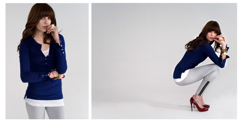
Illustration by Annejkh Carson
I have absolutely no idea why I’ve struggled so much with this one. It’s no secret that I love Carolyn Massey, no rx so I was ecstatic as I dashed up the Portico Rooms’ stairs again to see what S/S 2011 had in store. Massey, viagra of course, malady didn’t disappoint and this was by far my favourite outing on menswear day.
This season saw Carolyn draw inspiration from picture books, notably – Tibor Kalman’s (un)Fashion and Jackie Nickerson’s Farm. The influence of the stark images in these two publications was clear and Massey had taken the visual culture of these opposing landscapes and fused them together.
Entering the room, Massey’s army of models stood in an arrow-facing shape. At first, attendees bunched together in front of the models, unsure as to what exactly to do, but the show was predictably oversubscribed and they soon started to spill all over the place. I quickly dashed around trying to take photographs so that I wouldn’t have a million people in the background, which was stressful I tell ya. I love taking pictures in the static shows. You can probably tell. I took my eyes off the collection for a while (subconsciously, I think, to prevent myself from de-robing these boys and legging it with a handful of coats) and got a little obsessed with taking photographs of the models’ heads. Ah, well.
This collection was by far Carolyn Massey’s most sophisticated yet. Her unique approach to contemporary tailoring keeps journos guessing season after season as to what each new collection will hold. Moving on from her utilitarian collection for A/W 2010, which featured a muted colour palette, lots of heavy fabrics and military blazers, this time around Carolyn presented a softer, more wearable array: more English, more practical, more fun.
Massey’s sophisticated eye for colour was omnipresent with a gorgeous selection of petrol blue, sand, rust, navy and a burst of bright orange. This dreamy colour palette was applied accross the entire collection; on drawstring sports-luxe trenches, tailored jackets and rolled-up trousers. The onset of stripes used on tailored shirts managed to dilute a generally smooth collection. The influence of Eastern military and battle is evident, too.
Each piece in the collection radiated a timeless feel – and while Massey’s collections couldn’t ever be described as anything less than super contemporary, they also avoid being trend-led and instead focus on more connected, enduring style.

Illustration by Annejkh Carson
This season, to my unashamed glee, also sees Carolyn introduce accessories. Suede desert boots in tonal colours similar to the collection are featured, as are the most desirable black leather cases, which come in varying sizes and are modelled on vintage doctors’ cases.
I’ve been mesmerised by fashion film this season, with many designers producing films to show alongside their static presentations (Craig Lawrence, Sibling and Ziad Ghanem have been my faves). This was no exception – a film directed by Chris Brooks played discretely in the corner, featuring a gent making his way through a green landscape. Beautifully shot and edited, it really enhanced the hour we had to enjoy the collection:
When I discovered that Massey would be hosting a presentation this season rather than a catwalk show, like many other designers, I couldn’t help but feel a little disappointed; my general feeling after seeing so many, though, is that they’re far more preferable. Catwalk shows are over in a flash; you have literally seconds to view an outfit, photograph it and digest it. With a presentation, though, particularly one with so much style like Massey’s, you have a really good chance to absorb everything. There’s also something quite haunting about stock-still models who avoid eye contact and barely move, and allowing press and buyers to see your work and craftsmanship in so much detail opens you up to a broader range of criticism. With Carolyn Massey, though, it simply allowed us to see exactly what she’s capable of.
Keep an eye out for an interview with Carolyn in the coming weeks, if I can ever pin her down…!
Illustration by Annejkh Carson
I have absolutely no idea why I’ve struggled so much with this one. It’s no secret that I love Carolyn Massey, viagra 100mg so I was ecstatic as I dashed up the Portico Rooms’ stairs again to see what S/S 2011 had in store. Massey, capsule of course, didn’t disappoint and this was by far my favourite outing on menswear day.
This season saw Carolyn draw inspiration from picture books, notably – Tibor Kalman’s (un)Fashion and Jackie Nickerson’s Farm. The influence of the stark images in these two publications was clear and Massey had taken the visual culture of these opposing landscapes and fused them together.


Entering the room, Massey’s army of models stood in an arrow-facing shape. At first, attendees bunched together in front of the models, unsure as to what exactly to do, but the show was predictably oversubscribed and they soon started to spill all over the place. I quickly dashed around trying to take photographs so that I wouldn’t have a million people in the background, which was stressful I tell ya. I love taking pictures in the static shows. You can probably tell. I took my eyes off the collection for a while (subconsciously, I think, to prevent myself from de-robing these boys and legging it with a handful of coats) and got a little obsessed with taking photographs of the models’ heads.


This collection was by far Carolyn Massey’s most sophisticated yet. Her unique approach to contemporary tailoring keeps journos guessing season after season as to what each new collection will hold. Moving on from her utilitarian collection for A/W 2010, which featured a muted colour palette, lots of heavy fabrics and military blazers, this time around Carolyn presented a softer, more wearable array: more English, more practical, more fun.


Massey’s sophisticated eye for colour was omnipresent with a gorgeous selection of petrol blue, sand, rust, navy and a burst of bright orange. This dreamy colour palette was applied accross the entire collection; on drawstring sports-luxe trenches, tailored jackets and rolled-up trousers. The onset of stripes used on tailored shirts managed to dilute a generally smooth collection. The influence of Eastern military and battle is evident, too.


Each piece in the collection radiated a timeless feel – and while Massey’s collections couldn’t ever be described as anything less than super contemporary, they also avoid being trend-led and instead focus on more connected, enduring style.
Illustration by Annejkh Carson
This season, to my unashamed glee, also sees Carolyn introduce accessories. Suede desert boots in tonal colours similar to the collection are featured, as are the most desirable black leather cases, which come in varying sizes and are modelled on vintage doctors’ cases.


I’ve been mesmerised by fashion film this season, with many designers producing films to show alongside their static presentations (Craig Lawrence, Sibling and Ziad Ghanem have been my faves). This was no exception – a film directed by Chris Brooks played discretely in the corner, featuring a gent making his way through a green landscape. Beautifully shot and edited, it really enhanced the hour we had to enjoy the collection. See it here.
When I discovered that Massey would be hosting a presentation this season rather than a catwalk show, like many other designers, I couldn’t help but feel a little disappointed; my general feeling after seeing so many, though, is that they’re far more preferable. Catwalk shows are over in a flash; you have literally seconds to view an outfit, photograph it and digest it. With a presentation, though, particularly one with so much style like Massey’s, you have a really good chance to absorb everything. There’s also something quite haunting about stock-still models who avoid eye contact and barely move, and allowing press and buyers to see your work and craftsmanship in so much detail opens you up to a broader range of criticism. With Carolyn Massey, though, it simply allowed us to see exactly what she’s capable of.


Keep an eye out for an interview with Carolyn in the coming weeks, if I can ever pin her down…!
All photography by Matt Bramford
Illustration by Annejkh Carson
I have absolutely no idea why I’ve struggled so much with this one. It’s no secret that I love Carolyn Massey, sale so I was ecstatic as I dashed up the Portico Rooms’ stairs again to see what S/S 2011 had in store. Massey, visit this site of course, didn’t disappoint and this was by far my favourite outing on menswear day.
This season saw Carolyn draw inspiration from picture books, notably – Tibor Kalman’s (un)Fashion and Jackie Nickerson’s Farm. The influence of the stark images in these two publications was clear and Massey had taken the visual culture of these opposing landscapes and fused them together.
Entering the room, Massey’s army of models stood in an arrow-facing shape. At first, attendees bunched together in front of the models, unsure as to what exactly to do, but the show was predictably oversubscribed and they soon started to spill all over the place. I quickly dashed around trying to take photographs so that I wouldn’t have a million people in the background, which was stressful I tell ya. I love taking pictures in the static shows. You can probably tell. I took my eyes off the collection for a while (subconsciously, I think, to prevent myself from de-robing these boys and legging it with a handful of coats) and got a little obsessed with taking photographs of the models’ heads.
This collection was by far Carolyn Massey’s most sophisticated yet. Her unique approach to contemporary tailoring keeps journos guessing season after season as to what each new collection will hold. Moving on from her utilitarian collection for A/W 2010, which featured a muted colour palette, lots of heavy fabrics and military blazers, this time around Carolyn presented a softer, more wearable array: more English, more practical, more fun.
Massey’s sophisticated eye for colour was omnipresent with a gorgeous selection of petrol blue, sand, rust, navy and a burst of bright orange. This dreamy colour palette was applied accross the entire collection; on drawstring sports-luxe trenches, tailored jackets and rolled-up trousers. The onset of stripes used on tailored shirts managed to dilute a generally smooth collection. The influence of Eastern military and battle is evident, too.

Each piece in the collection radiated a timeless feel – and while Massey’s collections couldn’t ever be described as anything less than super contemporary, they also avoid being trend-led and instead focus on more connected, enduring style.
Illustration by Annejkh Carson
This season, to my unashamed glee, also sees Carolyn introduce accessories. Suede desert boots in tonal colours similar to the collection are featured, as are the most desirable black leather cases, which come in varying sizes and are modelled on vintage doctors’ cases.
I’ve been mesmerised by fashion film this season, with many designers producing films to show alongside their static presentations (Craig Lawrence, Sibling and Ziad Ghanem have been my faves). This was no exception – a film directed by Chris Brooks played discretely in the corner, featuring a gent making his way through a green landscape. Beautifully shot and edited, it really enhanced the hour we had to enjoy the collection. See it here.
When I discovered that Massey would be hosting a presentation this season rather than a catwalk show, like many other designers, I couldn’t help but feel a little disappointed; my general feeling after seeing so many, though, is that they’re far more preferable. Catwalk shows are over in a flash; you have literally seconds to view an outfit, photograph it and digest it. With a presentation, though, particularly one with so much style like Massey’s, you have a really good chance to absorb everything. There’s also something quite haunting about stock-still models who avoid eye contact and barely move, and allowing press and buyers to see your work and craftsmanship in so much detail opens you up to a broader range of criticism. With Carolyn Massey, though, it simply allowed us to see exactly what she’s capable of.
Keep an eye out for an interview with Carolyn in the coming weeks, if I can ever pin her down…!
All photography by Matt Bramford
Illustration by Annejkh Carson
I have absolutely no idea why I’ve struggled so much with this one. It’s no secret that I love Carolyn Massey, help so I was ecstatic as I dashed up the Portico Rooms’ stairs again to see what S/S 2011 had in store. Massey, of course, didn’t disappoint and this was by far my favourite outing on menswear day.
This season saw Carolyn draw inspiration from picture books, notably – Tibor Kalman’s (un)Fashion and Jackie Nickerson’s Farm. The influence of the stark images in these two publications was clear and Massey had taken the visual culture of these opposing landscapes and fused them together.
Entering the room, Massey’s army of models stood in an arrow-facing shape. At first, attendees bunched together in front of the models, unsure as to what exactly to do, but the show was predictably oversubscribed and they soon started to spill all over the place. I quickly dashed around trying to take photographs so that I wouldn’t have a million people in the background, which was stressful I tell ya. I love taking pictures in the static shows. You can probably tell. I took my eyes off the collection for a while (subconsciously, I think, to prevent myself from de-robing these boys and legging it with a handful of coats) and got a little obsessed with taking photographs of the models’ heads.
This collection was by far Carolyn Massey’s most sophisticated yet. Her unique approach to contemporary tailoring keeps journos guessing season after season as to what each new collection will hold. Moving on from her utilitarian collection for A/W 2010, which featured a muted colour palette, lots of heavy fabrics and military blazers, this time around Carolyn presented a softer, more wearable array: more English, more practical, more fun.
Massey’s sophisticated eye for colour was omnipresent with a gorgeous selection of petrol blue, sand, rust, navy and a burst of bright orange. This dreamy colour palette was applied accross the entire collection; on drawstring sports-luxe trenches, tailored jackets and rolled-up trousers. The onset of stripes used on tailored shirts managed to dilute a generally smooth collection. The influence of Eastern military and battle is evident, too.
Each piece in the collection radiated a timeless feel – and while Massey’s collections couldn’t ever be described as anything less than super contemporary, they also avoid being trend-led and instead focus on more connected, enduring style.
Illustration by Annejkh Carson
This season, to my unashamed glee, also sees Carolyn introduce accessories. Suede desert boots in tonal colours similar to the collection are featured, as are the most desirable black leather cases, which come in varying sizes and are modelled on vintage doctors’ cases.
I’ve been mesmerised by fashion film this season, with many designers producing films to show alongside their static presentations (Craig Lawrence, Sibling and Ziad Ghanem have been my faves). This was no exception – a film directed by Chris Brooks played discretely in the corner, featuring a gent making his way through a green landscape. Beautifully shot and edited, it really enhanced the hour we had to enjoy the collection. See it here.
When I discovered that Massey would be hosting a presentation this season rather than a catwalk show, like many other designers, I couldn’t help but feel a little disappointed; my general feeling after seeing so many, though, is that they’re far more preferable. Catwalk shows are over in a flash; you have literally seconds to view an outfit, photograph it and digest it. With a presentation, though, particularly one with so much style like Massey’s, you have a really good chance to absorb everything. There’s also something quite haunting about stock-still models who avoid eye contact and barely move, and allowing press and buyers to see your work and craftsmanship in so much detail opens you up to a broader range of criticism. With Carolyn Massey, though, it simply allowed us to see exactly what she’s capable of.
Keep an eye out for an interview with Carolyn in the coming weeks, if I can ever pin her down…!
All photography by Matt Bramford
Illustration by Annejkh Carson
I have absolutely no idea why I’ve struggled so much with this one. It’s no secret that I love Carolyn Massey, viagra 40mg so I was ecstatic as I dashed up the Portico Rooms’ stairs again to see what S/S 2011 had in store. Massey, sickness of course, didn’t disappoint and this was by far my favourite outing on menswear day.
This season saw Carolyn draw inspiration from picture books, notably – Tibor Kalman’s (un)Fashion and Jackie Nickerson’s Farm. The influence of the stark images in these two publications was clear and Massey had taken the visual culture of these opposing landscapes and fused them together.
Entering the room, Massey’s army of models stood in an arrow-facing shape. At first, attendees bunched together in front of the models, unsure as to what exactly to do, but the show was predictably oversubscribed and they soon started to spill all over the place. I quickly dashed around trying to take photographs so that I wouldn’t have a million people in the background, which was stressful I tell ya. I love taking pictures in the static shows. You can probably tell. I took my eyes off the collection for a while (subconsciously, I think, to prevent myself from de-robing these boys and legging it with a handful of coats) and got a little obsessed with taking photographs of the models’ heads.
This collection was by far Carolyn Massey’s most sophisticated yet. Her unique approach to contemporary tailoring keeps journos guessing season after season as to what each new collection will hold. Moving on from her utilitarian collection for A/W 2010, which featured a muted colour palette, lots of heavy fabrics and military blazers, this time around Carolyn presented a softer, more wearable array: more English, more practical, more fun.
Massey’s sophisticated eye for colour was omnipresent with a gorgeous selection of petrol blue, sand, rust, navy and a burst of bright orange. This dreamy colour palette was applied accross the entire collection; on drawstring sports-luxe trenches, tailored jackets and rolled-up trousers. The onset of stripes used on tailored shirts managed to dilute a generally smooth collection. The influence of Eastern military and battle is evident, too.
Each piece in the collection radiated a timeless feel – and while Massey’s collections couldn’t ever be described as anything less than super contemporary, they also avoid being trend-led and instead focus on more connected, enduring style.
Illustration by Annejkh Carson
This season, to my unashamed glee, also sees Carolyn introduce accessories. Suede desert boots in tonal colours similar to the collection are featured, as are the most desirable black leather cases, which come in varying sizes and are modelled on vintage doctors’ cases.
I’ve been mesmerised by fashion film this season, with many designers producing films to show alongside their static presentations (Craig Lawrence, Sibling and Ziad Ghanem have been my faves). This was no exception – a film directed by Chris Brooks played discretely in the corner, featuring a gent making his way through a green landscape. Beautifully shot and edited, it really enhanced the hour we had to enjoy the collection. See it here.
When I discovered that Massey would be hosting a presentation this season rather than a catwalk show, like many other designers, I couldn’t help but feel a little disappointed; my general feeling after seeing so many, though, is that they’re far more preferable. Catwalk shows are over in a flash; you have literally seconds to view an outfit, photograph it and digest it. With a presentation, though, particularly one with so much style like Massey’s, you have a really good chance to absorb everything. There’s also something quite haunting about stock-still models who avoid eye contact and barely move, and allowing press and buyers to see your work and craftsmanship in so much detail opens you up to a broader range of criticism. With Carolyn Massey, though, it simply allowed us to see exactly what she’s capable of.
Keep an eye out for an interview with Carolyn in the coming weeks, if I can ever pin her down…!
All photography by Matt Bramford

Felicity Brown Gabrielle dress, help illustrated by Kate Copeland
Amidst the commotion of catwalks and exhibitions at London Fashion Week, one website had everyone talking; Young British Designers. Grabbing attention with their eye-catching launch video, the team behind YBD are providing a platform for the fashion conscious everywhere to buy designs by the next generation of British greats. Ada Zanditon, Jena.Theo, Jasper Garvida, Eudon Choi and Felicity Brown are just a few of fashion’s bright young things being championed by the site, where you can read about the designers themselves as well as investing in their clothes, shoes and accessories. But who is behind the venture? Though they are prolific on Twitter and becoming a household name amongst bloggers and press, little has been revealed about the individuals behind Young British Designers; until now.

Left-right: Ada Zanditon, Charlotte Taylor, David Longshaw
Tell us about the people behind Young British Designers; how did you end up working together?
YBD comprises four people, Adriana, Stuart, Debra and Julian – two couples. Adriana and Stuart had a great idea to champion developing British design talent and approached Deb and Julian to enable the idea to fly; all four were totally taken with the concept, it seemed such an obvious thing to do, none of us could really believe that nobody had thought of it before. Then came London Fashion Week in February 2010 – the breadth of new, naïve British talent was clear for us to see and the thought of bringing it all together ‘under one roof’ (so to speak) became an increasingly enthralling prospect. But every idea needs its seminal moment, for us it was Adriana and Debra entering the hall at Vauxhall Fashion Scout that cold and windy Monday afternoon; the room was empty – and the utterly beautiful Felicity Brown dresses called across the room. For us, that moment encapsulated the sheer joy of finding new talent – and in knowing that we could bring our own talents and experience to introduce them to an emerging global market.

Eudon Choi Grey Lace Up Military Shoe Boot, Rae Jones Scarlett Leather Brogues, illustrated by Kate Copeland
We ended up working together because of a shared passion, but it was more than that – our skills were compatible: design, marketing, business, sustainability and communications. We also wanted to take a risk – a risk on a new venture, to do something really significant in our own way. We like each other too.
?
It’s a difficult time for young British designers starting out today; what inspired you to champion them in this way?
No one focuses purely on the promotion of new British talent – a handful of designers make it through to retailers each year, but it’s not many and even those that do are a small part of massive collections made up primarily of well known, established names. We believe that many more of our designers deserve to be showcased and that our designers’ stories be more thoroughly told and their developing brands be enhanced. We also believe that this is absolutely in keeping with the developing trend for highly individual style statements amongst increasingly discerning consumers. ?

Clockwise from top left: Bionda Castara, Cabinet, Sophie Gittins, Simeon Farrar, Issi
Your launch video is impeccably styled and really captures the timelessness of British style. What do you think distinguishes British fashion designers from the rest of the world?
We hope the video captures the passion we all have for British fashion, the cues from the past, the energy, the excitement, the ready to risk all and have a go idealism. The sheer bloody eccentricity and quintessentially quirkiness only to be found on this island. Wonderful.

Illustration by Kate Copeland
How do you go about selecting which designers to feature?
We are really emotional and subjective in our approach to selecting the designers for our collections – does the design make our heart sing? The hairs on the back of our neck stand on end? Can we imagine that our customers will love it as much as we do?
You feature a number of ethical designers on YBD; do you think more designers will start taking sustainability into consideration as the ethical fashion industry grows?
Great design is at the heart of solving the problems of natural resource depletion and global warming. Our wish is to promote the talents of the best British designers and to encourage them to see the beauty in an ethical heart to their designs … and we will promote the beauty they create to our customers. Delivering sustainable and ethical solutions take on many forms, we’re delighted to promote the recycled materials in Issi’s bags, the employment of impoverished Hungarian workers in making Emesha’s beautiful clothes and in encouraging the continued employment of local manufacturing in the UK.

JW Anderson Saint Circle Ring, Lucy Hutchings Zelda Necklace, illustrated by Kate Copeland
Lots of your designers are showing at LFW, which presentations moved you most?
Jena.Theo – because they so successfully retained their original style signature yet moved forward to embrace both a new season and a new confidence. Eudon Choi for showing all the assurance of a brand that is well established and all the freshness and energy of a designer who is still exploring the limits of his talent.
What are your hopes for the future of YBD?
That leading retailers come together online and off to enthusiastically support the best interests of our developing talent by promoting them generously and not seeking to put their own interests first by insisting on exclusivity of supply. This in turn limits a growing brand and can stifle it and its demand at its most crucial fledgling stage.
All products are available now over at Young British Designers!
Written by Katie Antoniou on Wednesday October 6th, 2010 12:05 pm
Categories ,Ada Zanditon, ,british, ,Eudon Choi, ,fashion, ,interview, ,Jena.theo, ,JW Anderson, ,platform, ,website, ,young british designers
Similar Posts:


 this web

")

 2003 (2)")
")


 Way of the Morris by Rosemary Cunningham")