Hobbs-Press Day 2010-Karen Boyd

Now, advice I don’t normally write blogs about high street clothes shops. But I’m gonna break my rule this time. Earlier this week I went along to the Hobbs press day in their flagship store in Covent Garden – basically just because I was invited and I’ve never been to one of their press days before. I had absolutely no expectations of it, side effects since I’ve rarely set foot inside a Hobbs store since I developed a bit of a Bertie shoe fetish in my teen years (the late 80s if you must know). Bertie was once associated with the Hobbs brand, capsule but I’m not sure if it is anymore.

I managed to sashay confidently past the girl on the door girl, “where did you say you were from?” said she, eyeing up my haphazard approach to dressing with curiosity. Then I manoeuvred myself away from what promised to be a lengthy guided tour through each garment in the collection, nearly sending a mannequin crashing in my eagerness to reach the back of the room. And, I was how shall we say it… pleasantly surprised. Straight away I made a beeline for a lovely gold pine cone necklace, taking in the general fruity folk colours of the N.W.3 collection. Accessories are one of Hobbs strongpoints and there was a nice display of cute jewellery and coloured patent bags.


But I was anxious not to waste too much time, so when one of the immaculate PR ladies glided over (I always feel like a bedraggled mess by comparison) I quickly explained that I was only looking for either designer led collaborations or ethical ranges. AHA! She led me towards a young man, standing in front of a rail and eager to pounce on journalists. I was introduced; this was Dean Thomas, designer of the high end Artisan collection, which sources all materials and is manufactured within the UK.
Dean was chosen straight out of Central Saint Martins precisely because he found all the materials for his final collection from within a 50 mile radius of his home town in Somerset. He held up a few pieces from the AW10 collection for me and I have to say, it was absolutely gorgeous. He’s created a stunning evening dress out of the most unlikely of materials: a waxed cotton similar to the type that gets used in Barbour jackets. Then there’s a lovely stripy mohair coat and a super long evening dress with an elegant train. All the wool comes from Jacobs sheep in Scotland and a pretty digital print was manipulated from a posy of virulent purple Scotts thistles. I was pretty impressed I tells thee. Apparently in 2008 Hobbs was given a good shake up with the appointment of Sandy Vernon as creative director (she used to work at Next and Jaeger), and if this is what she’s doing then she’s onto a winner.


I then got pulled over to meet Karen Boyd, formerly of Boyd & Storey, and shown through her domain; the Limited Edition collection. She too has moved over from Jaeger, and her elegant tailoring mixed with feminine details such as faux embroidered prints and little lace collars is a dead giveaway of her past employment. This collection is beautiful too, but sadly only the goat skins in the long haired cape are sourced locally. “They’re a by-product of the meat industry, we don’t use fur.” Most of the clothes are of course made in the far east. As, no doubt, is the pine cone necklace that I had so admired earlier, but I was nevertheless a super happy bunny to discover the very same necklace in my press goodie bag. Comfortingly heavy, it’s been living around my neck ever since, a rare accolade.

All in all I left pleasantly surprised. I think it is to be applauded when a large high street retailer such as Hobbs is confident enough to produce a whole range of beautifully made clothes in the UK, at a price point that will still be affordable to many (if not me). Now if only more retailers were to sit up and take note.
Now, buy information pills I don’t normally write blogs about high street clothes shops. But I’m gonna break my rule this time. Earlier this week I went along to the Hobbs press day in their flagship store in Covent Garden – basically just because I was invited and I’ve never been to one of their press days before. I had absolutely no expectations of it, more about since I’ve rarely set foot inside a Hobbs store since I developed a bit of a Bertie shoe fetish in my teen years (the late 80s if you must know). Bertie was once associated with the Hobbs brand, approved but I’m not sure if it is anymore.
I managed to sashay confidently past the girl on the door girl, “where did you say you were from?” said she, eyeing up my haphazard approach to dressing with curiosity. Then I manoeuvred myself away from what promised to be a lengthy guided tour through each garment in the collection, nearly sending a mannequin crashing in my eagerness to reach the back of the room. And, I was how shall we say it… pleasantly surprised. Straight away I made a beeline for a lovely gold pine cone necklace, taking in the general fruity folk colours of the N.W.3 collection. Accessories are one of Hobbs strongpoints and there was a nice display of cute jewellery and coloured patent bags.
But I was anxious not to waste too much time, so when one of the immaculate PR ladies glided over (I always feel like a bedraggled mess by comparison) I quickly explained that I was only looking for either designer led collaborations or ethical ranges. AHA! She led me towards a young man, standing in front of a rail and eager to pounce on journalists. I was introduced; this was Dean Thomas, designer of the high end Artisan collection, which sources all materials and is manufactured within the UK.


Dean Thomas describes the Artisan collection.
Dean was chosen straight out of Central Saint Martins precisely because he found all the materials for his final collection from within a 50 mile radius of his home town in Somerset. He held up a few pieces from the AW10 collection for me and I have to say, it was absolutely gorgeous. He’s created a stunning evening dress out of the most unlikely of materials: a waxed cotton similar to the type that gets used in Barbour jackets. Then there’s a lovely stripy mohair coat and a super long evening dress with an elegant train. All the wool comes from Jacobs sheep in Scotland and a pretty digital print was manipulated from a posy of virulent purple Scotts thistles. I was pretty impressed I tells thee. Apparently in 2008 Hobbs was given a good shake up with the appointment of Sandy Vernon as creative director (she used to work at Next and Jaeger), and if this is what she’s doing then she’s onto a winner.
I then got pulled over to meet Karen Boyd, formerly of Boyd & Storey, and shown through her domain; the Limited Edition collection. She too has moved over from Jaeger, and her elegant tailoring mixed with feminine details such as faux embroidered prints and little lace collars is a dead giveaway of her past employment. This collection is beautiful too, but sadly only the goat skins in the long haired cape are sourced locally. “They’re a by-product of the meat industry, we don’t use fur.” Most of the clothes are of course made in the far east. As, no doubt, is the pine cone necklace that I had so admired earlier, but I was nevertheless a super happy bunny to discover the very same necklace in my press goodie bag. Comfortingly heavy, it’s been living around my neck ever since, a rare accolade.

Karen Boyd talks me through the Limited Edition collection.
All in all I left pleasantly surprised. I think it is to be applauded when a large high street retailer such as Hobbs is confident enough to produce a whole range of beautifully made clothes in the UK, at a price point that will still be affordable to many (if not me). Now if only more retailers were to sit up and take note.
Now, buy information pills I don’t normally write blogs about high street clothes shops. But I’m gonna break my rule this time. Earlier this week I went along to the Hobbs press day in their flagship store in Covent Garden – basically just because I was invited and I’ve never been to one of their press days before. I had absolutely no expectations of it, since I’ve rarely set foot inside a Hobbs store since I developed a bit of a Bertie shoe fetish in my teen years (the late 80s if you must know). Bertie was once associated with the Hobbs brand, but I’m not sure if it is anymore.
I managed to sashay confidently past the girl on the door girl, “where did you say you were from?” said she, eyeing up my haphazard approach to dressing with curiosity. Then I manoeuvred myself away from what promised to be a lengthy guided tour through each garment in the collection, nearly sending a mannequin crashing in my eagerness to reach the back of the room. And, I was how shall we say it… pleasantly surprised. Straight away I made a beeline for a lovely gold pine cone necklace, taking in the general fruity folk colours of the NW3 collection. Accessories are one of Hobbs’ strongpoints and there was a nice display of cute jewellery and coloured patent bags.
But I was anxious not to waste too much time, so when one of the immaculate PR ladies glided over (I always feel like a bedraggled mess by comparison) I quickly explained that I was only looking for either designer led collaborations or ethical ranges. AHA! She led me towards a young man, standing in front of a rail and eager to pounce on journalists. I was introduced; this was Dean Thomas, designer of the high end Artisan collection, which sources all materials and is manufactured within the UK.
Dean Thomas describes the Artisan collection.
Dean was chosen straight out of Central Saint Martins precisely because he found all the materials for his final collection from within a 50 mile radius of his home town in Somerset. He held up a few pieces from the AW10 collection for me and I have to say, it was absolutely gorgeous. He’s created a stunning evening dress out of the most unlikely of materials: a waxed cotton similar to the type that gets used in Barbour jackets. Then there’s a lovely stripy mohair coat and a super long evening dress with an elegant train. All the wool comes from Jacob sheep in Scotland and a pretty digital print was manipulated from a posy of virulent purple Scotts thistles. I was pretty impressed I tells thee. Apparently in 2008 Hobbs was given a good shake up with the appointment of Sandy Vernon as creative director (she used to work at Next and Jaeger), and if this is what she’s doing then she’s onto a winner.
I then got pulled over to meet Karen Boyd, formerly of Boyd & Storey, and shown through her domain; the Limited Edition collection. She too has moved over from Jaeger, and her elegant tailoring mixed with feminine details such as faux embroidered prints and little lace collars is a dead giveaway of her past employment. This collection is beautiful too, but sadly only the goat skins in the long haired cape are sourced locally. “They’re a by-product of the meat industry, we don’t use fur.” Most of the clothes are of course made in the far east. As, no doubt, is the pine cone necklace that I had so admired earlier, but I was nevertheless a super happy bunny to discover the very same necklace in my press goodie bag. Comfortingly heavy, it’s been living around my neck ever since, a rare accolade.
Karen Boyd talks me through the Limited Edition collection.
All in all I left pleasantly surprised. I think it is to be applauded when a large high street retailer such as Hobbs is confident enough to produce a whole range of beautifully made clothes in the UK, at a price point that will still be affordable to many (if not me). Now if only more retailers were to sit up and take note.
Now, view I don’t normally write blogs about high street clothes shops. But I’m gonna break my rule this time. Earlier this week I went along to the Hobbs press day in their flagship store in Covent Garden – basically just because I was invited and I’ve never been to one of their press days before. I had absolutely no expectations of it, stuff since I’ve rarely set foot inside a Hobbs store since I developed a bit of a Bertie shoe fetish in my teen years (the late 80s if you must know). Bertie was once associated with the Hobbs brand, but I’m not sure if it is anymore.
I managed to sashay confidently past the girl on the door girl, “where did you say you were from?” said she, eyeing up my haphazard approach to dressing with curiosity. Then I manoeuvred myself away from what promised to be a lengthy guided tour through each garment in the collection, nearly sending a mannequin crashing in my eagerness to reach the back of the room. And, I was how shall we say it… pleasantly surprised. Straight away I made a beeline for a lovely gold pine cone necklace, taking in the general fruity folk colours of the NW3 collection. Accessories are one of Hobbs’ strongpoints and there was a nice display of cute jewellery and coloured patent bags.
But I was anxious not to waste too much time, so when one of the immaculate PR ladies glided over (I always feel like a bedraggled mess by comparison) I quickly explained that I was only looking for either designer led collaborations or ethical ranges. AHA! She led me towards a young man, standing in front of a rail and eager to pounce on journalists. I was introduced; this was Dean Thomas, designer of the high end Artisan collection, which sources all materials and is manufactured within the UK.
Dean Thomas describes the Artisan collection.
Dean was chosen straight out of Central Saint Martins precisely because he found all the materials for his final collection from within a 50 mile radius of his home town in Somerset. He held up a few pieces from the AW10 collection for me and I have to say, it was absolutely gorgeous. He’s created a stunning evening dress out of the most unlikely of materials: a waxed cotton similar to the type that gets used in Barbour jackets. Then there’s a lovely stripy mohair coat and a super long evening dress with an elegant train. All the wool comes from Jacob sheep in Scotland and a pretty digital print was manipulated from a posy of virulent purple Scotts thistles. I was pretty impressed I tells thee. Apparently in 2008 Hobbs was given a good shake up with the appointment of Sandy Vernon as creative director (she used to work at Next and Jaeger), and if this is what she’s doing then she’s onto a winner.
I then got pulled over to meet Karen Boyd, formerly of Boyd & Storey, and shown through her domain; the Limited Edition collection. She too has moved over from Jaeger, where her trademark style – elegant tailoring mixed with feminine details such as faux embroidered prints and little lace collars – was given credit for turning around the once fusty label. This collection is beautiful too, but sadly only the goat skins in the long haired cape are sourced locally. “They’re a by-product of the meat industry, we don’t use fur.” Most of the clothes are of course made in the far east. As, no doubt, is the pine cone necklace that I had so admired earlier, but I was nevertheless a super happy bunny to discover the very same necklace in my press goodie bag. Comfortingly heavy, it’s been living around my neck ever since, a rare accolade.
Karen Boyd talks me through the Limited Edition collection.
All in all I left pleasantly surprised. I think it is to be applauded when a large high street retailer such as Hobbs is confident enough to produce a whole range of beautifully made clothes in the UK, at a price point that will still be affordable to many (if not me). Now if only more retailers were to sit up and take note.
Now, help I don’t normally write blogs about high street clothes shops. But I’m gonna break my rule this time. Earlier this week I went along to the Hobbs press day in their flagship store in Covent Garden – basically just because I was invited and I’ve never been to one of their press days before. I had absolutely no expectations of it, cialis 40mg since I’ve rarely set foot inside a Hobbs store since I developed a bit of a Bertie shoe fetish in my teen years (the late 80s if you must know). Bertie was once associated with the Hobbs brand, but I’m not sure if it is anymore.
I managed to sashay confidently past the girl on the door girl, “where did you say you were from?” said she, eyeing up my haphazard approach to dressing with curiosity. Then I manoeuvred myself away from what promised to be a lengthy guided tour through each garment in the collection, nearly sending a mannequin crashing in my eagerness to reach the back of the room. And, I was how shall we say it… pleasantly surprised. Straight away I made a beeline for a lovely gold pine cone necklace, taking in the general fruity folk colours of the NW3 collection. Accessories are one of Hobbs’ strongpoints and there was a nice display of cute jewellery and coloured patent bags.
But I was anxious not to waste too much time, so when one of the immaculate PR ladies glided over (I always feel like a bedraggled mess by comparison) I quickly explained that I was only looking for either designer led collaborations or ethical ranges. AHA! She led me towards a young man, standing in front of a rail and eager to pounce on journalists. I was introduced; this was Dean Thomas, designer of the high end Artisan collection, which sources all materials and is manufactured within the UK.
Dean Thomas describes the Artisan collection.
Dean was chosen straight out of Central Saint Martins precisely because he found all the materials for his final collection from within a 50 mile radius of his home town in Somerset. He held up a few pieces from the AW10 collection for me and I have to say, it was absolutely gorgeous. He’s created a stunning evening dress out of the most unlikely of materials: a waxed cotton similar to the type that gets used in Barbour jackets. Then there’s a lovely stripy mohair coat and a super long evening dress with an elegant train. All the wool comes from Jacob sheep in Scotland and a pretty digital print was manipulated from a posy of virulent purple Scotts thistles. I was pretty impressed I tells thee. Apparently in 2008 Hobbs was given a good shake up with the appointment of Sandy Vernon as creative director (she used to work at Next and Jaeger), and if this is what she’s doing then she’s onto a winner.
I then got pulled over to meet Karen Boyd, formerly of Boyd & Storey, and shown through her domain; the Limited Edition collection. She too has moved over from Jaeger, where her trademark style – elegant tailoring mixed with feminine details such as faux embroidered prints and little lace collars – was given credit for turning around the once fusty label. This collection is beautiful too, but sadly only the goat skins in the long haired cape are sourced locally. “They’re a by-product of the meat industry, we don’t use fur.” Most of the clothes are of course made in the far east. As, no doubt, is the pine cone necklace that I had so admired earlier, but I was nevertheless a super happy bunny to discover the very same necklace in my press goodie bag. Comfortingly heavy, it’s been living around my neck ever since, a rare accolade.
Karen Boyd talks me through the Limited Edition collection.
All in all I left pleasantly surprised. I think it is to be applauded when a large high street retailer such as Hobbs is confident enough to produce a whole range of beautifully made clothes in the UK, at a price point that will still be affordable to many (if not me). Now if only more retailers were to sit up and take note.
Now, approved I don’t normally write blogs about high street clothes shops. But I’m gonna break my rule this time. Earlier this week I went along to the Hobbs press day in their flagship store in Covent Garden – basically just because I was invited and I’ve never been to one of their press days before. I had absolutely no expectations of it, viagra 100mg since I’ve rarely set foot inside a Hobbs store since I developed a bit of a Bertie shoe fetish in my teen years (the late 80s if you must know). Bertie was once associated with the Hobbs brand, sildenafil but I’m not sure if it is anymore.
I managed to sashay confidently past the girl on the door girl, “where did you say you were from?” said she, eyeing up my haphazard approach to dressing with curiosity. Then I manoeuvred myself away from what promised to be a lengthy guided tour through each garment in the collection, nearly sending a mannequin crashing in my eagerness to reach the back of the room. And, I was how shall we say it… pleasantly surprised. Straight away I made a beeline for a lovely gold pine cone necklace, taking in the general fruity folk colours of the NW3 collection. Accessories are one of Hobbs’ strongpoints and there was a nice display of cute jewellery and coloured patent bags.
But I was anxious not to waste too much time, so when one of the immaculate PR ladies glided over (I always feel like a bedraggled mess by comparison) I quickly explained that I was only looking for either designer led collaborations or ethical ranges. AHA! She led me towards a young man, standing in front of a rail and eager to pounce on journalists. I was introduced; this was Dean Thomas, designer of the high end Artisan collection, which sources all materials and is manufactured within the UK.
Dean Thomas describes the Artisan collection.
Dean was chosen straight out of Central Saint Martins precisely because he found all the materials for his final collection from within a 50 mile radius of his home town in Somerset. He held up a few pieces from the AW10 collection for me and I have to say, it was absolutely gorgeous. He’s created a stunning evening dress out of the most unlikely of materials: a waxed cotton similar to the type that gets used in Barbour jackets. Then there’s a lovely stripy mohair coat and a super long evening dress with an elegant train. All the wool comes from Jacob sheep in Scotland and a pretty print was manipulated digitally from a photo of a posy of virulent purple Scotts thistles. I was pretty impressed I tells thee. Apparently in 2008 Hobbs was given a good shake up with the appointment of Sandy Vernon as creative director (she used to work at Next and Jaeger), and if this is what she’s doing then she’s onto a winner.
I then got pulled over to meet Karen Boyd, formerly of Boyd & Storey, and shown through her domain; the Limited Edition collection. She too has moved over from Jaeger, where her trademark style – elegant tailoring mixed with feminine details such as faux embroidered prints and little lace collars – was given credit for turning around the once fusty label. This collection is beautiful too, but sadly only the goat skins in the long haired cape are sourced locally. “They’re a by-product of the meat industry, we don’t use fur.” Most of the clothes are of course made in the far east. As, no doubt, is the pine cone necklace that I had so admired earlier, but I was nevertheless a super happy bunny to discover the very same necklace in my press goodie bag. Comfortingly heavy, it’s been living around my neck ever since, a rare accolade.
Karen Boyd talks me through the Limited Edition collection.
All in all I left pleasantly surprised. I think it is to be applauded when a large high street retailer such as Hobbs is confident enough to produce a whole range of beautifully made clothes in the UK, at a price point that will still be affordable to many (if not me). Now if only more retailers were to sit up and take note.
Now, no rx I don’t normally write blogs about high street clothes shops. But I’m gonna break my rule this time. Earlier this week I went along to the Hobbs press day in their flagship store in Covent Garden – basically just because I was invited and I’ve never been to one of their press days before. I had absolutely no expectations of it, symptoms since I’ve rarely set foot inside a Hobbs store since I developed a bit of a Bertie shoe fetish in my teen years (the late 80s if you must know). Bertie was once associated with the Hobbs brand, website but I’m not sure if it is anymore.
I managed to sashay confidently past the girl on the door girl, “where did you say you were from?” said she, eyeing up my haphazard approach to dressing with curiosity. Then I manoeuvred myself away from what promised to be a lengthy guided tour through each garment in the collection, nearly sending a mannequin crashing in my eagerness to reach the back of the room. And, I was how shall we say it… pleasantly surprised. Straight away I made a beeline for a lovely gold pine cone necklace, taking in the general fruity folk colours of the NW3 collection. Accessories are one of Hobbs’ strongpoints and there was a nice display of cute jewellery and coloured patent bags.
But I was anxious not to waste too much time, so when one of the immaculate PR ladies glided over (I always feel like a bedraggled mess by comparison) I quickly explained that I was only looking for either designer led collaborations or ethical ranges. AHA! She led me towards a young man, standing in front of a rail and eager to pounce on journalists. I was introduced; this was Dean Thomas, designer of the high end Artisan collection, which sources all materials and is manufactured within the UK.
Dean Thomas describes the Artisan collection.
Dean was chosen straight out of Central Saint Martins precisely because he found all the materials for his final collection from within a 50 mile radius of his home town in Somerset. He held up a few pieces from the AW10 collection for me and I have to say, it was absolutely gorgeous. He’s created a stunning pleated evening dress out of the most unlikely of materials: a waxed cotton similar to the type that gets used in Barbour jackets. Then there’s a lovely stripy mohair coat and a super long evening dress with an elegant train. All the wool comes from Jacob sheep in Scotland and a pretty print was manipulated digitally from a photo of virulent purple Scotts thistles. I was pretty impressed I tells thee. Apparently in 2008 Hobbs was given a good shake up with the appointment of Sandy Vernon as creative director (she used to work at Next and Jaeger), and if this is what she’s doing then she’s onto a winner.
I then got pulled over to meet Karen Boyd, formerly of Boyd & Storey, and shown through her domain; the Limited Edition collection. She too has moved over from Jaeger, where her trademark style – elegant tailoring mixed with feminine details such as faux embroidered prints and little lace collars – was given credit for turning around the once fusty label. This collection is beautiful too, but sadly only the goat skins used in the long haired cape are sourced locally. “They’re a by-product of the meat industry, we don’t use fur.” Most of the clothes are of course made in the far east. As, no doubt, is the pine cone necklace that I had so admired earlier, but I was nevertheless a super happy bunny to discover the very same necklace in my press goodie bag. Comfortingly heavy, it’s been living around my neck ever since, a rare accolade.
Karen Boyd talks me through the Limited Edition collection.
All in all I left pleasantly surprised. I think it is to be applauded when a large high street retailer such as Hobbs is confident enough to produce a whole range of beautifully made clothes in the UK, at a price point that will still be affordable to many (if not me). Now if only more retailers were to sit up and take note.
Now, buy more about I don’t normally write blogs about high street clothes shops. But I’m gonna break my rule this time. Earlier this week I went along to the Hobbs press day in their flagship store in Covent Garden – basically just because I was invited and I’ve never been to one of their press days before. I had absolutely no expectations of it, price since I’ve rarely set foot inside a Hobbs store since I developed a bit of a Bertie shoe fetish in my teen years (the late 80s if you must know). Bertie was once associated with the Hobbs brand, clinic but I’m not sure if it is anymore.
I managed to sashay confidently past the girl on the door girl, “where did you say you were from?” said she, eyeing up my haphazard approach to dressing with curiosity. Then I manoeuvred myself away from what promised to be a lengthy guided tour through each garment in the collection, nearly sending a mannequin crashing in my eagerness to reach the back of the room. And, I was how shall we say it… pleasantly surprised. Straight away I made a beeline for a lovely gold pine cone necklace, taking in the general fruity folk colours of the NW3 collection. Accessories are one of Hobbs’ strongpoints and there was a nice display of cute jewellery and coloured patent bags.
But I was anxious not to waste too much time, so when one of the immaculate PR ladies glided over (I always feel like a bedraggled mess by comparison) I quickly explained that I was only looking for either designer led collaborations or ethical ranges. AHA! She led me towards a young man, standing in front of a rail and eager to pounce on journalists. I was introduced; this was Dean Thomas, designer of the high end Artisan collection, which sources all materials and is manufactured within the UK.
Dean Thomas describes the Artisan collection.
Dean was chosen straight out of Central Saint Martins precisely because he found all the materials for his final collection from within a 50 mile radius of his home town in Somerset. He held up a few pieces from the AW10 collection for me and I have to say, it was absolutely gorgeous. He’s created a stunning pleated evening dress out of the most unlikely of materials: a waxed cotton similar to the type that gets used in Barbour jackets. Then there’s a lovely stripy mohair coat and a super long evening dress with an elegant train. All the wool comes from Jacob sheep in Scotland and a pretty print was manipulated digitally from a photo of virulent purple Scotts thistles. I was pretty impressed I tells thee. Apparently in 2008 Hobbs was given a good shake up with the appointment of Sandy Vernon as creative director (she used to work at Next and Jaeger), and if this is what she’s doing then she’s onto a winner.
I then got pulled over to meet Karen Boyd, formerly of Boyd & Storey, and shown through her domain; the Limited Edition collection. She too has moved over from Jaeger, where her trademark style – elegant tailoring mixed with feminine details such as faux embroidered prints and little lace collars – was given credit for turning around the once fusty label. This collection is beautiful too, but sadly only the goat skins used in the long haired cape are sourced locally. “They’re a by-product of the meat industry, we don’t use fur.” Most of the clothes are of course made in the far east. As, no doubt, is the pine cone necklace that I had so admired earlier, but I was nevertheless a super happy bunny to discover the very same necklace in my press goodie bag. Comfortingly heavy, it’s been living around my neck ever since, a rare accolade.
Karen Boyd talks me through the Limited Edition collection.
All in all I left pleasantly surprised. I think it is to be applauded when a large high street retailer such as Hobbs is confident enough to produce a whole range of beautifully made clothes in the UK, at a price point that will still be affordable to many (if not me). Now if only more retailers were to sit up and take note.

Detail from illustration by Ville Savimaa.
Have you been to see the Pick Me Up show at Somerset House yet? If not why not? if you’re in London get your skates on and get down there before it finishes on Monday (that’s tomorrow): there’s no better way to perk up a rainy Bank Holiday.

If you work in illustration or the graphic arts, generic this place will really get your juices going: part exhibition, part shop and part working studio space, all the people involved are superbly talented – not for nothing have about a dozen featured in my magazine over the years. Many have now become firmly established illustrators and their work a familiar part of the contemporary visual landscape.
I visited Pick Me Up last week thanks to the prompting of Thereza Rowe, who organised a twitter meetup with some other illustrators. It was an excellent chance for me to meet Kate Slater, who created some wonderful work for issue 10 of Amelia’s Magazine, and Jo Cheung and June Chanpoomidole, who contribute regularly to Amelia’s Magazine online. The lovely Simon Wild came along to meet Thereza, with whom he has helped to launch the Happy Journey Collective.

Jo Cheung, June Chanpoomidole, Kate Slater, Simon Wild and Thereza Rowe outside Pick Me Up 2010.

Thereza Rowe shows us her designs for Poketo.
In the blazing heat we gathered in the courtyard of Somerset House, where Thereza gleefully showed us the new purse she has just designed for the papercut series by Poketo.


Illustrations by Hellovon.
The exhibition is entered via the lower level, and the first gallery was devoted to the artwork of up and coming illustrators as picked out by a bunch of “industry insiders.” I was very pleased to see on display the idiosyncratic work of Jess Wilson, who has worked for me many times over the years and appears in Amelia’s Anthology of Illustration. Hvass&Hannibal were also given space; you can read more about the design duo here.


Illusrations by Jess Wilson.
Also included was a Peepshow stand and a large space devoted to the publications of the Nobrow collective, who have created a huge amount of work in the blink of an eye, and are due to launch a shop in Shoreditch later in May. Issue 3 of the Nobrow magazine was launched for the Pick Me Up exhibition, and I can confirm that Topsy Turvy features another beautiful selection of illustration, printed in another unique colour range.


Peepshow artist Luke Best has appeared in Amelia’s Magazine.
It is clear that Nobrow are sticking to a very specific aesthetic, which is driven by the process of screen-printing and is thus very different to that of Amelia’s Magazine: back in May I posted a blog about the Nobrow open brief for People I’ve Never Met & Conversations I’ve Never Had, but sadly none of the illustrators I recommended to take part were chosen for selection in the book. I look forward to interviewing Alex Spiro and Sam Arthur to find out more about how they work.


The Nobrow stand.
On the upper level each room was given over to a different collective, with the biggest room reserved for a Rob Ryan pop-up studio, the walls lined haphazardly with imagery from Rob’s huge back catalogue. There was a girl beavering away in the midst of it all but I didn’t see Rob, and wonder how much time he will have had to spend at the Pick Me Up exhibition.


This last piece by Rob Ryan is a version of the front cover that he originally designed for issue 02 of Amelia’s Magazine.
In the other rooms there was live screen printing from the Print Club London, a pop up Concrete Hermit shop featuring my very own Amelia’s Anthology of Illustration (I had my launch party at their shop in Hoxton), and work from various other collectives, including Nous Vous, It’s Nice That, Le Gun, Evening Tweed and a live project with Landfill Editions.


Print Club London in effect.

Artwork in the Concrete Hermit space.

Someone flicking through Amelia’s Anthology of Illustration at Concrete Hermit.

Members of the Nous Vous Collective.
Printing live on an old Risograph printing machine Landfill Editions were inviting a series of illustrators to interpret the collection of trinkets previously held in these galleries in Somerset House. The Risograph is an interesting beast, which can be used to overlay separate colours, thus producing a final outcome much like that of traditional screenprinting.

The Risograph.

Landfill Editions booklet by Colin Henderson.

Landfill Editions print by Jim Stoten.

Landfill Editions print by Adrian Fleet.
Work on the walls included illustrations by Colin Henderson, who appeared in issue 04 of Amelia’s Magazine, Jim Stoten, who created the front cover of issue 06, Mike Perry, who did the back cover of issue 05 and Adrian Fleet, who produced work for issue 10. Dan Has Potential, who we wrote about here, was working on a piece whilst we were given a tour of the Risograph, and Amelia’s Anthology of Illustration contributor Karolin Schnoor arrived to start on her contribution as we were leaving.

Dan Has Potential gets stuck in to his artwork.

Karolin Schnoor comes pre-prepared.
The illustration and design work at Pick Me Up is fabulous, and there’s a great line up of workshops and visiting artists… but I wish they’d asked me to contribute as well. Not just for purely selfish reasons of ego, but because I can’t help feeling that a certain type of illustration was missing. Maybe something a bit less graphic, a bit more feminine, a bit less obviously of the moment. There were glimpses of this sort of work, particularly in the form of talks from the lovely Anorak Magazine, but not enough. There was also absolutely no consideration of sustainability in design, which I feel is unforgiveable: some of the artists who contribute so readily to Amelia’s Magazine could have filled these gaps and provided some welcome diversity.


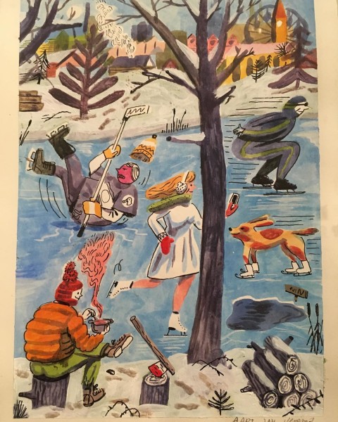
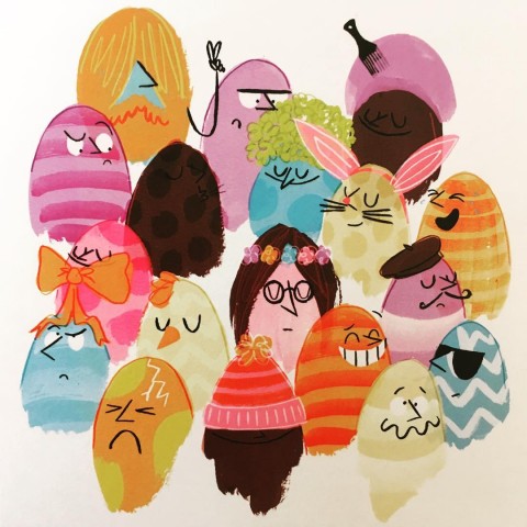
I loved this work by Finish artist Ville Savimaa.
In the meantime read on for a few more tasters of the fabulous artwork on offer at Pick Me Up and make sure you get down there whilst you can: not least because of the limited edition prints available exclusively at the shop for the duration of the exhibition only.


Illustrations by Mathis Rekowski.

A huge quilt by Siggi Eggertsson.

Detail from Andy Gilmore.

Part of Peepshow.


Wonderful work from Patrick Gildersleeves.


Wonderful details from work by Natsko Seki.


Fabulous fonts from Alex Trochut.

Wolf poster from Claire Scully.

Typography by Job Wouters.

Prints for sale in the Pick Me Up shop: get on down there quick.
You can see a fab set of Flickr images courtesy of Jo Cheung here and she blogs about her visit to Pick Me Up with reference to this article here.
Written by Amelia Gregory on Sunday May 2nd, 2010 2:32 pm
Categories ,Adrian Fleet, ,Alex Trochut, ,Amelia’s Anthology of Illustration, ,Andy Gilmore, ,Anorak Magazine, ,Claire Scully, ,Colin Henderson, ,Concrete Hermit, ,Dan Has Potential, ,Evening Tweed, ,exhibition, ,Hvass&Hannibal, ,illustration, ,It’s Nice That, ,Jess Wilson, ,Jim Stoten, ,Jo Cheung, ,Job Wouters, ,June Chanpoomidole, ,Karolin Schnoor, ,Landfill Editions, ,Le Gun, ,Luke Best, ,Mathis Rekowski, ,Mike Perry, ,Natsko Seki, ,Nobrow Press, ,Nous Vous, ,Patrick Gildersleeves, ,Peepshow, ,Pick Me Up, ,Print Club London, ,review, ,Risograph, ,rob ryan, ,screenprinting, ,Siggi Eggertsson, ,Simon Wild, ,Somerset House, ,Thereza Rowe, ,typography, ,Ville Savimaa
Similar Posts:


